Responsive web design is a hot topic these days, especially as websites need to adapt to the growing number of mobile devices with their relatively small screens. Many designers and developers want to create new websites with responsive layouts, or modify their existing sites to incorporate responsive elements.
However, the whole topic can be somewhat bewildering at first glance. Responsive design is a relatively new idea, and it is rapidly evolving. It’s full of rather confusing terms, such as responsive layouts, adaptive layouts, media queries and viewports. Where to begin?
In this article, you get a gentle introduction to the world of responsive web design. You’ll:
- Learn exactly what responsive design is, and why it’s useful
- Look at the difference between the terms “responsive design” and “adaptive design”
- Take an existing fluid layout and convert it into a responsive layout that looks good on all screens, from mobile to widescreen desktop, and
- See how media queries and the
viewportmetatag can help you build responsive layouts.
Ready to explore the world of responsive design? Let’s go!
Responsive design in a nutshell
The basic idea of responsive web design is that a website should “respond” to the device it’s being viewed on. In broad terms, this can mean things like:
- Adapting the layout to suit different screen sizes, from widescreen desktops to tiny phones
- Resizing images to suit the screen resolution
- Serving up lower-bandwidth images to mobile devices
- Simplifying page elements for mobile use
- Hiding non-essential elements on smaller screens
- Providing larger, finger-friendly links and buttons for mobile users, and
- Detecting and responding to mobile features such as geolocation and device orientation.
Most of the time, though, when people talk about “responsive web design” they’re referring mainly to the first of these points: creating a responsive layout that can gracefully adapt to different screen sizes. This is what you’ll be focusing on in this article.
Currently, most websites are designed to work on a desktop browser with a window that’s around 1,000 pixels wide. If your browser window is much narrower than this then the content either looks squashed, or you get a horizontal scrollbar. Similarly, if you maximize your browser on a widescreen display then the content often looks too stretched horizontally, or there’s an excessive amount of white space in the page.
For example, here’s the current www.elated.com layout at different browser sizes:

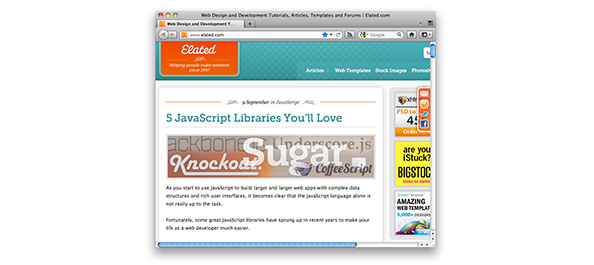
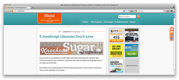
The www.elated.com layout is fixed-width. You can improve the situation somewhat by using a fluid-width layout, where the layout’s columns and elements resize proportionally with the browser width. Even then, a fluid-width layout starts to break down at very small or very large widths.
Since there’s a large variety of screen sizes and browser widths in use today, it’s very hard for a web designer to cater to all users using these traditional techniques.
Mobile browsers make the situation worse, with their tiny screens of between 320 and 768 pixels wide. Most modern mobile devices get around this to some extent by allowing you to zoom and pan a web page with your fingers. However, there’s no getting away from the fact that browsing a traditional web page layout, designed for the desktop, on a mobile browser is not a fun experience.
You can solve this problem by creating two websites — one for desktop and one for mobile — but then you have extra development time, plus you have to maintain two sets of templates for your site.
This explains why responsive web design is such a hot topic. By creating a responsive design, you only have to build one version of your website that works great on everything from tiny mobiles to widescreen desktops. As the screen or browser gets wider or narrower, the website responds by adjusting its layout appropriately.
Responsive or adaptive?
You may have heard both the term “responsive web design” and “adaptive web design” used to describe websites that adapt gracefully to different screen sizes. What’s the difference?
Essentially, both terms refer to the same basic idea: A website’s layout should alter itself depending on the device it’s being viewed on. Harry Roberts and Paul Gordon both suggest that “adaptive” is a better term for this behaviour, since the website really adapts to the device, rather than responding continuously to changes in its environment.
Harry takes this point further, and suggests that websites should simply adapt their layout to a small, specific set of screen sizes, rather than continuously responding as the user resizes their browser pixel by pixel. The idea is that such “adaptive” designs are simpler to build than “responsive” designs.
So the difference between the two terms is subtle. Personally I agree with Harry and Paul that “adaptive” is probably a better word to use. But most designers and developers seem to favour the term “responsive” at the time of writing. Take your pick!
An example of a non-responsive layout
OK, let’s put all this theory into practice and build a responsive layout. We’ll start with a fairly standard fluid layout. Here’s the markup:
<!doctype html>
<html>
<head>
<title>A Fluid Layout</title>
<link rel="stylesheet" href="main.css" />
</head>
<body>
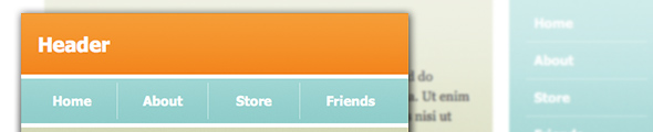
<div id="header">
<div class="inner">
<h2>Header</h2>
</div>
</div>
<div id="pageBody">
<div id="nav">
<ul>
<li><a href="#">Home</a></li>
<li><a href="#">About</a></li>
<li><a href="#">Store</a></li>
<li><a href="#">Friends</a></li>
</ul>
</div>
<div id="content">
<div class="inner">
<h1>Fluid Layout</h1>
<p>Lorem ipsum dolor sit amet, consectetur adipisicing elit, sed do eiusmod tempor incididunt ut labore et dolore magna aliqua. Ut enim ad minim veniam, quis nostrud exercitation ullamco laboris nisi ut aliquip ex ea commodo consequat. Duis aute irure dolor in reprehenderit in voluptate velit esse cillum dolore eu fugiat nulla pariatur. Excepteur sint occaecat cupidatat non proident, sunt in culpa qui officia deserunt mollit anim id est laborum. Lorem ipsum dolor sit amet, consectetur adipisicing elit, sed do eiusmod tempor incididunt ut labore et dolore magna aliqua. Ut enim ad minim veniam, quis nostrud exercitation ullamco laboris nisi ut aliquip ex ea commodo consequat. Duis aute irure dolor in reprehenderit in voluptate velit esse cillum dolore eu fugiat nulla pariatur. Excepteur sint occaecat cupidatat non proident, sunt in culpa qui officia deserunt mollit anim id est laborum.</p>
<p>Curabitur et leo dui, eu semper tellus. Vivamus aliquam, mi ultrices fringilla varius, augue nisl tincidunt elit, eu tincidunt ante metus ac mauris. Praesent congue blandit nunc, eu facilisis ligula faucibus sit amet. Proin eget turpis nulla. Phasellus mattis nisi a ante aliquet posuere. Vestibulum tortor quam, luctus imperdiet venenatis nec, molestie eu massa. Vivamus nec ipsum viverra augue aliquet bibendum. Morbi ac felis purus, sed vehicula mauris. Integer tempor mollis libero id hendrerit. Fusce sit amet urna quis justo varius pulvinar dapibus sed metus.
<p>Ut vel mauris eu velit fringilla lobortis. Phasellus accumsan sem in nisl luctus gravida. Vestibulum vitae scelerisque eros. Nullam id leo erat, et congue elit. Nunc volutpat justo tempor magna pretium adipiscing. Vivamus eget massa odio. Suspendisse potenti. Aliquam erat volutpat. Proin faucibus leo vel sem lobortis sed hendrerit diam suscipit. Maecenas dignissim, neque sit amet tristique pulvinar, ipsum orci porttitor odio, ac auctor nunc mauris ac nisi. Sed vitae dui et urna mollis elementum et id purus. Suspendisse bibendum quam id lacus condimentum ut pharetra orci mollis. Curabitur et consequat nisi. Suspendisse dictum luctus neque, id tincidunt justo rutrum non. Aenean fringilla quam ac magna ornare vehicula.</p>
</div>
</div>
<div id="sidebar">
<div class="inner">
<h2>About Us</h2>
<p>Duis aute irure dolor in reprehenderit in voluptate velit esse cillum dolore eu fugiat nulla pariatur. Morbi ac felis purus, sed vehicula mauris.</p>
<h2>Contact Us</h2>
<p>Morbi ac felis purus, sed vehicula mauris.</p>
</div>
</div>
</div>
<div id="footer">
<div class="inner">
<h3>Footer</h3>
</div>
</div>
</body>
</html>
And here’s the CSS file, main.css:
body {
  margin: 20px;
  padding: 0;
  font-family: "Georgia", serif;
  line-height: 150%;
}

h1 {
  line-height: 100%;
}

#pageBody {
  max-width: 1200px;
}

#header, #nav, #footer, h1, h2, h3 {
  font-family: Tahoma, Geneva, sans-serif;
}

#header {
  width: 100%;
  margin: 0;
  padding: 0;
}

#header .inner {
  margin: 0 0 20px 0;
  padding: 20px;
  color: #fff;
  background: #F38630;
}

#header a {
  display: block;
  float: right;
  color: #fff;
  font-weight: normal;
  font-size: 80%;
}

#content {
  float: left;
  width: 65%;
  margin: 0 0 20px 0;
  padding: 0;
}

#content .inner {
  margin-right: 20px;
  padding: 20px;
  color: #333;
  background: #E0E4CC;
}

#sidebar {
  float: right;
  width: 20%;
  margin: 0;
  padding: 0;
}

#sidebar .inner {
  margin-right: 20px;
  padding: 20px;
  color: #fff;
  background: #69D2E7;
  font-size: 85%;
}

#nav {
  float: right;
  width: 15%;
  margin: 0;
  padding: 0;
}

#nav ul {
  margin: 0;
  padding: 20px;
  list-style: none;
  color: #333;
  background: #A7DBD8;
  overflow: hidden;
}

#nav li {
  border-bottom: 1px solid rgba(255,255,255,.5);
}

#nav li:last-child {
  border-bottom: none;
}

#nav a {
  display: block;
  color: #fff;
  text-decoration: none;
  padding: 10px 0 10px 10px;
  font-weight: bold;
}

#nav a:hover {
  background: #bce5e3;
}

#footer {
  clear: both;
  width: 100%;
  margin: 0;
  padding: 0;
  color: #fff;
  background: #FA6900;
}

#footer .inner {
  padding: 5px 20px;
}
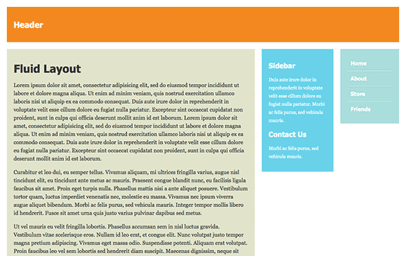
This layout is pretty straightforward. It comprises:
- A page header bar,
#header. The bar stretches across the whole viewport. - A main content area,
#content. This is floated left, and takes up 65% of the viewport width. - A sidebar area,
#sidebar. This is floated right so it sits to the right of the main content area, and takes up 20% of the viewport width. - A navigation menu,
#nav. This is also floated right, and sits to the right of the sidebar. It takes up 15% of the viewport width. - A page footer bar,
#footer. As with the header, this bar stretches across the whole viewport.
We also wrap the content area, sidebar and navigation menu in a #pageBody div, which we give a max-width of 1200 pixels to prevent the content stretching too much on very wide browser viewports.
Try the layout for yourself:
Resize your browser window to see how the layout changes with the viewport width.
As the viewport gets narrower, the content area, sidebar and navigation shrink proportionally. This works fine until the browser width drops below around 1,000 pixels, at which point the three columns start to feel a little cramped. When you narrow the browser window further, down to around 600 pixels, the columns become so squashed that the text inside becomes unreadable.
Making the layout responsive
Clearly, the fluid layout shown above isn’t going to work well on the narrow viewports of mobile devices. This is where responsive layouts come in.
By making our layout responsive, we can reposition the various elements in the page based on the viewport width. Wide desktop browser windows get the standard three-column layout, while narrow browser windows and mobile browsers receive a tweaked layout that is more appropriate for their reduced width.
Understanding media queries
The key to building responsive layouts is CSS media queries. With media queries, you can create a bunch of CSS rulesets that only apply when the browser’s viewport is a certain width or height, or within a given width/height range. For example, by creating a media query for viewports that are less than 700 pixels wide, you can apply a set of custom CSS rules that automatically rearrange a page’s elements when the page is displayed on narrow browser windows.
Media queries work in nearly all modern browsers, with the notable exception of Internet Explorer 8 and earlier.
Here are some media queries that you’re likely to use when building responsive layouts:
min-width: width- Applies when the viewport’s width is greater than or equal to width
max-width: width- Applies when the viewport’s width is less than or equal to width
min-device-width: width- Applies when the device’s screen width is greater than or equal to width
max-device-width: width- Applies when the device’s screen width is less than or equal to width
You can also specify exact width values using the properties width and device-width, although you’re more likely to use the min/max versions to specify a range of values.
The difference between width and device-width is subtle but important:
widthis the width of the browser viewport. On desktop browsers, this is typically smaller than the screen width. However, on mobile browsers, it’s typically larger than the screen width, since most mobile browsers use a “virtual viewport” that is bigger than the screen, allowing the user to zoom in and out, as well as pan around the viewport by dragging. For example, Mobile Safari uses a virtual viewport that is 980 pixels wide, even though an iOS device’s screen is typically between 320 and 768 pixels wide (in portrait mode). You’ll explore viewports in more depth later in the article.device-widthis the width of the device’s screen. On a desktop machine, this information isn’t usually that important to you as a web developer. On a mobile device, it can be useful to know the screen width, since you can then adapt your layout to fit the device’s screen comfortably. However, if you’re using theviewportmetatag to lock the viewport width to the screen width (more on this later) then you can just usewidthinstead ofdevice-widthto achieve the same result.
Another subtle difference is that width (and min-width/max-width) is measured in CSS pixels, whereas device-width (and min-device-width/max-device-width) is measured in device pixels. When a page is zoomed in to 100% on a mobile device, 1 CSS pixel = 1 device pixel. However, if the page is zoomed out, 1 CSS pixel is smaller than 1 device pixel. To complicate things further, the advent of high-density displays such as Apple’s retina display means that a “device pixel” may actually represent more than one actual screen pixel! (The good news is that this actually makes your life as web developer easier, since you don’t need to worry about whether a device’s display is normal- or high-density.)
For a detailed discussion on this topic, see A pixel is not a pixel is not a pixel.
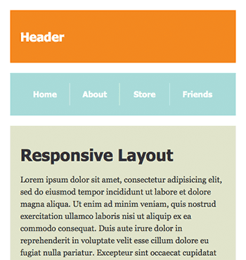
Adapting to viewports 1,000 pixels wide or less
As mentioned earlier in the article, our fluid layout works OK for wide browser viewports, but the content, sidebar and nav columns start to look cramped when the viewport shrinks below 1,000 pixels wide.
Let’s fix this. We’ll use a media query to detect if the viewport is less than or equal to 1,000 pixels wide. If it is then we’ll place the nav on top of the sidebar instead of to the right. We can then make the nav, sidebar and content areas a little wider so that everything feels less cramped.
Here’s the CSS to do this — you can either add it to the end of main.css, put it in a separate CSS file, or embed it into the page’s head section:
/* If the viewport width <= 1000 pixels ... */

@media screen and (max-width: 1000px) {

  /* Make the main content a bit wider */

  #content {
    width: 75%;
  }

  /* Put the nav on top of the sidebar */

  #nav, #sidebar {
    width: 25%;
  }

  /* Adjust the sidebar margins */

  #sidebar .inner {
    margin-right: 0;
    margin-top: 20px;
  }

}
The rulesets inside our media query are triggered when the page is viewed on a screen, and when the viewport’s width is 1,000 pixels or less. The rulesets work like this:
- The first ruleset stretches the main content’s width from 65% to 75%.
- The second ruleset puts the navigation on top of the sidebar by setting both elements to a width of 25%.
- The third ruleset removes the right margin from the sidebar content and adds some top margin instead, so that there is some vertical space between the nav and the sidebar.
Try out this new layout by clicking the button below:
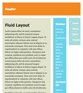
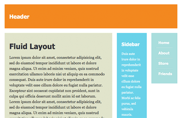
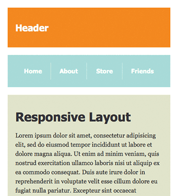
You can see how it looks in the following figures. The top screenshot shows the original fluid layout with an 800-pixel-wide viewport; the bottom screenshot shows the responsive layout at the same width.
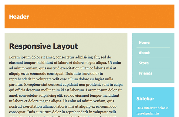
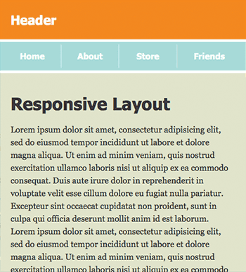
Adapting to viewports 700 pixels wide or less
As the viewport narrows further to around 700 pixels wide, even our new two-column layout starts to looked cramped:
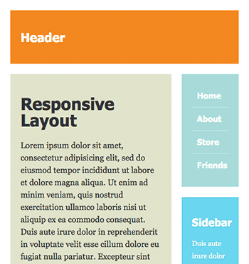
To solve this, we can use another media query to rework the page further into a single-column layout for these narrow viewport sizes. Here’s the CSS:
/* If the viewport width <= 700 pixels ... */

@media screen and (max-width: 700px) {

  /* Make the main content fill the viewport width */

  #content {
    width: 100%;
  }

  /* Remove the main content right margin */

  #content .inner {
    margin-right: 0;
  }

  /* Put the nav above the main content */

  #nav {
    float: none;
    width: 100%;
    margin-bottom: 20px;
  }

  /* Place the nav items side by side */

  #nav li {
    float: left;
    width: 24%;
    border-bottom: none;
    border-right: 1px solid rgba(255,255,255,.5);
  }

  #nav li:last-child {
    width: 27%;
    border-right: none;
  }

  #nav a {
    text-align: center;
    padding-left: 0;
  }

  /* Place the sidebar below the main content */

  #sidebar {
    float: none;
    clear: both;
    width: 100%;
    margin: 20px 0;
  }

}
These rulesets kick in when the page is viewed in a viewport less than or equal to 700 pixels wide. The rulesets:
- Stretch the content column to the full width of the viewport, and remove the content’s right margin
- Reposition the nav menu so it’s above the main content, and stretch it to the full viewport width
- Make the nav items run horizontally instead of vertically
- Reposition the sidebar so it’s below the main content, and stretch it to the full viewport width
Try out this new layout — click the button below, then resize the browser window so it’s less than 700 pixels wide:
The figure below shows the new single-column layout in a narrow viewport:
Adapting to viewports 480 pixels wide or less
We’ve now pushed our layout about as far as we can, with everything in a single column. However, for very narrow browser windows, such as mobile phones, we can make one final optimization: reduce or eliminate some of the padding and margin around the page elements.
Here’s the CSS:
/* If the viewport width <= 480 pixels ... */

@media screen and (max-width: 480px) {

  body {
    margin: 0;
  }

  #header .inner {
    padding-top: 5px;
    padding-bottom: 5px;
  }

  #header .inner, #content, #nav, #sidebar {
    margin-bottom: 5px;
  }

  #nav ul {
    padding: 5px 7px;
  }

}
These rulesets remove the white margin around the outside of the page, and reduce the other white margins from 20 pixels to 5 pixels, once the viewport width drops to 480 pixels or less. They also reduce the padding on the header and nav elements slightly.
Try out this layout in your browser. It should now look good at any browser width, from 1,600 pixels down to 320 pixels:
The figures below show the layout on a 480-pixel-wide browser, before and after applying the final media query.
Dealing with mobile devices: the viewport meta tag
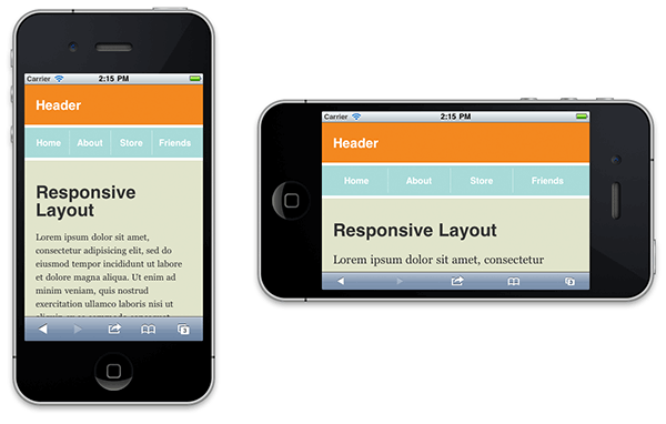
One of the main reasons to design a responsive layout that works well on both large and small screens is, of course, to make your websites mobile-friendly. So how does our new responsive layout look on an iPhone, for example? Check out the figure below:
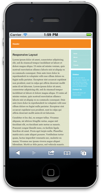
As you can see, the iPhone’s browser has zoomed the page out, making the text small and hard to read. Our “1,000 pixels or less” media query has kicked in — reducing the page to two columns instead of three — but the “480 pixels or less” media query is not triggered, even though an iPhone’s screen is just 320 pixels wide in portrait orientation, and 480 pixels wide in landscape. What’s going on?
The high-definition “retina” display of the iPhone 4 (and, presumably, the upcoming iPhone 5) is 640×960, not 320×480. However, for compatibility reasons, these devices still report their screen sizes as 320×480 pixels from a CSS perspective. For more on this, read A pixel is not a pixel is not a pixel.
The answer lies in the subtle difference between the viewport and the screen on mobile devices, which you looked at briefly in Understanding media queries, earlier in the article.
The iPhone, along with most mobile browsers, uses a “virtual” viewport that is larger than the physical screen. This allows mobile browsers to display web pages that are designed for larger, desktop browser windows. Initially, the viewport is zoomed out so that the whole page fills the screen. The user can then pinch or double-tap to zoom into specific areas of the viewport.
The iPhone’s viewport happens to be 980 pixels wide, which works great for most websites that are designed to fit on a 1024×768 desktop display. This is why our “1,000 pixels or less” media query is triggered on the iPhone. However, we’ve built a responsive layout that is specifically designed to adapt to smaller screens, with the page fully zoomed in. How can we tell the iPhone that it should use a 320- or 480-pixel-wide viewport that matches the screen size, rather than its 980-pixel-wide virtual viewport?
This is where the viewport meta tag comes in. By adding this tag to a page’s <head>...</head> section, you can control the size of the mobile browser’s viewport.
In our case, we want the viewport’s width to match the device’s screen width, so that there’s a 1:1 ratio between the page’s CSS pixels and the device’s screen pixels. We can do this using two values in the viewport tag: initial-scale and maximum-scale. Here’s how to do it:
<meta name="viewport" content="initial-scale=1, maximum-scale=1" />
initial-scale=1ensures that the page, when first displayed, is fully zoomed in, so that the viewport’s width matches the device’s screen width in portrait orientation — for example, 320 pixels on an iPhone and 768 pixels on an iPad.maximum-scale=1prevents the device from zooming in further than 1:1 when rotating to landscape orientation. In other words, it forces the iPhone viewport’s width to increase to 480 pixels in landscape mode. If we didn’t include themaximum-scalevalue then the viewport would be 320 pixels wide in both portrait and landscape orientations. Sometimes this might be what you want, but for our responsive layout, it would blow up the content too much in landscape mode.
Now, when viewing our page on an iPhone in portrait orientation, the viewport is 320 pixels wide. When viewing in landscape, it’s 480 pixels wide. This triggers our “480 pixels or less” media query successfully, as you can see in the following figure:
viewport meta tag along with the initial-scale and maximum-scale values, we can persuade mobile browsers to match their viewport’s width to the device’s width, thereby triggering the correct media query.If you have a mobile device such as an iPhone, iPad or Android phone, you can try out this final layout for yourself by tapping the button below:
You can also control the viewport’s width explicitly using values such as width=500 (for 500 pixels) and width=device-width (for the width of the device’s screen in portrait orientation). Depending on the nature of your layout, setting the width explicitly might suit you better. See the Safari Web Content Guide for more information.
Summary
In this article you’ve explored the concept of responsive web design, and tried out a few responsive design techniques. You’ve looked at:
- The basic idea behind responsive web design: creating websites that seamlessly adapt themselves to different screen sizes and devices.
- The subtle difference between the terms “responsive web design” and “adaptive web design”.
- How to convert a standard fluid layout into a responsive layout that adapts to various different browser sizes.
- CSS media queries, and their role in responsive layouts.
- How to set the size of a mobile browser’s viewport by using the
viewportmetatag.
I hope you’ve found the article useful, and that it has taken some of the mystery out of responsive web design. Have fun!
Responsive design resources
This article is by no means a complete look at responsive web design. There are other factors to consider, including more advanced media queries, scaling images, more viewport issues, and working with more complex layouts.
Here are some pages that you might find useful:
- Responsive Web Design by Ethan Marcotte. This is the seminal article that started off the whole responsive design movement.
- Responsive Web Design: What It Is and How To Use It. A nice in-depth article by Kayla Knight, explaining various responsive design techniques, including image scaling and content hiding. Also includes a showcase of responsive sites.
- A tale of two viewports. This two-part article is essential reading for understanding CSS pixels, the viewport concept, and how viewports behave in mobile browsers. (Warning: some parts may make your head explode!)
- Less Framework. This is a CSS framework that makes it easy to build adaptive layouts. Its sister framework, Golden Grid System, does the same for responsive (i.e. fluid adaptive) layouts.
- Media Queries. The official W3C spec.
Enjoy!
Brilliant stuff! How about a followup with some of the stuff you mention, including scaling images, fluid type resizing and loading different images for mobile?
Great Tutorial!
Simple, clear, step x step.
Q:
==
Is there any code that could be added
in order to make the last [DEMO] in the article,
also work in MS-INTERNET EXPLORER 8 and 7 browsers?
(we’ll have to live with these 2 browsers for a while…).
Thanks!
Sfdude
[Edited by SFdude on 30-Sep-11 13:07]
@simon: Thanks for the suggestions – I’ll add them to the list for future articles!
@SFdude: IE7/8 don’t support media queries natively, but there are some JavaScript polyfills out there that do the job – for example:
https://github.com/scottjehl/Respond
Great article. These are the kind of articles that make me register and post comments like these.
You’ve earned yourself another feedreader, clearest tut I’ve seen on the net.
@pieter: Thanks for the compliment 🙂
Great article, helpful and very well written. I’m really glad you explained the “viewport” meta tag instead of just saying to use it (like a lot of articles seem to do).
I’m subscribed to the RSS feed of probably 30 or 40 different different web development blogs and sites, and this article is by far one of the best I have ever read. Well done!
@Daniel15: Thank you! 🙂 Yes, I thought it was important to explain the viewport meta tag. Mobile viewports can be quite a tricky topic!
Another great article Matt, Thanks.
I’ve adapted this principle into a couple of WP themes but your article has highlighted a point I’ve missed re: iPhones.
http://ethanmarcotte.com has been championing this design principle for some time and, it’s something I’m definitely taking to heart.
How about a follow up with some advice on images in responsive design? That would be real useful.
Thanks again,
Phil.
Outstanding article! Very succinct and enlightening.
Wondering when we could have media galleries like WOW Slider and Nivo Slider for responsive layouts.
I’m fairly sure you could write a workaround using javascript or jQuery for older IE browsers based on the viewport width and then importing the relevant documents stylesheet that way for backwards compatibilty.
@refreshcreation: That’s exactly what Respond.js does: https://github.com/scottjehl/Respond
Awesome stuff!
@bionic frog: Thanks – yeah I’m thinking about a followup article that delves deeper into responsive design (images, fonts etc).
@ed1nh0: That would be nice 🙂 Although WOW Slider works fairly well on my iPhone as it is.
Thanks. Very useful.
Really good article, clear and well explained. I have tested the code on Windows Phone and works really well. Thanks for this.
@arbbot Thanks for letting us know about Win Pho (7?). Good to hear!
Simon
Yes, the tests were done using an HTC Windows Phone 7 (although I’m inclined to omit the “7” since is until now it is a decent mobile development platform 😉 )
You can check my own staff at http://blog.anthonybaker.me
Cheers!
I published the results of running the tutorial output on the Windows Phone emulator and a Windows Phone device. It worked perfectly without needing to make any kind of modifications. You can check the results (with screen shots) on my blog. I took the liberty to use the tutorial demo URLs for the tests and post screens hots of them. Hope that is fine with you.
http://blog.anthonybaker.me/2012/01/adaptive-layout-on-windows-phone.html
@Antony. That’s really great – fantastic to know this stuff works well on WinPho7 too. Thanks for that – much appreciated!
How do you find your WinPho7 phone? Do you use it as your “everyday” phone, and do you like it? I find myself drawn to the interface, as Apple become ever more fascinated with modelling real-world objects, which personally I dislike.
Simon
@Simon. Thanks for keeping track of the comments. I’m glad to share stuff since this article has helped me so much.
I really like my windows phone. I used as my everyday phone. I had a WinPho 6.5 before and it was a total junk and a nightmare for app development, but definitely, WinPho7 changed that radically. My wife has an iPhone as many of my colleagues, and several more have Android phones. I honestly find that WinPho7 is way better. The interface is totally refreshing, clear and uncluttered. Easy to personalize and change. The development environment is the best out there. Trust me, I have done work with Apple and Android tools and they are quite bad compared to WinPho dev tools. They are heavy…I grant you that, but way better. The Emulator is great, Visual Studio is probably the best IDE out there and Expression Blend is the best UI development tool. I know I’m a bit subjective because I’m primarily a .NET developer, but that’s what I believe and I have tried to test all the other open source, apple and android tools out there. You could differ because of principles or philosophy which is totally fine, but in terms of experience as a user and as a developer, there’s no match.
Regarding apps, well WinPho is still quite new. There are already 50,000 apps out there and it is also true that in general thery are a bit more pricey than their counterparts in Android and iPhone, but is minimal. Just my 2 cents. Cheers!
It’s interesting you say this as a dev. WinPho7 seems to need some very cool apps that aren’t on other platforms, and if the devs are happy, that’s a start!
Simon
Fantasic article! :0). very clear and well explained.
@angiemck: Thanks 🙂
I’m a fairly new web designer, just getting in to responsive and adaptive designing and this article was amazing. I NEVER comment on articles that I read on the web, but this one – I just couldn’t resist. I feel more confident about designing a site already! Thank you, Thank you, Thank you!!!
@catiepershing: Thanks for your kind words – I’m glad you liked the article 🙂
that’s really amazing. the CSS code you have shared is really awesome and i just love that. thanks for sharing all those here. looking forward to have more.
<a href=”http://www.danawebdesign.com/”>long beach web design</a>
[Edited by lngbeachwebdsgn on 18-Mar-13 02:14]