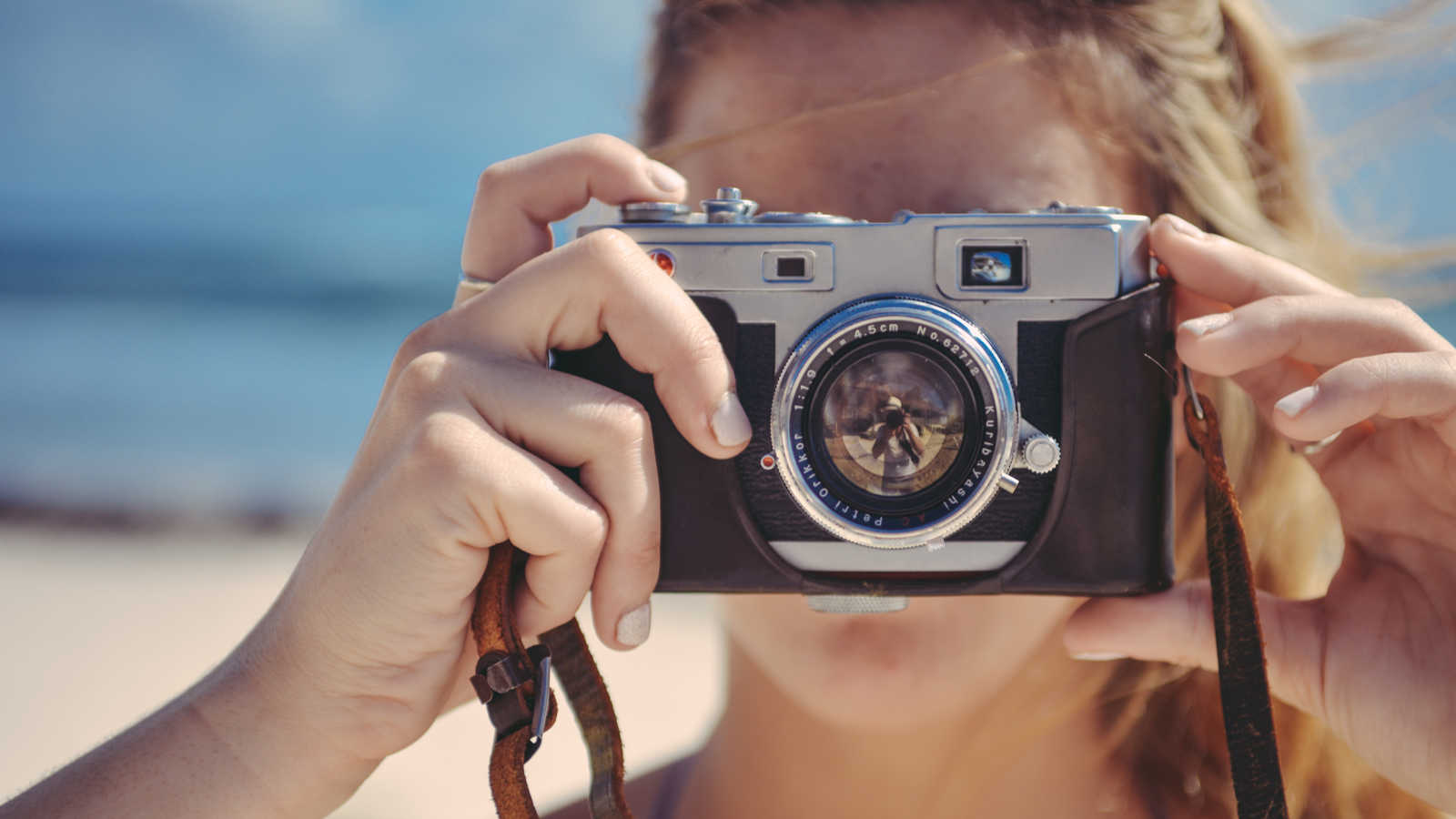
Great images make a huge difference to the look and feel of your website. Whether it’s product photos, a headshot of your gorgeous self for your About page, or some inspirational images for your blog posts, eye-grabbing imagery will help your customers trust you and your business.
But we’re not all professional photographers, right? So how do you go about making these amazing pics? There are many fantastic stock photo libraries, of course, which are a great place to start. But sometimes you need to take your own photos. Even a stock photo might need some tweaking to work well on your site.
That’s why I wrote this guide to creating great images for your site! In it, you’ll learn:
- How to choose an image-editing app that meets your needs
- The best way to crop your images for maximum effect
- Ways to tweak an image’s brightness, contrast, and colours to make it pop
- A clever trick to make the subject of your photo stand out
- How to reduce pesky noise in a photo to make it look cleaner and load faster, and
- How to improve soft images with sharpening so that they look more pro.
Ready to get started? Let’s begin by choosing the perfect image editor for you!
Choose your weapon!
To get your images looking gorgeous, you need an image editor. This is an app that runs on your computer, in your web browser, or on your phone or tablet. With an image editor, you can make all sorts of adjustments and tweaks to your photos so that they end up looking really professional.
Maybe you already have a go-to image editor. If not, here are some suggestions:
- Adobe Photoshop (Mac & Windows, US$9.99/month): The granddaddy of them all. Used by professional photographers and graphic designers. Contains more features than you will probably ever need, and has a pretty steep learning curve. It also comes with Adobe Photoshop Lightroom, which is designed for organising your photo library, but is also good for making quick adjustments to photos.
- Adobe Photoshop Elements (Mac & Windows, US$99): A good budget alternative to Photoshop. It’s a cut-down version that still has pretty much everything you need for preparing images for the web, and is easier to use too.
- Pixelmator (Mac, US$29.99): A Mac app that’s similar to Photoshop Elements in terms of features, and is lovely to use. It’s also very good value. There’s also Pixelmator Pro, which is a fair bit pricier, but gets closer to Photoshop in terms of features.
- Affinity Photo (Mac & Windows, US$49.99): A powerful (and much more affordable) Photoshop alternative that many professionals are now using. It has a very Photoshop-like feel and has pretty much all the features that a pro photographer needs.
- Pixlr (Any computer, free): A suite of easy-to-use photo editing tools. There are two web apps: Pixlr Express for quick and easy adjustments, and Pixlr Editor, which is like a cut-down version of Photoshop Elements. There’s also a mobile app for editing photos on the go.
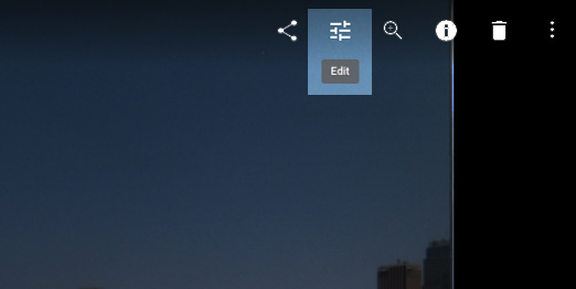
- Google Photos (Any computer, free): This service is designed to store and organise your personal photo library online, but it also contains an easy-to-use photo editor that’s great for making quick improvements to your pics. Just click a photo in your Google Photos library to view it, then click the Edit icon in the top-right corner to edit:
- PicMonkey (Any computer, US$5.99-$8.99/month): An online photo editing service that’s really easy to use and comes with a ton of stunning visual effects, overlays and themes. It also has some handy adjustments that let you crop and enhance your photos.
- Photos (Mac, free): Apple’s photo manager app lets you organise and edit your photos, and it comes built into your Mac. You can easily crop, auto-enhance and retouch your pics, as well as make light and colour adjustments quickly. If you prefer, you can also use the built-in Preview app to do cropping and simple adjustments on a single photo.
- Paint.NET (Windows, free): An excellent Photoshop-like photo editor for Windows. While not as fully-featured as Photoshop or Photoshop Elements, it still has all the adjustment tools you need to make your photos look awesome.
- GIMP (Any computer, free): A powerful, open-source graphics editor that’s often compared to Photoshop. It has a steep learning curve and arguably isn’t as nice to use as Photoshop. That said, you can get great results with GIMP if you put the effort in, and the price is hard to beat!
If you don’t already have an image editor then I’d suggest spending some time trying out the options above, until you find a tool that you’re happy to use.
Once you’re up and running, it’s time to start tweaking those pics!
Improve your image with cropping
The first thing I like to do with a photo is crop it, if necessary. Cropping means removing some of the top, bottom, left, and/or right sides of an image, resulting in a smaller image. Even the most basic image editors have a crop feature of some sort, so this is something you’ll be able to do easily.
Here’s how cropping can help make your images better:
- It can improve composition.
Composition means organising the different parts of an image to give a pleasing result. Composition rules, such as the rule of thirds and balancing elements, can really help here. Ideally, you get your composition right when you take your picture, but if you don’t then you can often fix things by cropping it later. Here’s an example: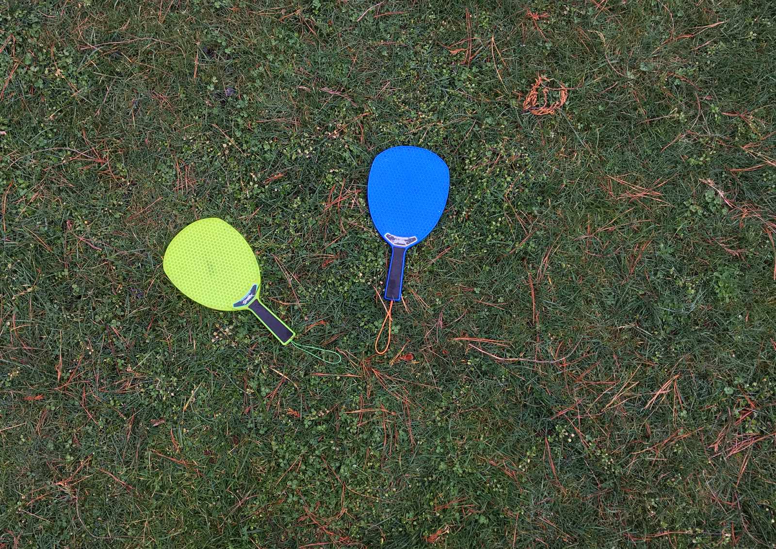

An image with bad composition. It doesn’t follow the rule of thirds, and there’s too much space around the bats. 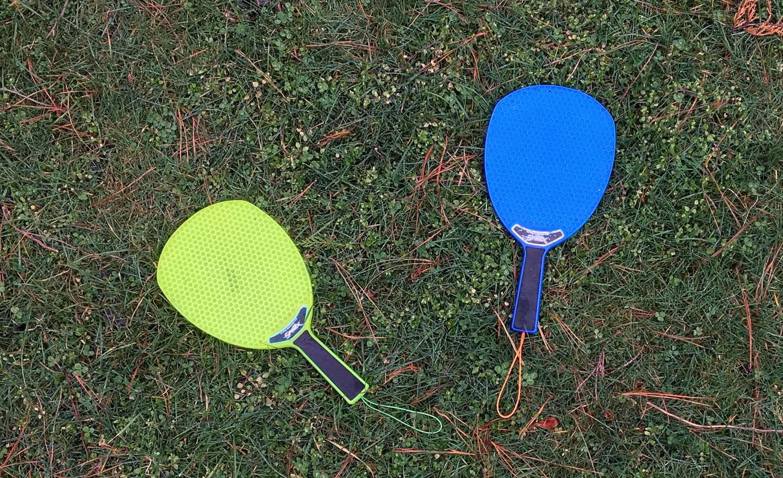

After cropping, the image follows the rule of thirds, the bats are nicely balanced, and the whole image “feels” better. - It removes distracting elements.
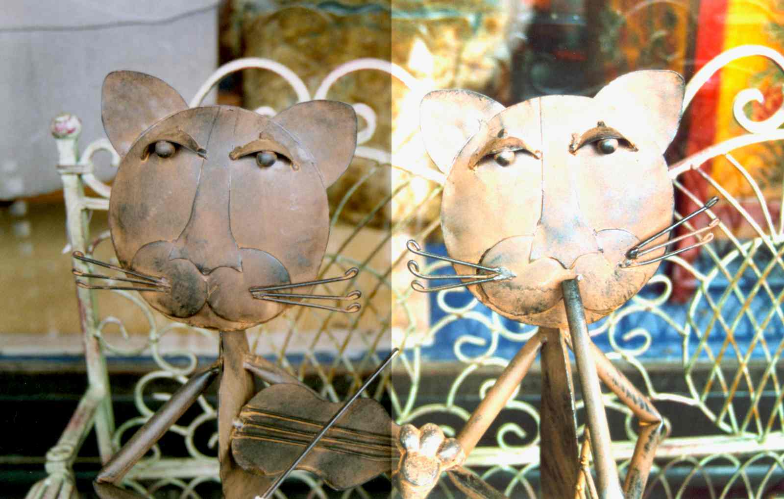
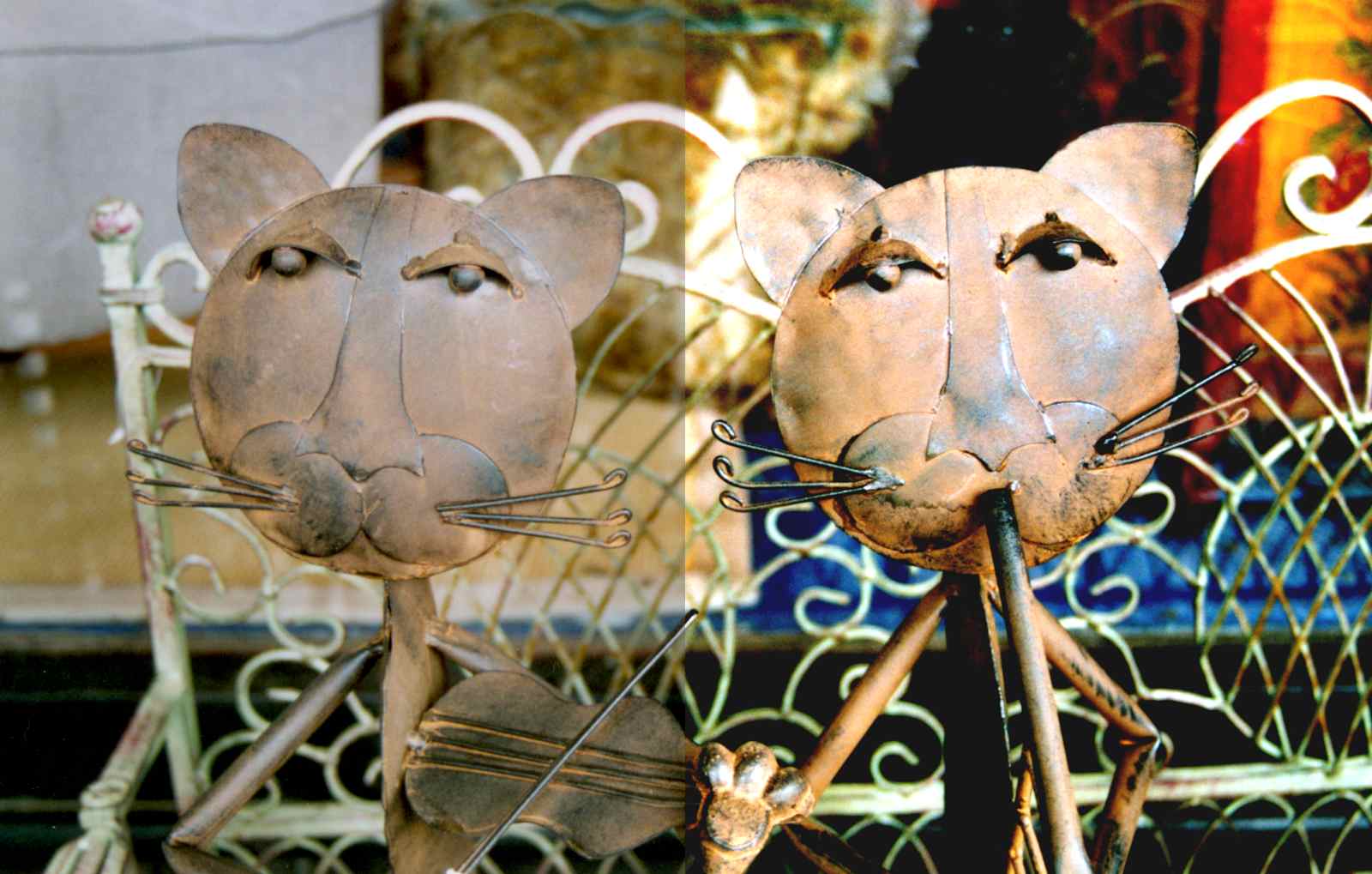
Your photo might contain objects that distract from the main subject of the image, such as a busy background or an extra person in a portrait. With careful cropping, you can remove these distractions so that your viewers can focus on the important thing in the photo. Here’s an example: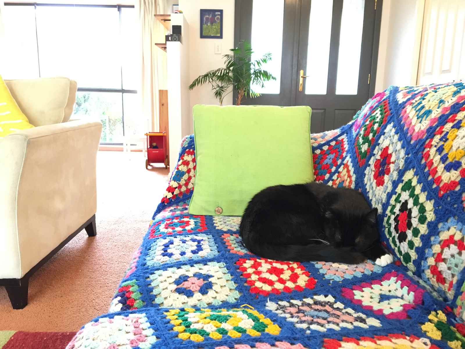

This photo has a lot of distractions around the main subject: the cat and the cushion. 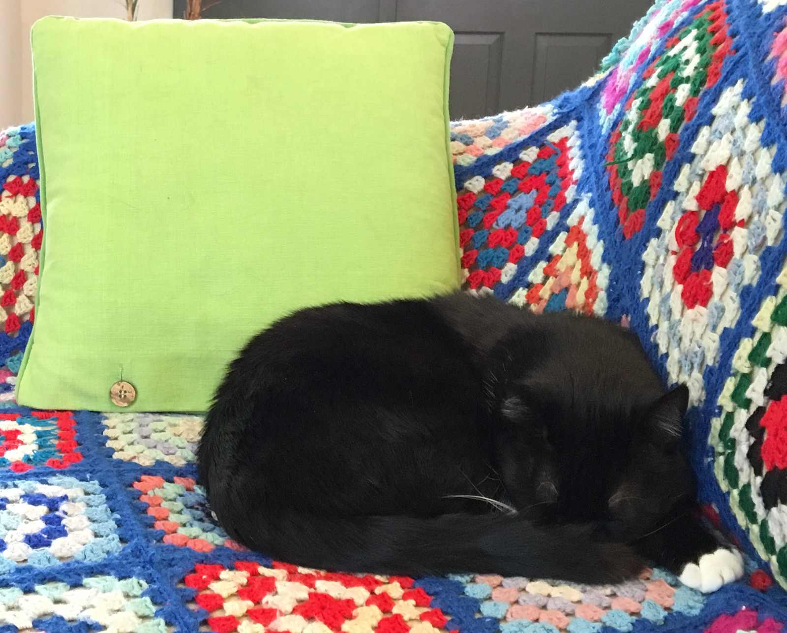

After cropping, the distractions have been removed so you can focus on the kitty. - It lets you change the aspect ratio.
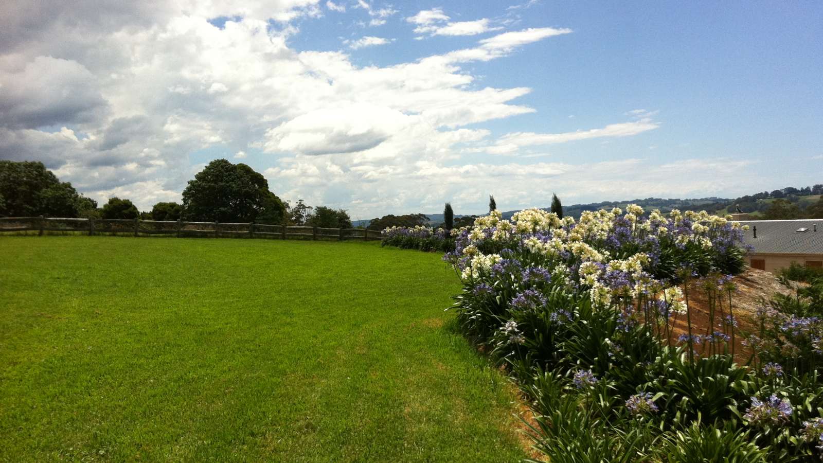
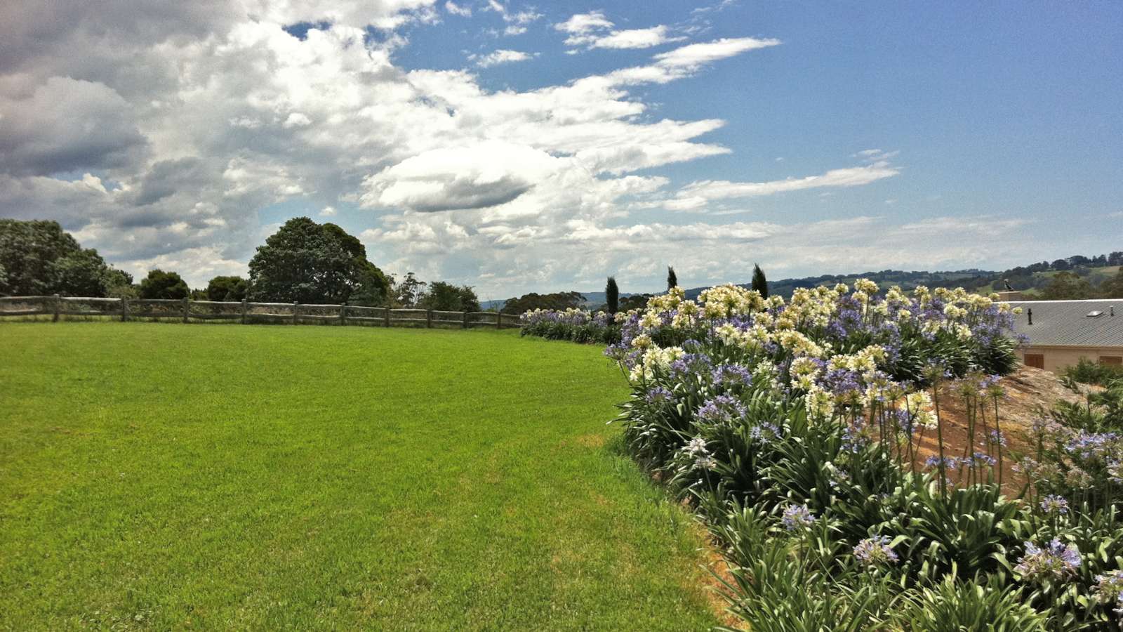
The aspect ratio is the relationship between an image’s width and height. For example, an image might be wider than it is tall (known as a “landscape” aspect ratio), it might be taller than it is wide (a “portrait” ratio), or it may have equal width and height (a “square” ratio). Sometimes the layout of your webpage might call for, say, a landscape ratio, but the photo you want to use has a portrait ratio. By cropping the image to remove most of the top or bottom, you can convert it into the landscape ratio that you need. For example:

Nice pic, but your website might call for a landscape image, rather than portrait. 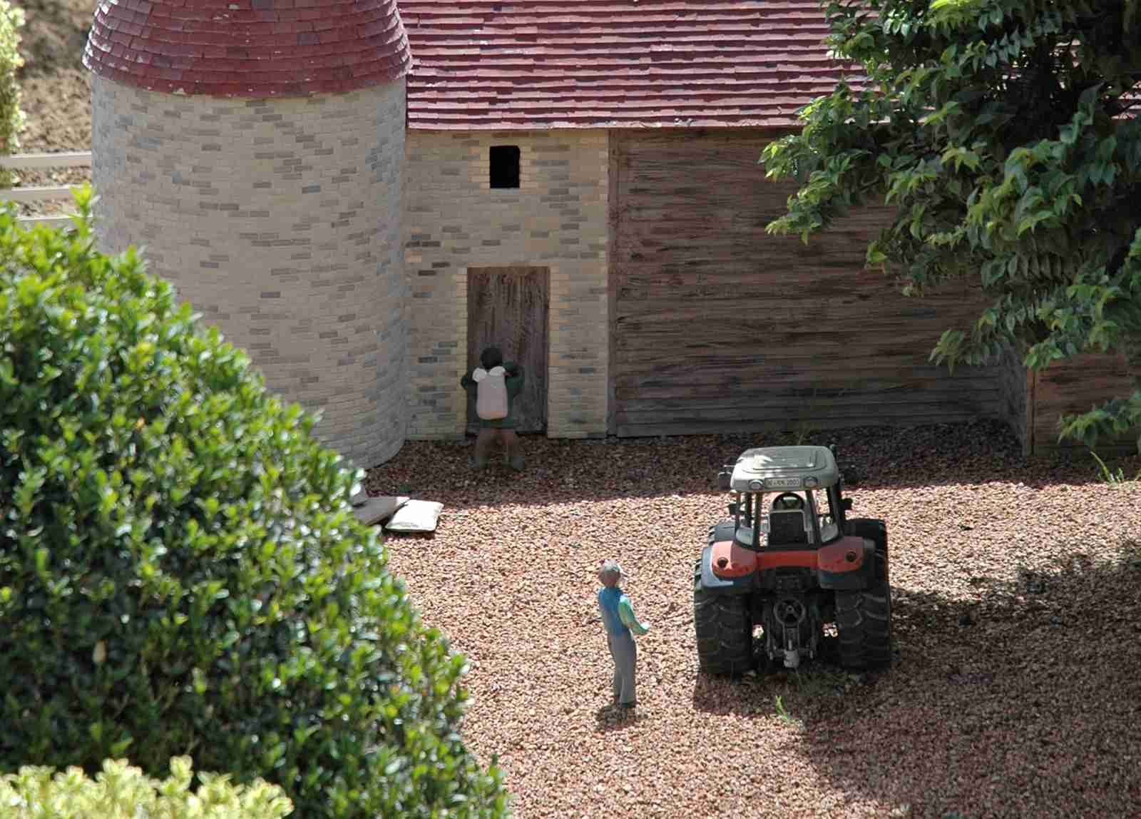

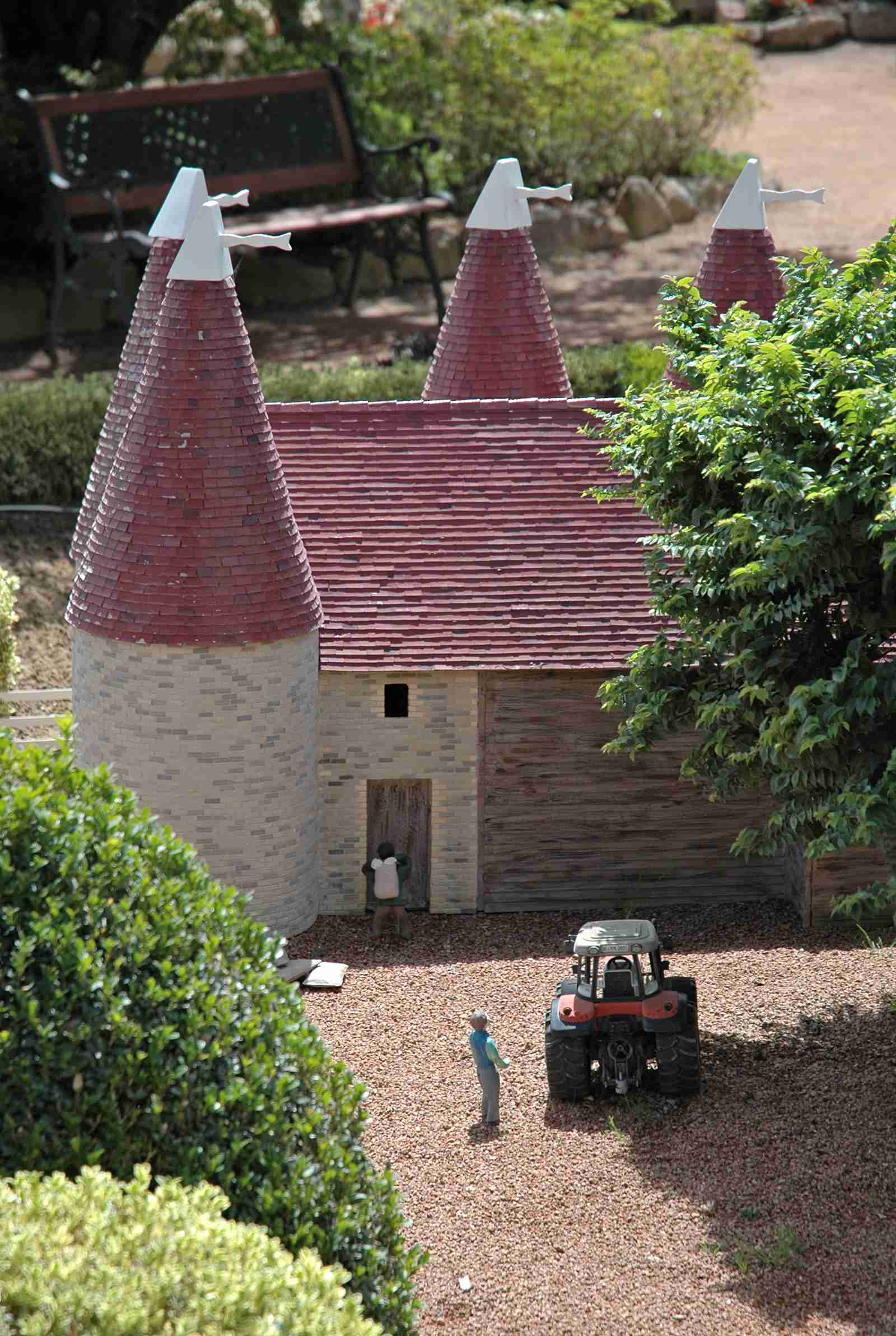
With some careful cropping, you can create a landscape image from the original.
Enhance your image to make it pop
Enhancing an image means playing with its brightness, contrast and colours to bring out the best in the image. If you do it right, you can turn a dull, lifeless photo into a rich, gorgeous, eye-catching thing of beauty!
But first, here are three important photography terms that you need to know:
- Shadows are the darkest areas of an image (the areas with colours that are closest to black).
- Highlights are the brightest areas of an image (the areas with colours that are closest to white).
- Midtones are the rest of the image — the areas that are brighter than the shadows, but darker than the highlights.
Most image editors give you several tools to enhance images. Here’s how they work:
- Exposure moves the brightness of your whole image up or down. It’s the equivalent of changing the aperture or shutter speed in a camera. If your image is clearly too dark or bright then this is the first thing you’ll probably want to adjust. Be careful though, because it’s easy to overdo it and lose a lot of detail in the shadows or highlights.

Taking an image (left) and dialling up the exposure raises the overall brightness (right). - Brightness mainly adjusts the brightness of the midtones in your image. Since the midtones tend to be the most noticeable areas in an image, you can use this tool to adjust the apparent brightness of the image without overly darkening the shadows or washing out the highlights.

Increasing an image’s brightness lightens the midtones without wrecking the highlights. - Contrast adjusts the difference between the bright and dark areas in your image. If you increase the contrast then the shadows and highlights in your image get harsher, making the image more dramatic. Decreasing the contrast softens the shadows and highlights.
When you increase an image’s contrast, the shadows and highlights become more pronounced. - Saturation controls how colourful your image is. If you increase the saturation then all the colours in the image get more intense. If you decrease the staturation, the colours fade out until, eventually, you get a black & white image.

Increasing the saturation makes the colours more intense.
If you have an image that you want to use on your site, but the image seems dull or lacks “pop”, try playing with the exposure, brightness, contrast, and saturation in your image editor until you get a result that you’re happy with. Once you’ve worked on a few images, you’ll start to get a feel for how these adjustments can help you get the best from your pics!
Bring out detail in the shadows and highlights
This is a great trick to make your photos more pro-looking and eye-grabbing!
Many photos suffer from a lack of detail in their shadows and highlights. The shadows are too dark to see the detail, while the highlights are too washed out.
If you adjust the brightness and contrast in just the shadows and highlights then the image can look a lot more impressive, as the following “before-and-after” images show:
There are a couple of ways to pull off this trick:
- The Shadow/Highlight tool.
This is a quick and easy way to bring out detail in the shadows and highlights, and it’s what I used to enhance the photo above. The Shadow/Highlight tool automatically lightens the shadows and darkens the highlights in your image to bring out detail. The tool has different names, depending on the image editor you’re using — for example:- Photoshop and Photoshop Elements: Shadow/Highlight
- Affinity Photo: Shadows/Highlights
- Google Photos, PicMonkey, Apple Photos, Adobe Photoshop Lightroom, and Adobe Camera Raw: the Highlights and Shadows controls
- Pixelmator: Light & Dark
- Paint.NET : Adjustments > Shadow / Highlight Recovery
To use the tool, you drag the Shadows and Highlights sliders to control the level of lightening in the shadows and darkening of the highlights. (As with most enhancements, it’s best not to overdo it, or your photos can start to look noisy and artificial.)
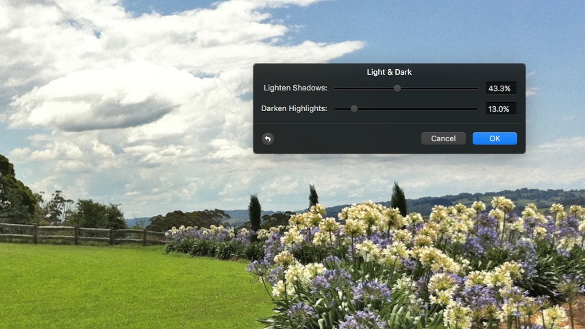

Using Pixelmator’s Light & Dark tool to enhance the shadows and highlights. - The Dodge and Burn tools.
These tools give you a “paintbrush” that you can use to manually lighten or darken areas of your image. (The Dodge tool lightens; the Burn tool darkens.) It’s best to go easy with these tools, since it’s easy to overdo it; select a low Exposure setting, if there is one.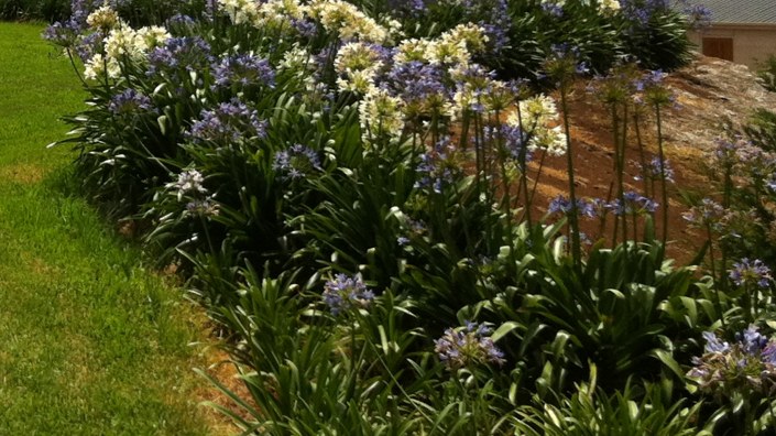

The Dodge tool lets you selectively lighten areas of an image by “painting”. Here’s part of the image before dodging… 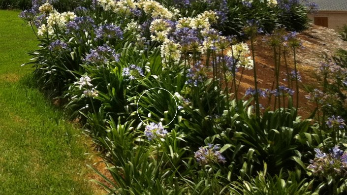
…and here’s the same image after going over the dark area with the Dodge tool to bring out the details. Try experimenting with the tool’s colour range option, if available. For example, select the Dodge tool’s Shadows range to lighten just the shadows, or the Midtones range to bring up some detail in the midrange.
Blur your background to highlight the subject
Most photos contain a subject: the main thing in the photo, such as a person or an interesting object. If the subject in your photo is in front of a busy background, it can be hard for the viewer to focus on the object:
A common trick to solve this problem is to blur the background. You can do this when you take the photo, if you have the right kind of camera — the technique is called shallow depth of field. However, you can also use your image editor to get a similar effect after the photo has been taken.
Most image editors have a Blur tool that gives you a “paintbrush” to blur parts of an image. You just click and drag the brush over the background portions of your photo to blur them.
It’s best to set the tool’s strength fairly low and build up the blur effect in stages with several brush strokes. Also, as you get close to the subject, zoom in and use a tiny brush size to create a clean border between the subject and the blurred background.
After blurring, the background no longer distracts the viewer, allowing them to focus on the subject:

Reduce noise to clean your image and make it load quicker
Noise is those little dots and specks that you can see in an image — particularly when zoomed in on areas of flat colour:

Many things can create noise in your photo, from low-quality cameras and poor lighting conditions through to using too much compression on JPEG images.
Noise doesn’t just make your image look messy and unprofessional. It can even slow down your website, because it’s hard for computers to reduce the file size of an image that contain a lot of noise.
Removing noise completely is hard, but there are a few ways you can reduce it:
- First, when taking photos, make sure you have enough light on your subject (or use the flash).
- If you have taken a noisy photo and you can’t retake it, you can try using the noise reduction tools available in many image editors such as Photoshop, Lightroom, Affinity Photo, and Apple Photos.
- Finally, as a last resort, try using your editor’s Blur tool (see “Blur your background to highlight the subject” earlier in this article) to soften noisy areas of the image.
Here’s the same image with noise reduction applied:
Sharpen your image to bring out details
Some photos are slightly blurry, which makes them look soft and lacking in detail. This usually happens when the photo was taken slightly out of focus, or when you heavily crop a photo so that you’ve zoomed into the cropped area. It can also happen when scanning in prints that were taken with a film camera.
Most modern cameras and scanners try to compensate for this problem by slightly sharpening the image before it’s sent to your computer. Sharpening — also known as unsharp masking — enhances the edges in an image to bring out the detail, as you can see in this example:

If an image on your computer isn’t sharp enough for your taste, here’s how to sharpen it manually:
- Resize the image to the size you want first. It’s important to resize your image before you sharpen, otherwise the sharpening effect will be lost when you resize.
- Set the zoom level to 100% in your image editor. If you don’t then you won’t properly see the effect that the sharpening is having.
- Find the Sharpen function in the editor. In Photoshop it’s called Unsharp Mask, while Lightroom’s sharpening sliders are in the Detail panel in the Develop module. In Pixelmator, look for the Unsharp effect in the Effects Browser. In most other editors, the function is simply called Sharpen or Sharpening.
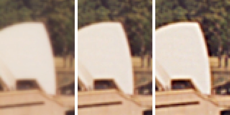
- If your editor has a Radius slider, set it to between 0.5 and 1.5. (Bigger values produce thicker edges. For very large photos, try a bigger radius.)
- Increase the Amount or Intensity slider until you can see the edges of the image just start to sharpen and the detail start to come out. If you start to see overly harsh edges, or bright halos appearing around the edges, then you’ve gone too far:
Make your website look awesome!
As you’ve seen, there are tons of ways to improve your website’s images, from clever cropping through to tweaking brightness, contrast and colour, as well as blurring backgrounds, reducing noise, and image sharpening. All you need is an image editing app that you’re comfortable with, and a bit of practice. You’ll be making professional-quality images for your site in no time!
If you have any image-editing questions, please post them in the comments below and I’ll do my best to help you out. 🙂
[Image credits: Taking photo by stokpic (CC0), cropped, edited]
Leave a Reply