In my previous article Responsive Web Design Demystified, I explained the concepts behind responsive web design, and showed how to build a simple responsive layout from the ground up.
In this article, you learn five additional techniques that will help you build great responsive layouts. You’ll put each technique into practice as you build on the responsive layout created in the previous article.
Here’s what you’ll learn in this article:
- How to hide non-essential content on smaller screens
- Creating collapsible blocks of content to make the best use of mobile displays
- Scaling images in proportion to the available screen width
- How to create responsive images that are optimised for different screen sizes and network speeds, and
- Resizing type according to browser width.
Ready? Let’s get started!
Hiding content
In Responsive Web Design Demystified, we looked at ways to reformat page content on smaller screens to make better use of the available screen width. To optimise pages further, we can hide less important content altogether on small-screen devices.
You can hide content by adding the CSS property display: none to the container that you want to hide. So to hide a block of content when the viewport is narrower than a given width, we just add a display: none rule within the appropriate media query.
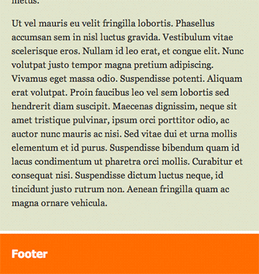
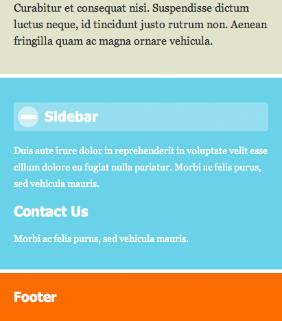
Let’s look at an example. In our previous responsive layout, we moved the sidebar below the main content area once the viewport narrowed to 700 pixels wide. Let’s take this further and hide the sidebar altogether when the viewport shrinks to 480 pixels or less.
Here’s the modified media query — the new code is highlighted:
    /* If the viewport width <= 480 pixels ... */

    @media screen and (max-width: 480px) {

      body {
        margin: 0;
      }

      #header .inner {
        padding-top: 5px;
        padding-bottom: 5px;
      }

      #header .inner, #content, #nav, #sidebar {
        margin-bottom: 5px;
      }

      #nav ul {
        padding: 5px 7px;
      }

      #sidebar {
        display: none;
      }
    }
As you can see, we’ve simply added a #sidebar ruleset that sets the sidebar to display: none when the viewport width is 480 pixels or less.
Try this out by pressing the following button:
Resize your browser window so it’s less than 480 pixels wide, or view the demo page on a mobile phone browser. You’ll see that the sidebar box hides itself at these narrow viewport widths, allowing the user to focus on the more important content in the page.
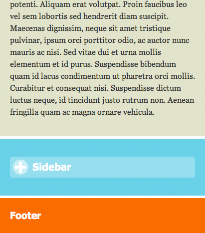
Collapsing content
Instead of hiding a block of content altogether for narrow viewports, you can take a less drastic approach and collapse the content. To do this, you hide all of the content apart from its header, then allow the user to tap or click on the header to reveal or hide the content.
To create a collapsible block of content that kicks in for narrow viewports, you need to use a combination of CSS and JavaScript. Here’s our previous responsive layout again, with the sidebar turned into a collapsible block. The new or changed lines of code are highlighted:
<!doctype html>
<html>
<head>
<title>A Responsive Layout with Collapsible Content</title>
<link rel="stylesheet" href="main.css" />
<meta name="viewport" content="initial-scale=1, maximum-scale=1" />
<script src="http://ajax.googleapis.com/ajax/libs/jquery/1.7.1/jquery.min.js"></script>
<script>
// Collapsible sidebar:
$( function() {
// Collapse initially (if viewport <= 480px)
var collapsed = true;
// Toggle sidebar content on click
$('#sidebar .inner>h2').click( function() {
collapsed = !collapsed;
formatSidebar();
} );
// Format sidebar whenever the window is resized
$(window).resize( formatSidebar );
// Format sidebar when the page first loads
formatSidebar();
// Show full sidebar if viewport > 480px
// Show expanded or collapsed sidebar if viewport <= 480px
function formatSidebar() {
if ( $(window).width() > 480 ) {
$('#sidebar').removeClass( 'collapsible' );
$('#sidebar .inner div').show();
} else {
$('#sidebar').addClass( 'collapsible' );
if ( collapsed ) {
$('#sidebar .inner div').hide();
$('#sidebar .inner>h2').removeClass( 'minus' );
} else {
$('#sidebar .inner div').show();
$('#sidebar .inner>h2').addClass( 'minus' );
}
}
};
} );
</script>
<style>
/* Collapsible sidebar for viewports <= 480px */
#sidebar.collapsible .inner>h2 {
padding-left: 40px;
padding-top: 3px;
height: 29px;
background: rgba(255,255,255,.3) url('plusminus.png') no-repeat 0 0;
background-clip: padding-box;
border: 5px solid rgba(255,255,255,.3);
border-radius: 5px;
cursor: pointer;
}
#sidebar.collapsible .inner>h2.minus {
background-position: 0 -32px;
}
/* If the viewport width <= 1000 pixels ... */
@media screen and (max-width: 1000px) {
/* Make the main content a bit wider */
#content {
width: 75%;
}
/* Put the nav on top of the sidebar */
#nav, #sidebar {
width: 25%;
}
/* Adjust the sidebar margins */
#sidebar .inner {
margin-right: 0;
margin-top: 20px;
}
}
/* If the viewport width <= 700 pixels ... */
@media screen and (max-width: 700px) {
/* Make the main content fill the viewport width */
#content {
width: 100%;
}
/* Remove the main content right margin */
#content .inner {
margin-right: 0;
}
/* Put the nav above the main content */
#nav {
float: none;
width: 100%;
margin-bottom: 20px;
}
/* Place the nav items side by side */
#nav li {
float: left;
width: 24%;
border-bottom: none;
border-right: 1px solid rgba(255,255,255,.5);
}
#nav li:last-child {
width: 27%;
border-right: none;
}
#nav a {
text-align: center;
padding-left: 0;
}
/* Place the sidebar below the main content */
#sidebar {
float: none;
clear: both;
width: 100%;
margin: 20px 0;
}
}
/* If the viewport width <= 480 pixels ... */
@media screen and (max-width: 480px) {
body {
margin: 0;
}
#header .inner {
padding-top: 5px;
padding-bottom: 5px;
}
#header .inner, #content, #nav, #sidebar {
margin-bottom: 5px;
}
#nav ul {
padding: 5px 7px;
}
}
</style>
</head>
<body>
<div id="header">
<div class="inner">
<h2>Header</h2>
</div>
</div>
<div id="pageBody">
<div id="nav">
<ul>
<li><a href="#">Home</a></li>
<li><a href="#">About</a></li>
<li><a href="#">Store</a></li>
<li><a href="#">Friends</a></li>
</ul>
</div>
<div id="content">
<div class="inner">
<h1>Responsive Layout</h1>
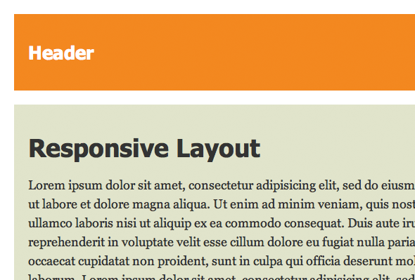
<p>Lorem ipsum dolor sit amet, consectetur adipisicing elit, sed do eiusmod tempor incididunt ut labore et dolore magna aliqua. Ut enim ad minim veniam, quis nostrud exercitation ullamco laboris nisi ut aliquip ex ea commodo consequat. Duis aute irure dolor in reprehenderit in voluptate velit esse cillum dolore eu fugiat nulla pariatur. Excepteur sint occaecat cupidatat non proident, sunt in culpa qui officia deserunt mollit anim id est laborum. Lorem ipsum dolor sit amet, consectetur adipisicing elit, sed do eiusmod tempor incididunt ut labore et dolore magna aliqua. Ut enim ad minim veniam, quis nostrud exercitation ullamco laboris nisi ut aliquip ex ea commodo consequat. Duis aute irure dolor in reprehenderit in voluptate velit esse cillum dolore eu fugiat nulla pariatur. Excepteur sint occaecat cupidatat non proident, sunt in culpa qui officia deserunt mollit anim id est laborum.</p>
<p>Curabitur et leo dui, eu semper tellus. Vivamus aliquam, mi ultrices fringilla varius, augue nisl tincidunt elit, eu tincidunt ante metus ac mauris. Praesent congue blandit nunc, eu facilisis ligula faucibus sit amet. Proin eget turpis nulla. Phasellus mattis nisi a ante aliquet posuere. Vestibulum tortor quam, luctus imperdiet venenatis nec, molestie eu massa. Vivamus nec ipsum viverra augue aliquet bibendum. Morbi ac felis purus, sed vehicula mauris. Integer tempor mollis libero id hendrerit. Fusce sit amet urna quis justo varius pulvinar dapibus sed metus.
<p>Ut vel mauris eu velit fringilla lobortis. Phasellus accumsan sem in nisl luctus gravida. Vestibulum vitae scelerisque eros. Nullam id leo erat, et congue elit. Nunc volutpat justo tempor magna pretium adipiscing. Vivamus eget massa odio. Suspendisse potenti. Aliquam erat volutpat. Proin faucibus leo vel sem lobortis sed hendrerit diam suscipit. Maecenas dignissim, neque sit amet tristique pulvinar, ipsum orci porttitor odio, ac auctor nunc mauris ac nisi. Sed vitae dui et urna mollis elementum et id purus. Suspendisse bibendum quam id lacus condimentum ut pharetra orci mollis. Curabitur et consequat nisi. Suspendisse dictum luctus neque, id tincidunt justo rutrum non. Aenean fringilla quam ac magna ornare vehicula.</p>
</div>
</div>
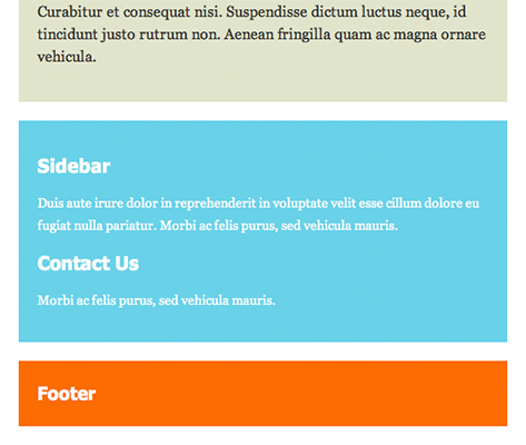
<div id="sidebar">
<div class="inner">
<h2>Sidebar</h2>
<div>
<p>Duis aute irure dolor in reprehenderit in voluptate velit esse cillum dolore eu fugiat nulla pariatur. Morbi ac felis purus, sed vehicula mauris.</p>
<h2>Contact Us</h2>
<p>Morbi ac felis purus, sed vehicula mauris.</p>
</div>
</div>
</div>
</div>
<div id="footer">
<div class="inner">
<h3>Footer</h3>
</div>
</div>
</body>
</html>
There are three main changes to the page to enable the collapsible content:
- The JavaScript
We’ve used jQuery to help us create our collapsible sidebar. Once the DOM is ready, we initialize acollapsedvariable totrue; this variable tracks the state of the collapsible block (expanded or contracted). We then add aclickhandler to the sidebar’s toph2heading that toggles the content between its expanded and collapsed states, callingformatSidebar()to format the sidebar appropriately.We then attach
formatSidebar()as aresizeevent handler to thewindowobject. This ensures thatformatSidebar()runs whenever the window is resized. We also callformatSidebar()directly within our DOM ready handler so that the sidebar is formatted when the page first loads.The
formatSidebar()function itself formats the sidebar heading and content appropriately. If the viewport is wider than 480 pixels, it displays the sidebar content in full. However, if the viewport is 480 pixels or less, the function adds thecollapsibleCSS class to the sidebar to style it as a collapsible block, and collapses or expands the content according to the value of thecollapsedvariable. - The CSS
We’ve added two new CSS rules that kick in whenever the JavaScript code adds thecollapsibleclass to the sidebar. The first rule,#sidebar.collapsible .inner>h2, styles the firsth2heading in the sidebar as a rounded button with a “plus/minus” icon. The second rule,#sidebar.collapsible .inner>h2.minus, changes the icon from a “plus” to a “minus” when the CSS classminusis added to theh2by the JavaScript created above. - The markup
Lastly, towards the end of the markup, we’ve wrapped the sidebar content in an extradivthat we can show or hide in order to expand or collapse the content.
Try out this collapsible sidebar by pressing the button below:
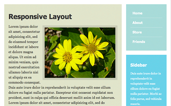
Resize your browser to make it narrower. With viewports greater than 480 pixels wide, the sidebar behaves as before: it sits to the right of the main content in wide viewports, and moves below the main content in narrower viewports. Once the browser gets down to 480 pixels or less, however, the sidebar turns into a collapsible block, and its heading turns into a clickable plus/minus button that you can click or tap to expand and collapse the content.
Scaling images
Another useful trick when building responsive (and fluid) layouts is to scale images in the page according to the browser width. This allows images to keep their proportion relative to the rest of the content in the page.
The easiest way to scale an image is to add the CSS max-width property to the img element, and give the property a percentage value. The browser then determines the image’s width as a proportion of the width of its enclosing element, and also adjusts the image’s height automatically to keep the image’s aspect ratio correct.
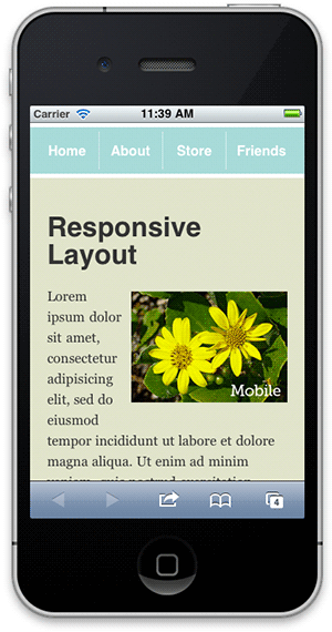
Let’s add a photo to the main content area of our responsive layout example, and make it scale according to browser width. First, add the photo:
    <div id="content">
      <div class="inner">

        <h1>Responsive Layout</h1>

        <img src="photo.jpg" alt="Flowers" class="photo" />

        <p>Lorem ipsum dolor sit amet, consectetur adipisicing elit, sed do eiusmod tempor incididunt ut labore et dolore magna aliqua. Ut enim ad minim veniam, quis nostrud exercitation ullamco laboris nisi ut aliquip ex ea commodo consequat. Duis aute irure dolor in reprehenderit in voluptate velit esse cillum dolore eu fugiat nulla pariatur. Excepteur sint occaecat cupidatat non proident, sunt in culpa qui officia deserunt mollit anim id est laborum. Lorem ipsum dolor sit amet, consectetur adipisicing elit, sed do eiusmod tempor incididunt ut labore et dolore magna aliqua. Ut enim ad minim veniam, quis nostrud exercitation ullamco laboris nisi ut aliquip ex ea commodo consequat. Duis aute irure dolor in reprehenderit in voluptate velit esse cillum dolore eu fugiat nulla pariatur. Excepteur sint occaecat cupidatat non proident, sunt in culpa qui officia deserunt mollit anim id est laborum.</p>

        <p>Curabitur et leo dui, eu semper tellus. Vivamus aliquam, mi ultrices fringilla varius, augue nisl tincidunt elit, eu tincidunt ante metus ac mauris. Praesent congue blandit nunc, eu facilisis ligula faucibus sit amet. Proin eget turpis nulla. Phasellus mattis nisi a ante aliquet posuere. Vestibulum tortor quam, luctus imperdiet venenatis nec, molestie eu massa. Vivamus nec ipsum viverra augue aliquet bibendum. Morbi ac felis purus, sed vehicula mauris. Integer tempor mollis libero id hendrerit. Fusce sit amet urna quis justo varius pulvinar dapibus sed metus.

        <p>Ut vel mauris eu velit fringilla lobortis. Phasellus accumsan sem in nisl luctus gravida. Vestibulum vitae scelerisque eros. Nullam id leo erat, et congue elit. Nunc volutpat justo tempor magna pretium adipiscing. Vivamus eget massa odio. Suspendisse potenti. Aliquam erat volutpat. Proin faucibus leo vel sem lobortis sed hendrerit diam suscipit. Maecenas dignissim, neque sit amet tristique pulvinar, ipsum orci porttitor odio, ac auctor nunc mauris ac nisi. Sed vitae dui et urna mollis elementum et id purus. Suspendisse bibendum quam id lacus condimentum ut pharetra orci mollis. Curabitur et consequat nisi. Suspendisse dictum luctus neque, id tincidunt justo rutrum non. Aenean fringilla quam ac magna ornare vehicula.</p>

      </div>
    </div>
Next, add some CSS to float the photo to the right, give it an appopriate margin and border, and set its width to 65% of the container width using the max-width property:
    .photo {
      float: right;
      margin: .4em 0 10px 10px;
      border: 10px solid rgba(0,0,0,.1);
      max-width: 65%;
    }
Finally, to make the most of the screen real estate on very small devices, let’s also remove the photo’s border when the browser width dips to 480 pixels or less:
    /* If the viewport width <= 480 pixels ... */

    @media screen and (max-width: 480px) {

      body {
        margin: 0;
      }

      #header .inner {
        padding-top: 5px;
        padding-bottom: 5px;
      }

      #header .inner, #content, #nav, #sidebar {
        margin-bottom: 5px;
      }

      #nav ul {
        padding: 5px 7px;
      }

      .photo {
        border: none;
      }

    }
You can see how the photo looks by pressing the following button:
As you resize the browser, notice how the image scales with the width of its container so that it always remains in proportion to the content. With browser windows less than 480 pixels wide, such as mobile phone browsers, the image’s border disappears to make the best use of the available space.
max-width with a percentage value, we can make images scale in proportion to the width of the content area.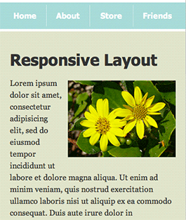
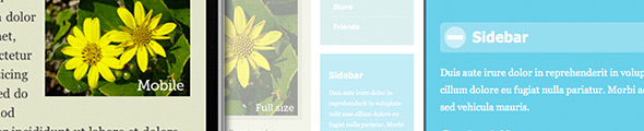
Responsive images
Image scaling ensures that images don’t take up too much screen space on smaller mobile devices. However, the browser still has to load the full-size image into memory before it can scale it down. Not only does this eat up the precious little memory available on mobile devices, but it also uses unnecessary bandwidth, which can be a real problem on slow cellular networks.
Scott Jehl over at Filament Group has come up with a neat solution to this problem, known as responsive images. Here’s how it works:
- You download the
.htaccessandresponsiveimgs.min.jsfiles from the GitHub page. - You add the
.htaccessfile to your website’s document root. - You include the
responsiveimgs.min.jsscript in your page. - You create two versions of each image that you want to be responsive: (1) the full-size version for desktop browsers (for example,
large.jpg), and (2) a scaled-down version for mobile browsers (for example,small.jpg). - Wherever you want to insert a responsive image in your page, you use an
imgtag along these lines:<img src="small.jpg?full=large.jpg">. - When your page loads, the responsive images script detects whether the screen width is “small” (480 pixels or less by default) or “large”.
- If the script detects a “small” screen then it does nothing. The browser retrieves the small image specified in the
imgtag (for example,small.jpg), and displays it. - If the script detects a “large” screen then it works in tandem with some Apache mod_rewrite magic on the server to redirect any image requests with a
?full=query parameter to the image path specified after the'?full='(forexample, large.jpg).
The upshot of this process is that mobile devices are served the smaller, mobile-optimised version of your image, while desktop browsers are redirected to the full-resolution image.
Let’s modify our image scaling example above to enable responsive images. First, we include the responsive image script in our document’s head section:
<!doctype html>
<html>
<head>
  <title>A Responsive Layout with a Responsive Image</title>
  <link rel="stylesheet" href="main.css" />
  <meta name="viewport" content="initial-scale=1, maximum-scale=1" />

  <script src="responsiveimgs.min.js"></script>

  <style>

    .photo {
      float: right;
      margin: .4em 0 10px 10px;
      border: 10px solid rgba(0,0,0,.1);
      max-width: 65%;
    }

  ...
</head>
Then we just need to modify the image’s URL in the img tag in the page, like this:
<img src="photo-300.jpg?full=photo-500.jpg" alt="Flowers" class="photo" />
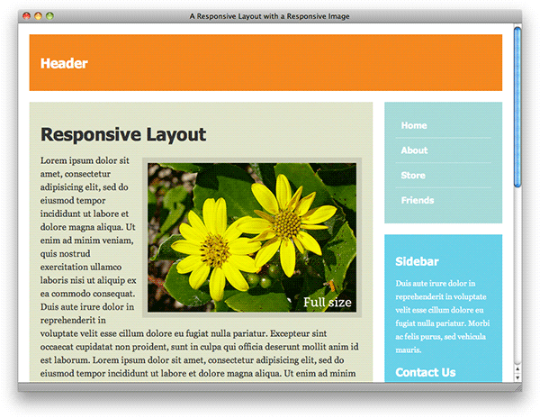
As you can see, we’ve specified two images in the img tag: photo-300.jpg is the reduced-size version of the image for mobile devices, weighing in at just 25 kB, while photo-500.jpg is the full-size version, which has a file size of 131 kB.
We’ve also added the required .htaccess file to the folder containing the document.
Press the button below to see the result:
If you view the page on a desktop browser then you’ll see the full version of the image (photo-500.jpg). However, if you view it on a mobile browser then you’ll be served the scaled-down version of the image (photo-300.jpg).
I’ve added a label in the bottom right corner of each image so that you can tell at a glance whether you’re viewing the full-size or mobile version of the image.
Resizing type
As well as scaling images based on browser width, you can also resize text in the page to suit different browser sizes and make the best use of the available screen space. You can see this approach in action on the excellent Hicksdesign website.
It’s best to use a light touch here, and make only small adjustments to the font size. If you make the text too big then it will look unwieldy; make it too small and people will struggle to read it.
For example, let’s make some tweaks to our basic responsive layout in order to increase the font size slightly for wide browsers, and reduce the text size for narrower browsers and mobile devices. Here’s the markup with the changes highlighted:
<!doctype html>
<html>
<head>
  <title>A Responsive Layout with Type Resizing</title>
  <link rel="stylesheet" href="main.css" />
  <meta name="viewport" content="initial-scale=1, maximum-scale=1" />

  <style>

    body {
      font-size: 110%;
    }

    /* If the viewport width <= 1000 pixels ... */

    @media screen and (max-width: 1000px) {

      /* Make the main content a bit wider */

      #content {
        width: 75%;
      }

      /* Put the nav on top of the sidebar */

      #nav, #sidebar {
        width: 25%;
      }

      /* Adjust the sidebar margins */

      #sidebar .inner {
        margin-right: 0;
        margin-top: 20px;
      }

      body {
        font-size: 105%;
      }

    }


    /* If the viewport width <= 700 pixels ... */

    @media screen and (max-width: 700px) {

      /* Make the main content fill the viewport width */

      #content {
        width: 100%;
      }

      /* Remove the main content right margin */

      #content .inner {
        margin-right: 0;
      }

      /* Put the nav above the main content */

      #nav {
        float: none;
        width: 100%;
        margin-bottom: 20px;
      }

      /* Place the nav items side by side */

      #nav li {
        float: left;
        width: 24%;
        border-bottom: none;
        border-right: 1px solid rgba(255,255,255,.5);
      }

      #nav li:last-child {
        width: 27%;
        border-right: none;
      }

      #nav a {
        text-align: center;
        padding-left: 0;
      }

      /* Place the sidebar below the main content */

      #sidebar {
        float: none;
        clear: both;
        width: 100%;
        margin: 20px 0;
      }

      body {
        font-size: 100%;
      }

    }


    /* If the viewport width <= 480 pixels ... */

    @media screen and (max-width: 480px) {

      body {
        margin: 0;
      }

      #header .inner {
        padding-top: 5px;
        padding-bottom: 5px;
      }

      #header .inner, #content, #nav, #sidebar {
        margin-bottom: 5px;
      }

      #nav ul {
        padding: 5px 7px;
      }

      body {
        font-size: 95%;
      }

    }

  </style>

</head>
<body>

  <div id="header">
    <div class="inner">
      <h2>Header</h2>
    </div>
  </div>

  <div id="pageBody">

    <div id="nav">
      <ul>
        <li><a href="#">Home</a></li>
        <li><a href="#">About</a></li>
        <li><a href="#">Store</a></li>
        <li><a href="#">Friends</a></li>
      </ul>
    </div>

    <div id="content">
      <div class="inner">

        <h1>Responsive Layout</h1>

        <p>Lorem ipsum dolor sit amet, consectetur adipisicing elit, sed do eiusmod tempor incididunt ut labore et dolore magna aliqua. Ut enim ad minim veniam, quis nostrud exercitation ullamco laboris nisi ut aliquip ex ea commodo consequat. Duis aute irure dolor in reprehenderit in voluptate velit esse cillum dolore eu fugiat nulla pariatur. Excepteur sint occaecat cupidatat non proident, sunt in culpa qui officia deserunt mollit anim id est laborum. Lorem ipsum dolor sit amet, consectetur adipisicing elit, sed do eiusmod tempor incididunt ut labore et dolore magna aliqua. Ut enim ad minim veniam, quis nostrud exercitation ullamco laboris nisi ut aliquip ex ea commodo consequat. Duis aute irure dolor in reprehenderit in voluptate velit esse cillum dolore eu fugiat nulla pariatur. Excepteur sint occaecat cupidatat non proident, sunt in culpa qui officia deserunt mollit anim id est laborum.</p>

        <p>Curabitur et leo dui, eu semper tellus. Vivamus aliquam, mi ultrices fringilla varius, augue nisl tincidunt elit, eu tincidunt ante metus ac mauris. Praesent congue blandit nunc, eu facilisis ligula faucibus sit amet. Proin eget turpis nulla. Phasellus mattis nisi a ante aliquet posuere. Vestibulum tortor quam, luctus imperdiet venenatis nec, molestie eu massa. Vivamus nec ipsum viverra augue aliquet bibendum. Morbi ac felis purus, sed vehicula mauris. Integer tempor mollis libero id hendrerit. Fusce sit amet urna quis justo varius pulvinar dapibus sed metus.

        <p>Ut vel mauris eu velit fringilla lobortis. Phasellus accumsan sem in nisl luctus gravida. Vestibulum vitae scelerisque eros. Nullam id leo erat, et congue elit. Nunc volutpat justo tempor magna pretium adipiscing. Vivamus eget massa odio. Suspendisse potenti. Aliquam erat volutpat. Proin faucibus leo vel sem lobortis sed hendrerit diam suscipit. Maecenas dignissim, neque sit amet tristique pulvinar, ipsum orci porttitor odio, ac auctor nunc mauris ac nisi. Sed vitae dui et urna mollis elementum et id purus. Suspendisse bibendum quam id lacus condimentum ut pharetra orci mollis. Curabitur et consequat nisi. Suspendisse dictum luctus neque, id tincidunt justo rutrum non. Aenean fringilla quam ac magna ornare vehicula.</p>

      </div>
    </div>

    <div id="sidebar">
      <div class="inner">

        <h2>Sidebar</h2>
        <p>Duis aute irure dolor in reprehenderit in voluptate velit esse cillum dolore eu fugiat nulla pariatur. Morbi ac felis purus, sed vehicula mauris.</p>

        <h2>Contact Us</h2>
        <p>Morbi ac felis purus, sed vehicula mauris.</p>

      </div>
    </div>

  </div>

  <div id="footer">
    <div class="inner">
      <h3>Footer</h3>
    </div>
  </div>


</body>
</html>
Here we’ve set the font-size property on the body element at various points throughout the style sheet:
- We’ve set the default font size to 110%.
- For viewport widths between 701 and 1,000 pixels, we’ve set the font size to 105%.
- For viewport widths between 481 and 700 pixels, we’ve set the font size to 100%.
- For viewport widths of 480 pixels or less, we’ve set the font size to 95%.
Press the button below to see the result:
As you shrink your browser window from wide to narrow, notice how all the text in the page reduces in size as the layout changes.
font-size property within media queries, we can display larger text for wide browser windows…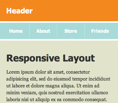
Summary
In this article you’ve explored 5 ways to improve your responsive web layouts. You’ve looked at:
- Using the
display: noneCSS property within media queries to hide content on smaller screens. - Creating collapsible blocks using JavaScript and CSS in order to pack more content onto mobile displays.
- Scaling images with the
max-widthproperty and percentage widths. This ensures that images remain in proportion to the browser window size. - Using JavaScript and Apache’s mod_rewrite to create responsive images: desktop browsers get a full-size image, while mobile browsers receive a lower-resolution version.
- Adjusting font size to suit different browser widths and fit more text on smaller screens.
With these techniques, as well as a basic knowledge of responsive design, you’re well placed to create fantastic responsive websites that look great on any browser, from desktop to mobile.
Have fun!
Fantastic walkthrough you’ve created here, Elated. I’ve been looking for a more straight-forward way to hide content with CSS and display:none for a while. This is fantastic! Re-tweeting!
– Tommy
One suggestion though, when we set the image max-width to 100%, we also need to set the height to auto.