
jQuery Mobile is a handy JavaScript framework that makes it easy for you to build mobile web apps and mobile-friendly websites. jQuery Mobile 1.3 came out last week, and it has all sorts of lovely new features and improvements over 1.2. In this article you’ll get an overview of these changes, and see how to use jQuery Mobile 1.3 to enhance your websites and web apps even further.
You’ll look at:
- Responsive web design improvements
- Responsive grids
- Two types of responsive tables for displaying data
- A new panel widget
- Improvements to range sliders and other form fields
- A new
navigatemethod and event for easy history manipulation - A new easy way to build autocomplete listviews
- New options for dialogs and popups
- Two new icons, as well as other icon improvements, and
- A few miscellaneous enhancements to the framework and documentation.
We’ll start by taking a look at the concept of responsive web design, and see how jQuery Mobile 1.3 makes it easier than ever to build responsive webpages.
Responsive web design improvements
As of 1.3, jQuery Mobile focuses more strongly on responsive web design. With this technique, your webpage adapts to different devices and browsers. For example, when viewed on a desktop browser, your page might include a main content column on the left side of your page and a sidebar column on the right. On a mobile phone, however, those columns would be stacked one below the other, to better accommodate the reduced screen width on mobile devices.
Find out more about responsive web design, and how to build responsive page layouts.
jQuery Mobile takes a “mobile first” approach to responsive design. While it’s primarily built for mobile devices, the framework makes it easy for your page layout to adapt to everything from mobile phones through to tablets and desktops.
jQuery Mobile 1.3 helps you build responsive layouts in many different ways, which you’ll explore in the following sections. Let’s start by taking a look at some responsive design tips, as well as the concept of breakpoints, which are key to responsive design.
New responsive design tips in the documentation
The jQuery Mobile team have added a great article to the documentation called Going Responsive. This article explains the three key concepts of responsive design:
- Media queries
- A responsive layout grid, and
- Flexible images and other elements.
The article also goes on to explain some “mobile first” best practices for good responsive design, and shows how to use jQuery Mobile to build a simple mobile-first responsive layout.
Understanding breakpoints
Breakpoints are a key concept of any responsive layout. A breakpoint is a specific browser width — usually in pixels or ems — at which the layout changes. Browsers narrower than the breakpoint display one version of the layout optimised for narrower screens; browsers wider than the breakpoint display a layout better suited to wider screens. A responsive layout typically has at least one, but sometimes as many as three, breakpoints.
To specify a breakpoint, you typically use the CSS media queries min-width and max-width. With jQuery Mobile you usually specify the breakpoint width in ems, rather than pixels. You’ll see some breakpoint examples in the following sections.
While you are encouraged to set your own breakpoints to match your particular site’s design, many of jQuery Mobile’s widgets feature preset breakpoints, which make it easy to create responsive widgets just by adding various CSS classes to them. You’ll look at these in the following sections too.
Responsive grids
jQuery Mobile already features a simple layout grid system: Just create a containing element with a ui-grid-* CSS class, then add ui-block-* classes to each element inside the grid.
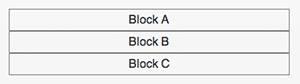
By adding your own CSS class to a ui-grid-* element, then creating a suitable media query, you can make the elements in a grid stack vertically on narrow browsers, and stretch across the page width as normal on wider browsers. Here’s an example grid with an added myGrid CSS class:
<div class="ui-grid-b myGrid">
  <div class="ui-block-a">Block A</div>
  <div class="ui-block-b">Block B</div>
  <div class="ui-block-c">Block C</div>
</div>
…and here’s a suitable media query that uses a breakpoint of 50 ems to make the grid responsive:
@media all and (max-width: 50em) {
  .myGrid .ui-block-a,
  .myGrid .ui-block-b,
  .myGrid .ui-block-c,
  .myGrid .ui-block-d,
  .myGrid .ui-block-e {
    width: 100%;
    float: none;
  }
}
Try out this grid by pressing the following button. Resize your browser to see the grid stack vertically in viewports up to 50 ems wide, and stretch across the page in wider viewports:

If you don’t want the hassle of creating your own media queries, jQuery Mobile comes with a preset media query for responsive grids. Simply add the class ui-responsive to a <div class="ui-grid-*"> element to make the elements stack vertically below 560px (35em), and sit side-by-side at 560px and above.
Find out more about responsive grids.
Responsive tables
Responsive tables are a new core feature of jQuery Mobile 1.3. These allow you to display a large amount of tabular data in a way that looks good and functions well on both desktop and mobile browsers.
There are two modes for responsive tables in jQuery Mobile: reflow and column toggle.
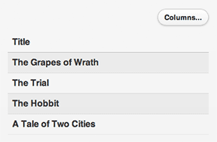
Reflow mode
This is the default setting. It vertically stacks the table cells in each row, and adds some vertical space between the rows. This makes the table readable on a mobile phone (following the “mobile first” philosophy). It’s then up to you to add a suitable media query to make the table display in the traditional row/column format above a particular browser width.
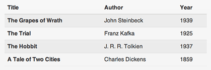
For example, in the following table, the cells in each row stack vertically when displayed in a jQuery Mobile page:
<table data-role="table" id="bookList" class="table-stroke table-stripe">

  <thead>
    <tr>
      <th>Title</th>
      <th>Author</th>
      <th><abbr title="Year of Publication">Year</abbr></th>
    </tr>
  </thead>

  <tbody>
    <tr>
      <th>The Grapes of Wrath</th>
      <td>John Steinbeck</td>
      <td>1939</td>
    </tr>
    <tr>
      <th>The Trial</th>
      <td>Franz Kafka</td>
      <td>1925</td>
    </tr>
    <tr>
      <th>The Hobbit</th>
      <td>J. R. R. Tolkien</td>
      <td>1937</td>
    </tr>
    <tr>
      <th>A Tale of Two Cities</th>
      <td>Charles Dickens</td>
      <td>1859</td>
    </tr>
  </tbody>

</table>
To make this #bookList table responsive, you add a media query. For example, with the following media query, our table is vertically stacked only up to a breakpoint of 30 ems. On viewports 30 ems and wider, the columns sit side-by-side like a regular table:
@media all and ( min-width: 30em ) {

  /* Show the table header rows and set all cells to display: table-cell */
  #bookList td,
  #bookList th,
  #bookList tbody th,
  #bookList tbody td,
  #bookList thead td,
  #bookList thead th {
    display: table-cell;
    margin: 0;
  }

  /* Hide the labels in each cell */
  #bookList td .ui-table-cell-label,
  #bookList th .ui-table-cell-label {
    display: none;
  }
}
Try out this reflow mode table by pressing the following button. Resize your browser to see the effect. In viewports narrower than 30 ems, each table row stacks vertically. In viewports 30 ems and wider, the columns sit side-by-side across the page:

As with responsive grids, jQuery Mobile comes with a preset media query for reflow tables which you can use instead of creating your own media query. Add the ui-responsive class to a <table> element to make the cells in each row stack vertically below 560px (35em), and sit side-by-side at 560px and above.
Column toggle mode
This table mode takes a different approach. You create a column toggle table by adding the data-mode="columntoggle" attribute to the table element. Then you can give each th element in the table a data-priority attribute (1=highest, 6=lowest). jQuery Mobile then progressively shows columns from the table, in order of priority, as the browser viewport widens. So, while all columns are visible on a desktop browser, only the most important columns are shown on a mobile phone.
In addition, jQuery Mobile adds a “Columns…” button to the table that lets the user choose which columns they’d like to see.
If you don’t assign a data-priority attribute to a column, the column is always shown.
Once you’ve created your column toggle table, you need to add media queries to your CSS that show and hide the columns at your chosen viewport widths, according to priority.
Let’s build a column toggle table. Here’s the markup:
<table data-role="table" id="bookList" data-mode="columntoggle" class="table-stroke table-stripe" >

  <thead>
    <tr>
      <th>Title</th>
      <th data-priority="1">Author</th>
      <th data-priority="3"><abbr title="Year of Publication">Year</abbr></th>
      <th data-priority="2">Price</th>
    </tr>
  </thead>

  <tbody>

    <tr>
      <th>The Grapes of Wrath</th>
      <td>John Steinbeck</td>
      <td>1939</td>
      <td>$14.99</td>
    </tr>
    <tr>
      <th>The Trial</th>
      <td>Franz Kafka</td>
      <td>1925</td>
      <td>$7.99</td>
    </tr>
    <tr>
      <th>The Hobbit</th>
      <td>J. R. R. Tolkien</td>
      <td>1937</td>
      <td>$6.99</td>
    </tr>
    <tr>
      <th>A Tale of Two Cities</th>
      <td>Charles Dickens</td>
      <td>1859</td>
      <td>$9.99</td>
    </tr>

  </tbody>

</table>
Here we’ve created a #bookList table with the data-mode="columntoggle" attribute to specify a column toggle table. We’ve given three of the the columns data-priority attributes. The Title column is always shown, even at the narrowest viewports. As the viewport gets wider, the other three columns progressively appear: Author first, followed by Price, and finally Year.
To make our column toggle table work, we also need to add our media queries:
/* Show priority 1 at 25em */
@media screen and (min-width: 25em) {
   #bookList th.ui-table-priority-1,
   #bookList td.ui-table-priority-1 {
     display: table-cell;
   }
}

/* Show priority 2 at 35em */
@media screen and (min-width: 35em) {
   #bookList  th.ui-table-priority-2,
   #bookList td.ui-table-priority-2 {
     display: table-cell;
   }
}

/* Show priority 3 at 45em */
@media screen and (min-width: 45em) {
   #bookList  th.ui-table-priority-3,
   #bookList td.ui-table-priority-3 {
     display: table-cell;
   }
}

/* Manually hidden */
#bookList th.ui-table-cell-hidden,
#bookList td.ui-table-cell-hidden {
  display: none;
}

/* Manually shown */
#bookList th.ui-table-cell-visible,
#bookList td.ui-table-cell-visible {
   display: table-cell;
}
Here we’ve added media queries to show priority 1 columns at viewports 25 ems and wider; priority 2 columns at 35 ems and wider; and priority 3 columns at 45 ems and wider. We’ve also added a couple of extra media queries; these are required to ensure that the Columns button functions properly.
Try out this table by pressing the following button. Resize your browser and notice how the columns appear and disappear according to priority. Try using the Columns button to manually display columns:
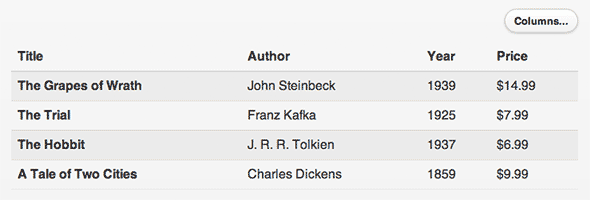
If you’d rather not create your own media queries for your column toggle tables, jQuery Mobile comes with a range of preset media queries for various column priorities. Just add the ui-responsive class to the <table> element. The preset breakpoints are 20em for priority 1 columns, 30em for priority 2, 40em for priority 3, and so on.
Find out how to create reflow tables and column toggle tables.
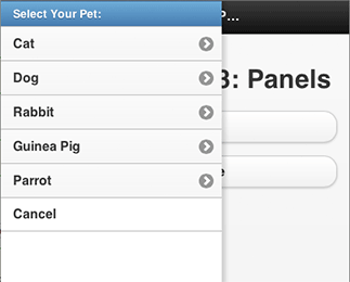
New panel widget
The panel widget is new to jQuery Mobile 1.3. A panel is a flexible, easy-to-use widget that slides in from the left or right side of the browser viewport. The user can dismiss the panel by tapping in the page outside the panel, swiping left or right, or pressing the Esc key.
Unlike dialogs, panels feel relatively unobtrusive since they don’t take over the whole page. Panels are great for bringing up in-page navigation, as well as for temporary sidebars holding toolboxes, inspectors, and so on.
Here’s how panels work:
- To create a panel, all you have to do is add a
data-role="panel"divto your markup and give it anid, such asmyPanel. The panel needs to be placed inside thedata-role="page"container, either before or after the header, content and/or footerdivs. - To create a button that opens the panel when tapped, just link to the panel’s
idfrom the button. For example:<a href="#myPanel" data-role="button">...</a>.
You can change the way a panel appears by adding a data-display attribute to the panel container:
data-display="reveal"makes the panel sit under the page. The page slides to reveal the panel. This is the default setting.data-display="overlay"makes the panel float on top of the page.data-display="push"shows the panel by sliding both the page and the panel as one.
You can also choose whether the panel appears on the left or right by adding data-position="left" or data-position="right" to the panel container. The default is "left".
As with popups, panels come with very minimal styling by default. It’s up to you to style the content inside the panel. However, like all jQuery Mobile widgets, you can set a panel’s swatch (colour scheme) using the data-theme attribute.
For example, the following page has an overlay panel containing a listview, as well as a button to open the panel:
<div data-role="page">

  <div data-role="panel" data-display="overlay" data-theme="d" id="choosePet">
    <ul data-role="listview" data-theme="d">
      <li data-role="list-divider">Select Your Pet:</li>
      <li><a href="#" data-rel="close">Cat</a></li>
      <li><a href="#" data-rel="close">Dog</a></li>
      <li><a href="#" data-rel="close">Rabbit</a></li>
      <li><a href="#" data-rel="close">Guinea Pig</a></li>
      <li><a href="#" data-rel="close">Parrot</a></li>
      <li data-theme="d" data-rel="close">Cancel</li>
    </ul>
  </div>

  <div data-role="header" data-position="fixed">
    <h1>jQuery Mobile 1.3: Panels</h1>
  </div>

  <div data-role="content">
    <h1>jQuery Mobile 1.3: Panels</h1>
    <a href="#choosePet" data-role="button">Pets</a>
  </div>

</div>
Adding the data-rel="close" attribute to an element tells jQuery Mobile to close the panel when the user taps that element.
Press the button below to see this panel in action. Press the Pets button to open the panel, then select an option in the list (or tap outside the panel) to close the panel again.
If you add the class ui-responsive-panel to the data-role="page" element containing a panel, the page content reflows to make room for the panel if the viewport is wider than 880px (55em). This lets the user read both the panel and the page at the same time.
Range slider improvements
jQuery Mobile 1.3 now supports range sliders with two handles, which are handy for selecting minimum and maximum values. To create a two-handle range slider, you need to create two <input type="range"> elements — one for each handle — then wrap them in a div with a data-role="rangeslider" attribute.
Don’t forget to add label elements for each input too; these should both contain the same label text. (jQuery Mobile uses the first label’s text for the actual widget label.)
Here’s an example of a two-handled range slider:
<form>
  <div data-role="rangeslider">
    <label for="priceMin">Price Range ($):</label>
    <input type="range" name="priceMin" id="priceMin" min="0" max="1000" value="0">
    <label for="priceMax">Price Range ($):</label>
    <input type="range" name="priceMax" id="priceMax" min="0" max="1000" value="1000">
  </div>
</form>
Press the following button to try out this slider:
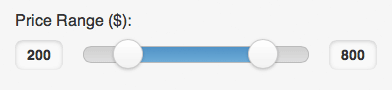
As well as supporting dual-handle sliders, the jQuery Mobile team have refined the look of the input fields next to the slider track so that they are smaller and less obtrusive. You can also now use values less than 1 — for example, 0.01 — for the step attribute, letting you create finer-grained sliders.
Learn more about creating and customising sliders.
New navigate method and event
jQuery Mobile’s Ajax navigation system lets the user navigate between pages without having to reload the whole page each time. To track the current page in the address bar, it uses the browser’s history.replaceState() method and the popstate event on newer browsers, falling back to adding hashes to URLs and using the hashchange event on older browsers.
If you need to work with the browser history yourself then all these different methods and events can be quite fiddly to work with. As of jQuery Mobile 1.3, life gets a lot easier, thanks to the new navigate() method and navigate event:
- The
navigate()method lets you manually navigate to a new URL in the address bar, and optionally store data associated with the new URL. On newer browsers, jQuery Mobile does this with thereplaceState()method; on older browsers it uses hashes:$.mobile.navigate( "#wonderWidget", dataObject );
- The
navigateevent gives you a single, unified event that you can use to track when the URL has changed, retrieve the data associated with the URL, and act accordingly. On newer browsers it’s effectively a wrapper for thepopstateevent; on older browsers jQuery Mobile uses thehashchangeevent:$( window ).on( "navigate", function( event, dataObject ) { // Do something with dataObject } );The returned data object also contains a
stateobject with some useful properties, includingurl(the current URL),hash(the current hash portion of the URL) anddirection("forward"or"back").
Find out more about the navigate() method and navigate event.
Easy autocompletion for listviews
jQuery Mobile 1.2 introduced a new listviewbeforefilter event that allows you to create an “autocomplete” listview using data that is either local (embedded in the page), or pulled from a remote data source using Ajax. Here’s a demo of this technique, and I also include a demo using local data in my jQuery Mobile book.
jQuery Mobile 1.3 takes things further with a new data-filter-reveal attribute, making it really easy to build an autocomplete listview from local data. All you need to do is:
- Create your listview as normal, including all the possible options in the list.
- Add the
data-filter="true"anddata-filter-reveal="true"attributes to the listview.
data-filter-reveal="true" tells jQuery Mobile to hide all the list items by default. Then, when the user types some characters into the filter box, only the matching items are revealed.
Here’s an example:
<ul data-role="listview" data-filter="true" data-filter-reveal="true" data-filter-placeholder="Find a pet..." data-inset="true">
  <li><a href="#" data-rel="close">Cat</a></li>
  <li><a href="#" data-rel="close">Dog</a></li>
  <li><a href="#" data-rel="close">Rabbit</a></li>
  <li><a href="#" data-rel="close">Guinea Pig</a></li>
  <li><a href="#" data-rel="close">Parrot</a></li>
</ul>
Press the button below to see how this listview works. Notice that no items are shown by default. When you start typing some text into the filter box, jQuery Mobile displays the items that contain the text:
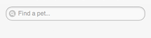
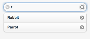
data-filter-reveal attribute, you can easily create an autocomplete listview with local data.Read more about autocomplete listviews.
Extra dialog and popup options
jQuery Mobile 1.3 also adds some extra options to both dialogs and popups:
- Dialogs have a new
data-close-btnattribute to control the “close” button in the dialog header.data-close-btn="right"moves the button from the left to the right hand side, whiledata-close-btn="none"removes the button altogether. You can also now use thedata-corners="false"attribute to easily remove the rounded corners from a dialog. - Popups have a new
data-dismissibleattribute; set this to"false"to prevent the popup closing when the user taps outside it. (Incidentally, this attribute also works for panels.)

data-close-btn and data-corners attributes let you create dialogs with no close button and square corners.Find our more about dialogs and popups in jQuery Mobile 1.3.
Form field improvements
There are a few enhancements to form inputs in jQuery Mobile 1.3:
- Clear buttons are now supported in any text input
The “clear” button (a little “X”) that previously only appeared in search fields can now be added to any textual input field (but not textareas). Just add thedata-clear-btn="true"attribute to theinputelement. You can set the hidden text on this button using thedata-clear-btn-textattribute. Finally, you can also remove the “clear” button from search fields using — you guessed it —data-clear-btn="false". - Styled file inputs
More mobile browsers now support the<input type="file">input for file uploads. jQuery Mobile now styles these automatically to match the other input types. You can even use thedata-clear-btn="true"attribute to add a “clear” button to file inputs. - Other small form field improvements
Text inputs now look better on IE9 and Windows Phone; textareas now “auto-grow” when you paste text into them (previously this only happened when manually typing); and text inputs now handle multibyte (e.g. UTF-8) strings better.
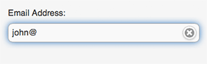
data-clear-btn="true" to any text input — such as this <input type="email"> field — to add a “clear” button to the field.Icon improvements
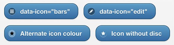
jQuery Mobile 1.3 introduces two new icons to the standard icon set:
data-icon="bars"produces a “three horizontal bars” icon — useful for “menu” buttons in headers.data-icon="edit"produces a “pencil” icon, which is useful for “edit” buttons.
You can also now easily specify an icon from the alternate (black by default) icon set by adding the CSS class ui-icon-alt to the element, as well as remove the disc around an icon by adding the ui-icon-nodisc class.
data-icon="bars", data-icon="edit", the ui-icon-alt class, and the ui-icon-nodisc class.Other improvements
As well as all the above enhancements, jQuery Mobile 1.3 includes a whole raft of other minor tweaks and improvements. Here are some highlights:
data-cornersattribute on collapsible blocks
As with many other widget types, you can now adddata-corners="false"to adata-role="collapsible"ordata-role="collapsible-set"container to remove the rounded corners from a collapsible block or collapsible set.- Fixed toolbar improvements
jQuery Mobile’s fixed header and footer bars remain in place at the top and bottom of the browser viewport as the user scrolls the page. Since older mobile browsers (particularly on Android) don’t handle fixed elements well, jQuery Mobile includes a lot of tweaks and workarounds to get fixed toolbars working satisfactorily on these browsers. jQuery Mobile 1.3 adds even more fixes, and also packages them into an extension calledfixedToolbar.workarounds.js. You can exclude this extension in the download builder if you want to save bandwidth and don’t mind not supporting these older browsers. - Extensible
swipeevent
You can now extend three methods that are associated with theswipeevent:start,stop, andhandleSwipe. This lets you customize the way thatswipeevents are handled and processed. See the Swipe API for details. - New API docs and demo centre
As of 1.3, the jQuery Mobile documentation has been split into two sites. The API documentation contains detailed information on each widget and its associated options and methods, as well as global events and methods and a handydata-attribute reference. Meanwhile, the new demo centre gives a general overview of jQuery Mobile’s features, with lots of hands-on demos that show you how to use the features.
Summary
jQuery Mobile 1.3 adds a whole host of new features and improvements to what was already a great mobile framework. In particular, jQuery Mobile 1.3 includes:
- An increased emphasis on mobile-first, responsive web design.
- Responsive grids for easier responsive layouts.
- New responsive tables with two modes: reflow and column toggle.
- A new panel widget that slides in from the left or right side of the viewport.
- Improvements to range sliders, including dual-handle sliders, an improved look, and better
stepattribute support. - A new
navigate()method andnavigateevent to make cross-browser Ajax navigation simpler to work with. - A new
data-filter-revealattribute for listviews to make it easy to build autocomplete lists. - More dialog options to control the “close” button and rounded corners.
- A new
data-dismissibleattribute to prevent popups (and panels) closing when the user taps outside them. - Enhancements to form fields, including clear buttons in any text input type; styled
<input type="file">fields; and improved styling and functionality for text inputs and textareas. - Two new icons,
barsandedit, as well as CSS classes for displaying icons from the alternate set and hiding the discs around icons. - You can now turn off rounded corners on collapsible blocks and collapsible sets.
- Fixed toolbars now work better on older mobile browsers, and you can optionally remove the fixed toolbar workarounds from your jQuery Mobile download.
- The
swipeevent is now more flexible thanks to three new extensible methods. - Last — but by no means least — a fantastic new API documentation site and a new demo centre for showing off jQuery Mobile’s features!
jQuery Mobile 1.3 is a great release for this excellent framework, and it also paves the way for the upcoming jQuery Mobile 1.4, which will include streamlined JavaScript and CSS; SVG icons; a new tab widget; performance improvements; tons of code refactoring and cleanup, and lots more. Watch this space!

Leave a Reply