
The latest version of jQuery Mobile, 1.1, has just hit the streets, and it has some great new features and improvements over 1.0. In this article you’ll get a quick run-down of jQuery Mobile 1.1, and all that it has to offer you as a mobile web developer.
You’ll look at:
- Improved fixed header and footer toolbars
- Enhancements to page transitions, and two new transition effects
- Loading spinner and text improvements
- Cute mini form elements
- Nicer-looking flip switches
- Improved sliders
- Disabling markup enhancements and Ajax handling for entire containers, and
- A few other minor improvements in version 1.1.
At the end of the article, you’ll also get a brief taste of the new features and widgets that are slated for the upcoming jQuery Mobile 1.2 release.
Let’s start with one of jQuery Mobile 1.1’s headline features: its vastly improved fixed header and footer toolbars.
Huge improvements to fixed toolbars
Fixed toolbars are header and footer bars that you lock to the top or bottom of the viewport by adding the data-position="fixed" attribute to the header or footer.
The easiest way to create fixed page elements is to use the CSS position: fixed property. Since mobile browser support for this property has historically been very patchy, older versions of jQuery Mobile dynamically repositioned the fixed toolbars as the user scrolled. This worked, but the effect was somewhat clunky.
Thankfully, browser support has improved these days, and with version 1.1, the jQuery Mobile team have totally reworked fixed toolbars so that they now use position: fixed when possible, resulting in much smoother fixed toolbars. For browsers that don’t support position: fixed, such as Safari in iOS 4.3, the framework falls back to regular statically-positioned toolbars, with the header at the top of the page and the footer at the bottom.
If you want to re-enable the previous dynamically-repositioned fixed toolbars for older browsers — as used by jQuery Mobile 1.0 and earlier — there’s a polyfill available. This can be useful if you use header and/or footer bars in very long pages.
Press the buttons below to compare the older, dynamically-positioned fixed toolbars with the new position: fixed toolbars. (To see the new toolbars working, you’ll need a modern mobile browser such as Safari in iOS 5, or a desktop browser.)
In addition, fixed toolbars now have a range of options and methods that you can use to customize their behaviour. These include the visibleOnPageShow option that controls whether the toolbar appears when the page is initially shown; the tapToggle option for turning the “toggle-on-tap” feature on or off; and the show, hide and toggle methods for programmatically displaying and hiding toolbars.
There’s one other small but important change with fixed toolbars, relating to fullscreen positioning. In jQuery Mobile 1.0, you could put fixed toolbars into a “fullscreen” mode by adding data-fullscreen="true" to the page container. In 1.1, you now need to add this attribute to the individual header and footer toolbar containers instead of the page container.
There are some known issues with position: fixed and Android 2.2/2.3. Check the docs for details.
jQuery Mobile 1.0 used the CSS overflow-scrolling: touch property to improve fixed toolbars in browsers that supported it. Since 1.1 now uses true position: fixed toolbars, the overflow-scrolling: touch code has been removed from the framework. This means that 1.0’s $.mobile.touchOverflowEnabled global option no longer has any effect in 1.1. The option is now deprecated, so you should remove any reference to it from your code.
Smoother, snappier page transitions
Once of the nicest changes in jQuery Mobile 1.1 is much smoother transitions between pages. Due to the way transitions in jQuery Mobile work, the framework has to scroll to the top of the current page before transitioning to the new page. Here’s the sequence of events:
- User scrolls down in the current page
- User clicks a link to view a new page
- jQuery Mobile has to scroll to the top of the current page
- jQuery Mobile transitions the new page into view
This scrolling to the top of the page can be quite jarring, especially with slower mobile browsers:
Although it’s not currently possible to avoid the scrolling, with version 1.1 the jQuery Mobile team have come up with a great workaround. Now the process looks like this:
- User scrolls down in the current page
- User clicks a link to view a new page
- jQuery Mobile starts the transition
- At an appropriate point during the transition, jQuery Mobile fades out the current page, scrolls to the top of the (now blank) current page, and fades the page back in
- jQuery Mobile completes the transition, revealing the new page
The clever bit is that jQuery Mobile now fades the current page out just before scrolling the page to the top, then fades it back in after the scroll. This has two advantages:
- The user doesn’t see the scrolling happen
- Scrolling the page is much faster, because it doesn’t have any content
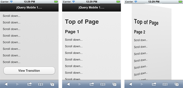
You can see the difference by viewing the following two pages in a modern mobile browser. For each page, scroll down, then tap the View Transition button to see a “flip” transition in action. Notice that the transitions are quicker and smoother in 1.1, and the scroll to the top of the page is much less noticeable, particularly with mobile browsers.
You can also check out some transition demos on the jQuery Mobile site:
- jQuery Mobile 1.0’s transitions (without the fade)
- jQuery Mobile 1.1’s transitions (with the fade)
The exception to this new fade in/out rule is the slide transition, which still uses the old, non-fading method, since it looks a lot better without the fade. If you want to apply a faster version of the slide transition that does incorporate the fade, use slidefade instead of slide.
As of 1.1, fade is now the default transition effect (previously it was slide). Also, due to limitations in older mobile browsers, such as Android 2.x, fade is now the only supported transition type with these browsers. If you specify a different transition, it will fall back to fade when viewed in these older browsers.
Another nice improvement is that transitions are now supported in Firefox (newer versions only).
Two new transition effects
As well as the transition effects supported by 1.0 — slide, slideup, slidedown, pop, fade, and flip — 1.1 ushers in two new lovely transitions:
turn- Flips the current page towards you, bringing the new page in from behind, as if the left edges of the pages were attached to a pole. This is reminiscent of the flip effect in Windows 8’s Metro UI.
flow- Moves the current page into the background, then slides it along to reveal the new page, which then moves into the foreground. This is much like Safari on the iPhone’s effect when switching between tabs.
You can see these two transitions in action by pressing the following buttons:
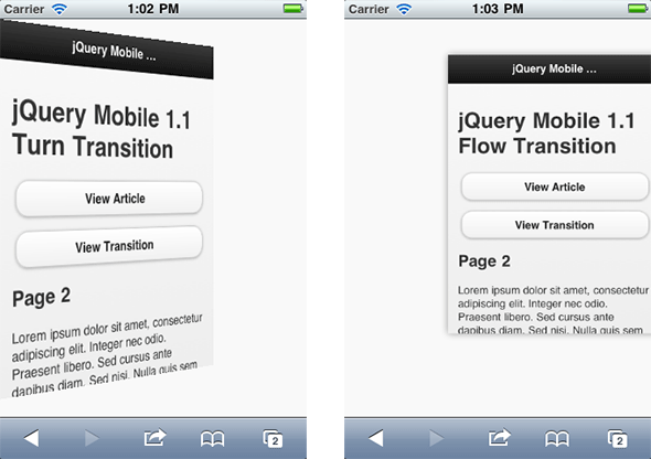
turn transition (left) and flow transition (right).A nicer, more flexible loading spinner
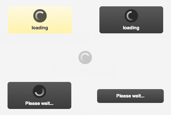
The loading spinner graphic has been redesigned so that it’s subtler and easier on the eye. The spinner also has no text by default (previously the word “loading” appeared beneath the spinner).
In addition, you can now set various extra options on the spinner:
$.mobile.

loadingMessageTextVisible- Whether to display the “loading” message beneath the spinner. (Boolean; defaults to
false) $.mobile.
loadingMessageTheme- The swatch to use for the loading message box — the box only appears when
$.mobile.loadingMessageTextVisibleistrue. (A single-letter swatch string; defaults to"a") $.mobile.
pageLoadErrorMessageTheme- The swatch to use for the message box when displaying loading errors. (A single-letter swatch string; defaults to
"e")
You alter these settings globally in the usual way from within a mobileinit event handler, like this:
$(document).bind( "mobileinit", function() {
  $.mobile.loadingMessageTextVisible = true;
} );
As with previous versions, you can set the actual loading message text with $.mobile.loadingMessage, and the error message text with $.mobile.pageLoadErrorMessage.
Additionally, if you call $.mobile.showPageLoadingMsg() to display the loading message on demand, you can now pass up to three arguments to customize the message and spinner:
- The swatch for the message box (defaults to
"a") - The message text (defaults to
"loading") - Whether to hide the spinner image (
true) or show it (false). Defaults tofalse.
Here’s a demo page that shows how some of these loading message options look:
Mini form elements for use in toolbars
You can now add the attribute data-mini="true" to any form element to create a slightly smaller version of the element, perfect for placing in toolbars. If you like, you can also use these mini elements in your main page content areas to save space.
This page shows you all these mini form elements next to their full-size counterparts.
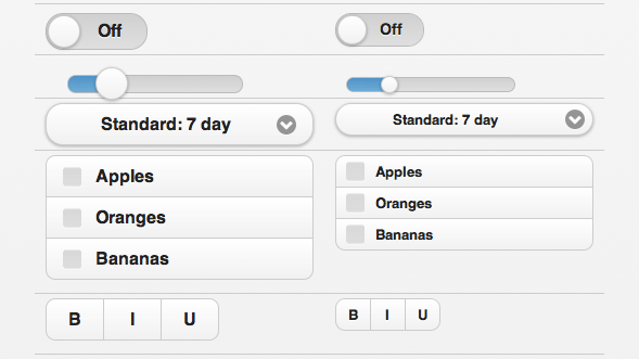
data-mini="true" to any form element (left) to render a miniature version of it (right).A new look for flip toggle switches
The jQuery Mobile developers have restyled the flip toggle switch widget for 1.1. The new switch looks cleaner and more compact, and more closely mimics the flip switch style on many mobile platforms:

Press the buttons below to see the old and new flip switches in action:
Slider improvements
Range sliders now fully support the HTML step attribute. This attribute lets you specify the increment when moving the slider (it defaults to 1). For example, adding the attribute step="5" to an <input type="range"> element will make the slider move in steps of 5 when dragged, or when using the spinner control next to the slider (if available).
Previous versions of jQuery Mobile supported the step attribute only when using the keyboard or spinner control to move the slider. Now the step value also kicks in when dragging the slider and when using the numeric input box.
If the user enters a value in the numeric input box next to the slider, jQuery Mobile rounds the value to the nearest step value if necessary.
Another nice improvement to sliders is highlighting. By adding a data-highlight="true" attribute to a slider, you can highlight the area of the slider track to the left of the handle, giving the user a good visual indication of the value they’ve chosen:
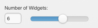
data-highlight="true" to an <input type="range"> slider to add a highlight to the track.Press the button below to check out these step and highlight improvements to sliders.
Preventing groups of elements from being enhanced
By default, jQuery Mobile goes through the markup in your mobile pages and enhances it to create touch-friendly widgets, such as sliders, checkboxes and list views. It also adds click handlers to links, and submit handlers to forms, to enable jQuery Mobile’s Ajax-based navigation system on these elements.
Usually this is what you want to happen. However, sometimes you might be creating your own custom widget, and you don’t want jQuery Mobile to apply its own enhancements to your widget markup.
With previous versions of jQuery Mobile, you could use various tricks such as the page plugin’s keepNative option, the initSelector property of individual plugins, and the data-role="none" attribute to disable enhancement for specific elements or element classes.
jQuery Mobile 1.1 adds a new level of flexibility, in the form of the data-enhance="false" attribute. By adding this attribute to a container element, you prevent jQuery Mobile from enhancing any of the markup inside the element, or attaching its own click or submit handlers to links or forms inside the element:
<div id="myContainer" data-enhance="false">
<!-- Enhancement and Ajax handling disabled for all elements inside this div -->
</div>
For this to work, you also need to set the global option $.mobile.ignoreContentEnabled to true inside a mobileinit event handler, like this:
$(document).bind( "mobileinit", function() {
  $.mobile.ignoreContentEnabled = true;
} );
Try this out by pressing the button below:
Turning off Ajax handling for whole containers
As mentioned above, jQuery Mobile automatically adds event handlers to links and forms to load target pages using its Ajax-based navigation system. Previous versions of jQuery Mobile let you disable Ajax handling for a specific link or form by adding the data-ajax="false" attribute to the a or form element.
In jQuery Mobile 1.1, you can now easily disable Ajax handling for all links and/or forms within a container element by adding data-ajax="false" to the container:
<div id="myContainer" data-ajax="false">
<!-- Ajax handling disabled for all elements inside this div -->
</div>
As with the data-enhance="false" attribute described in the previous section, you also need to set the global option $.mobile.ignoreContentEnabled to true inside a mobileinit event handler for data-ajax="false" to have any effect.
Try this out by pressing the button below. The demo page includes two containers, each with a link styled as a button. The first container’s link uses jQuery Mobile’s Ajax handling in the usual way. The second container has the data-ajax="false" attribute, so the link inside the container behaves as a standard, non-Ajax link:
The demo page works like this:
- When you tap the first button, jQuery Mobile loads the target page,
page2.html, using Ajax, and transitions to the page using thefliptransition specified by the button’sdata-transitionattribute. - The second button isn’t Ajax-enhanced, so when you tap it, the browser loads
page2.htmlin the usual way, bypassing jQuery Mobile’s Ajax navigation system and transition effect.
Other changes
There are some other minor improvements in jQuery Mobile 1.1:
- Cleaner default theme
Various aspects of the default theme, such as padding, margins and colours, have been subtly tweaked to make everything look neater and cleaner. - Easy theme upgrading with ThemeRoller
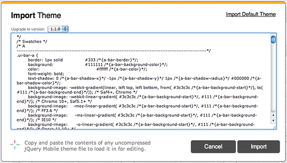
The ThemeRoller tool now supports jQuery Mobile 1.1, and makes it easy to convert your existing 1.0 themes to 1.1. Just click Import, paste in your 1.0 theme’s CSS, make sure Upgrade to version: 1.1.0 is selected, then click the Import button in the dialog (see screenshot below). - Support for jQuery 1.7.1
Like version 1.0, jQuery Mobile 1.1 supports jQuery 1.6.4. However, it also works with the latest and greatest version of jQuery, 1.7.1. - AMD module support
jQuery Mobile 1.1 now uses RequireJs’s Asynchronous Module Definition API to allow the various modules in jQuery Mobile to load as required. - Zoom fixes
Mobile Safari on iOS contains an annoying bug related to user-zoomable pages (pages that don’t havemaximum-scale=1included in theirviewportmetatag): When rotating from portrait to landscape, the viewport zooms in too much, and you lose some of the page’s right-hand content. Scott Jehl has come up with a cunning workaround for this, and it’s included in jQuery Mobile 1.1 by default. The workaround also stops iOS zooming in when focusinginputandselectelements. If required, you can disable this feature by setting calling$.mobile.zoom.disable( true ). - Searchable documentation
The jQuery Mobile team have added a useful search / sitemap feature to the docs, which makes it easy to find stuff. Naturally, the page uses a jQuery Mobile filterable list view to do the job! Search for any text, and the list view reveals the relevant sections.
What’s coming up in 1.2
While 1.1 has been mainly about improving jQuery Mobile’s current functionality, 1.2 will see the introduction of some new widgets and features. Here are some highlight features that are currently planned:
- A popup component
This allows you to turn anydivinto a popup by adding the attributedata-role="popup"to thediv. You can create a button that opens the popup by linking to the popup’sidand adding adata-rel="popup"attribute to the link. Popups are great for small dialogs, login boxes, simple menus, and lots more. Check out this popup demo page. - Fetch links
By adding adata-targetattribute to a link, you can tell jQuery Mobile to load the linked page’s content (or partial content) into an existing container in the page, rather than doing a full transition to the linked page. This makes it really easy to create things like slideshows and “pull to refresh” widgets. - Download builder
The jQuery Mobile team are also working on a download builder. This will allow you to choose exactly which jQuery Mobile functionality — widgets, transitions, and so on — you need for your app. The builder then serves you a custom jQuery Mobile build containing just the code you need, so you can keep your app’s download times to a minimum.
Expect jQuery Mobile 1.2 to launch in a few months’ time. You can find out more about jQuery Mobile’s roadmap on their blog.
Summary
In this article you explored many of the new features and improvements that jQuery Mobile 1.1 brings. You learned about:
- Fixed toolbar improvements, including genuine CSS
position: fixedtoolbars; a polyfill for the older fixed toolbar style; new toolbar options and methods; changes to fullscreen toolbars; and the deprecatedtouchOverflowfeature. - Improvements to page transitions, including smoother, faster transitions; a change to the default transition; Firefox support; and two new transitions:
turnandflow. - An enhanced loading spinner, with a new design and a range of options that let you customize the spinner’s appearance.
- The
data-mini="true"attribute for creating miniature versions of form controls. - Better-looking flip toggle switches. The new switches have a cleaner, more compact look.
- Improvements to range sliders, including full support for the
stepattribute and a newdata-highlightattribute. - Preventing whole groups of elements from being enhanced by using the
data-enhance="false"anddata-ajax="false"attributes. - Various other improvements, including a cleaner theme; the ability to upgrade themes with ThemeRoller; jQuery 1.7.1 support; AMD module support; iOS zoom fixes when changing orientations; and new searchable online docs.
- jQuery Mobile 1.2: What new features to expect in the upcoming 1.2 release.
I hope you enjoyed reading this article. You can download jQuery Mobile 1.1 now from the jQuery Mobile website, and start building some great mobile websites and apps. Happy coding!

Leave a Reply