
(Requires Safari)
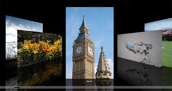
If you’ve used a Mac or iTunes at all, you’ve probably come across the Cover Flow view. This shows you a series of album covers, photos, or other documents in 3D, allowing you to flip between them by clicking them, dragging a scrollbar, or using the arrow keys.
It’s a nice effect, but it requires a fair bit of processing power to accomplish. I thought it’d be a fun challenge to recreate it as closely as possible in a browser using CSS and JavaScript. At the start I had no idea if this was even possible, but I’m pretty happy with the result!
Cross-browser? Erm, not quite…!
The code uses quite a few CSS properties of the WebKit browser engine, and currently it only works in Safari on Mac and Windows, and Mobile Safari on iOS (iPhone, iPod touch and iPad). It should theoretically work in Chrome too, but Chrome’s handling of rotateY() seems to be broken at the time of writing. So you’ll need to view the demo on Safari for now. Such is life. I hope that one day I can extend the demo to work in other browsers once they support the relevant CSS3 features.
In this tutorial I’ll explain how I created the Cover Flow gallery demo. Along the way we’ll explore many of WebKit’s powerful CSS features, and look at various techniques for positioning and animating objects in 3D. I hope you enjoy reading it!
The basic idea
So how can we go about recreating the Cover Flow effect using nothing but CSS and JavaScript? Well, it turns out that WebKit contains all we need to achieve the various effects used in Cover Flow:
- CSS 3D transforms let us position and rotate the slide images in 3D space. WebKit handles the projection onto the 2D page automatically.
- CSS transitions let us animate the slides’ movement automatically. All we need to do is add a transition, specify a new position and angle for each slide using 3D transforms, and the browser smoothly transitions the slide from the old to the new position. By adding a sharp cubic bezier curve function to the transition, we can make it start very quickly and ease out very slowly, just like the real Cover Flow.
- CSS reflections make it easy to add a reflection below each slide image.
- HTML5 sliders combined with various WebKit-specific CSS properties and shadow DOM pseudo-elements let us create a custom “scrollbar” much like the original.
Here’s the rough plan for our JavaScript code:
- Grab the slide images in the document.
- Wrap a
divaround each image to contain both the image and reflection, and to isolate the reflection from the ones behind it. - Position each slide
divin 3D space according to its position in the list. The current slide faces forward, at the front of the 3D space. All slides to the left and right of the current slide are moved slightly backward “into” the screen so they sit in the background, and rotated slightly clockwise or counter-clockwise as appropriate. - Add a
clickhandler to each slidedivthat makes that slide the new current slide. Once we have a new current slide, we simply update all the slide positions in 3D space, and let the CSS transition move the slides gradually from their old to their new positions. - Similarly, add a
changehandler to the slider so that the current slide is updated when the slider is moved. Also add akeydownhandler to allow the user to change the current slide with the left and right arrow keys. We’ll also use a plugin that detects swipe gestures, so mobile users can navigate the gallery using swipe gestures. - Add a
resizehandler to the window that redraws the gallery when the user resizes the browser. This ensures that the current slide remains centred, and the images scale appropriately to fill the window height.
That’s pretty much it in a nutshell. Now let’s look at the code in a bit more depth, step by step…
To see the full commented code all in one place, you can either view the demo then view the page source, or download the code using the button at the top of the article.
Step 1: The markup
Our body element markup is very simple:
<body>

  <div id="gallery">
    <img src="slides/BarbedWire.jpg" alt="Barbed Wire" />
    <img src="slides/Chillies.jpg" alt="Chillies" />
    <img src="slides/BigBen.jpg" alt="Big Ben" />
    <img src="slides/DriftStuff.jpg" alt="Drift Stuff" />
    <img src="slides/CricketMatch.jpg" alt="Cricket Match" />
    <img src="slides/Driftwood.jpg" alt="Driftwood" />
    <img src="slides/LionStatue.jpg" alt="Lion Statue" />
    <img src="slides/RainbowRibbons.jpg" alt="Rainbow Ribbons" />
    <img src="slides/Feather.jpg" alt="Feather" />
    <img src="slides/LondonEyeFromBelow.jpg" alt="London Eye From Below" />
    <img src="slides/GrassLight.jpg" alt="Grass and Light" />
    <img src="slides/ParliamentSquare.jpg" alt="Parliament Square" />
    <img src="slides/DriftwoodGuy.jpg" alt="Driftwood and Guy" />
    <img src="slides/PostBox.jpg" alt="Post Box" />
    <img src="slides/SeaweedGasmask.jpg" alt="Seaweed Gasmask" />
    <img src="slides/StickSea.jpg" alt="Stick and Sea" />
    <img src="slides/Surfers.jpg" alt="Surfers" />
  </div>
  <input type="range" name="slider" id="slider" />
  <div id="caption"></div>
  <div id="loading">Please wait...</div>

</body>
We have:
- A
#gallerydivholding the slide images. Each image hasalttext which we’ll use for its caption. - A
rangeslider that the user can drag to move between images. - A
divto hold the current image’s caption, and - A
divcontaining a loading message.
Step 2: The CSS

There’s quite a lot of CSS in the page, some of which isn’t relevant to the Cover Flow effect. I’ll just include the relevant stuff here.
The gallery container
#gallery {
  position: absolute;
  width: 100%;
  height: 100%;
  -webkit-perspective: 600px;
  overflow: hidden;
  -webkit-mask-image: -webkit-gradient(linear, left top, right top, color-stop(0, rgba(0,0,0,.2)), color-stop(.1, rgba(0,0,0,
1)), color-stop(.9, rgba(0,0,0,1)), color-stop(1, rgba(0,0,0,.2)) );
}
We make the container fill the entire width and height of the browser. (You can adjust the width and height values to make a smaller, in-page gallery if you prefer.) We also set overflow: hidden so that images outside the gallery div don’t cause a browser scrollbar to appear.
The interesting properties in this rule are:
-webkit-perspective: 600px;
This tells WebKit to render the contents of thedivin 3D. The value represents how close the “camera” is to the page. Small values make everything look very distorted and foreshortened, while big values make everything look flatter.600pxis a good compromise between “looking nicely 3-dimensional” and “not looking silly”. (Find out more about WebKit 3D transforms.)-webkit-mask-image: -webkit-gradient(...);
If you look at Apple’s Cover Flow, the images fade out towards the left and right side of the screen. We could do this by messing about with the opacities of the individual slides, but a “quick and dirty” approach is to use the-webkit-mask-imageproperty. This lets us overlay an alpha mask onto our gallery. We specify a gradient rather than an actual image. The gradient starts with an opacity of 0.2 on the left side, fades in to an opacity of 1 shortly after, then fades back to 0.2 towards the far right of the gallery. This creates a subtle masking effect, fading out the images on the extreme left and right sides of the gallery.
The slide images within the gallery
#gallery img {
  -webkit-box-reflect:
    below
    0
    -webkit-gradient(
      linear,
      left top,
      left bottom,
      color-stop(0, rgba(255, 255, 255, 0)),
      color-stop(.5, rgba(255, 255, 255, .3)),
      color-stop(1, rgba(255, 255, 255, .3))
    );

    max-width: inherit;
    max-height: inherit;
    display: none;
}
We give each slide image a reflection using -webkit-box-reflect. We add a gradient mask to make the reflection semitransparent, and fade it out slightly towards the bottom.
We also make the slide image fill its containing div by setting max-width and max-height to inherit. Our JavaScript will set appropriate max-width and max-height values on the container div to ensure that each slide is shrunk to fit if it’s too wide or too tall.
Finally, we hide the images while they’re loading by using display: none.
The slide divs around the images
#gallery div {
  position: absolute;
  padding-bottom: 400px;
  bottom: -300px;
  background: #000;
}
The semitransparent reflections are lovely, but there’s one problem: Since an image’s reflection is semitransparent, the reflections from images behind the current image show through, creating a mess of merged reflections.
To get around this problem, our JavaScript wraps a div around each slide image. We give the div a black background in the CSS. This ensures that each reflection is opaque with respect to the reflections behind it. We also give the div some bottom padding to allow for the reflection, and position it 300 pixels below the bottom of the gallery so that the reflections partially disappear below the bottom.
The slider input
#slider {
  position: absolute;
  bottom: 20px;
  left: 5%;
  right: 5%;
  -webkit-appearance: none !important;
  border-radius: 10px;
  border: 1px solid white;
  background: #999;
  opacity: .5;
  display: none;
}

#slider::-webkit-slider-thumb {
  -webkit-appearance: none !important;
  width: 50px;
  height: 18px;
  border-radius: 10px;
  border: 2px solid #fff;
  background: -webkit-gradient(linear, left top, left bottom, color-stop(0, #999), color-stop(.5, #000) );
}
The original Cover Flow has a translucent scrollbar beneath the images that you can drag to move between images. We can recreate this scrollbar using the HTML5 <input type="range"> slider control. We customize the look of this control fairly heavily using CSS.
First we place the slider at the bottom of the window, and centre it using equal left and right properties. We then use the -webkit-appearance: none rule to remove the default browser styling for range inputs. This allows us to style the input, giving it a curved border, light grey background and 50% opacity. We also hide the slider initially while the gallery loads.
The ::-webkit-slider-thumb pseudo-element lets us style the thumb control on the slider. Normally this can’t be styled as it’s in the shadow DOM, but WebKit handily lets us style it using this pseudo-element. We give it a fixed with and height, as well as a curved border and a subtle gradient background.
The end effect isn’t identical to the original Cover Flow scrollbar, but it’s close enough.
The caption
#caption {
  position: absolute;
  z-index: 2;
  bottom: 75px;
  width: 100%;
  color: #fff;
  text-align: center;
  font-family: "Lucida Grande", sans-serif;
  font-size: 12px;
  font-weight: bold;
}
The caption is easy. We position it just below the current image, centre it horizontally, and give it a bold Lucida Grande font, as used in the original Apple version.
The loading text
#loading {
  position: absolute;
  z-index: 1;
  bottom: 50%;
  width: 100%;
  color: #ffc;
  text-align: center;
  font-family: "Georgia", serif;
  font-size: 36px;
  letter-spacing: .1em;
  opacity: 0;
  filter: alpha(opacity=0);
}
This is the “Please wait…” text that appears while the gallery loads. We position it in the centre of the window, and style and colour the text nicely. We set its opacity to zero initially to hide it.
Step 3: Set up the JavaScript
Now that we’ve created our markup and CSS, we’re ready to add the gallery functionality using JavaScript. First we’ll set some things up:
<script type="text/javascript" src="http://ajax.googleapis.com/ajax/libs/jquery/1.6/jquery.min.js"></script>
<script type="text/javascript" src="jquery.jswipe-0.1.2.js"></script>
<script type="text/javascript">

//  --- Begin Config ---
var loadingMessageDelay = 2000;       // How long to wait before showing loading message (in ms)
var loadingMessageSpeed = 1200;       // Duration of each pulse in/out of the loading message (in ms)
var loadingMessageMinOpacity = 0.4;   // Minimum opacity of the loading message
var loadingMessageMaxOpacity = 1;     // Maximum opacity of the loading message
var bgRotateAngle = 65;               // Rotation angle of background slides (in degrees)
var stepPercent = 15;                 // Horiz gap between background slides (as % of window height)
var currentSlidePaddingPercent = 70;  // Horiz gap between current slide and background slides (as % of window height)
var swipeXThreshold = 30;             // X-axis minimum threshold for swipe action (in px)
var swipeYThreshold = 90;             // Y-axis maximum threshold for swipe action (in px)
var leftKeyCode = 37;                 // Character code for "move left" key (default: left arrow)
var rightKeyCode = 39;                // Character code for "move right" key (default: right arrow)
//  --- End Config ---

var currentSlide = 1;                 // The slide that the user is currently viewing
var oldCurrentSlide = currentSlide;   // The previous slide that the user viewed
var totalSlides = 0;                  // Total number of slides in the gallery (computed later)
var flipTimeouts = new Array;         // For storing the timeout IDs so we can clear them


// Display the loading message after a short delay
$( function() {
  $('#loading').delay( loadingMessageDelay );
  fadeInLoadingMessage();
} );

// Fire the init() function once the page and all images have loaded
$(window).load( init );
First we load the jQuery library, as well as the jQuery Swipe plugin. This plugin lets us detect swipe gestures on mobile devices.
jQuery Swipe isn’t available on a CDN, so you’ll need to download it, then put the jquery.jswipe-0.1.2.js file in the same folder as your gallery page.
Next, we add various configuration options for things like the loading message, the angle at which to rotate background slides, the gap between each slide, and the padding either side of the current slide. If you want to tweak any of the values, the comments in the code should give you all the info you need.
We now set up some initial variables, including:
currentSlide- The index number of the foreground slide, where 1 is the first slide in the list
oldCurrentSlide- This will hold the index of the slide that was previously the current slide before the user moved to the new slide. We’ll use this value to detect if a background slide has swapped from the left to the right side, or vice-versa.
totalSlides- The number of slides in the gallery. We’ll populate this value once all the images have loaded.
flipTimeouts- This array will hold the IDs for some timers that we’ll create in the
displayGallery()function later. We store the IDs so we can clear the timeouts whenever the gallery is redisplayed.
We now add a delay to the “Please wait…” loading message (2 seconds by default). If the gallery hasn’t loaded by this point, we start pulsing the loading message by calling the fadeInLoadingMessage() function (of which more later).
Last, but by no means least, we set up the init() function as a handler for the window’s load event. This event is triggered once the entire page, including all images, has loaded. At this point, we’re ready to set up our gallery, which is exactly what init() does…
Step 4: The init() function
init() does all the things needed to set up the gallery. Then, once everything’s in place, it displays the gallery.
function init() {

  totalSlides = $('#gallery img').length;  // Total number of slides in the gallery
  var pos = 0;  // To track the index of the slide we’re working with

  // Hide the loading message and reveal the slider
  $('#loading').clearQueue().stop().fadeTo( 'fast', 0 ).remove();
  if ( !navigator.platform.match(/(iPhone|iPod|iPad)/) ) $('#slider').fadeIn('slow');

  // For each image in the gallery:
  //  - Show the image
  //  - Wrap the image in a div
  //  - Store the image’s index and initial oldLeftPos values in the div

  $('#gallery img').each( function() {
    $(this).css( 'display', 'inline' );
    var div = $('<div />').data('slideNum',++pos);
    $(this).wrap( div );
    $(this).parent().data('oldLeftPos',0);
  } );

  // Add a click handler to each div to jump to the div’s image when clicked
  $('#gallery div').click( function() {
    oldCurrentSlide = currentSlide;
    currentSlide = $(this).data('slideNum');
    displayGallery();
  } );

  // Redraw the gallery whenever the user resizes the browser
  $(window).resize( displayGallery );

  // Bind the moveRight() and moveLeft() functions to
  // the swipeLeft and swipeRight events respectively.
  $('body').swipe( {
       swipeLeft: moveRight,
       swipeRight: moveLeft,
       threshold: { x:swipeXThreshold, y:swipeYThreshold }
  } );

  // Bind the moveleft() and moveRight() functions to the
  // "move left" and "move right" keys on the keyboard

  $(document).keydown( function(event) {
    if ( event.which == leftKeyCode ) moveLeft();
    if ( event.which == rightKeyCode ) moveRight();
  } );

  // Set up the slider

  $('#slider').attr( {
    'min': 1,
    'max': totalSlides,
    'value': currentSlide
  } );

  $('#slider').change( function() {
    oldCurrentSlide = currentSlide;
    currentSlide = $(this).val();
    displayGallery();
  } );

  // All set! Show the gallery
  displayGallery();

}
Let’s look at each chunk of code in the init() function:
-
- Set up a couple of variables
We start by initializing 2 variables:totalSlides, which holds the total number of slides in the gallery (determined by using the jQuerylengthproperty), andpos, which will hold the index number of the slide we’re currently processing. - Hide the loading message and reveal the slider
Next we kill any fading animations on the loading message, fade it out usingfadeTo(), and remove it from the DOM. We then fade the slider input in usingfadeIn(). However, since iOS doesn’t (yet) support sliders fully, we don’t show the slider on iOS devices. - Wrap each image in a
divand show it
The code then loops through each image in the gallery using theeach()method. It un-hides the image, then wraps the image in a newdivelement. As I mentioned in Step 3, this fixes the problem of reflections merging together.We also store a couple of bits of information about the slider in this
div, using thedata()method. These areslideNum(the slide’s index, starting from 1), and an initial value foroldLeftPos(the slide’s previous horizontal position before the current slide was changed — we use this later when positioning the slides). - Add a
clickhandler to eachdivto jump to thediv‘s image when clicked
We add a simpleclickhandler to each slidedivso that when the user clicks thediv, the slide is brought to the front. The handler setsoldCurrentSlideto the index of the current slide, then changescurrentSlideto the index of the clicked slide and callsdisplayGallery()to update the slide positions. - Redraw the gallery whenever the user resizes the browser
If the user resizes their browser window then it would be nice to update the gallery so that the slide images scale with the window height, and to keep the current slide in the centre. So we set ourdisplayGallery()function as thewindow.resizehandler. Now, whenever the user changes their window size,displayGallery()repositions and resizes the slides automatically. - Bind the
moveRight()andmoveLeft()functions to theswipeLeftandswipeRightevents
We use the jQuery Swipe plugin to let the user swipe left and right on a touch device to move between the slides. If the user swipes right-to-left then we callmoveRight()to move to the next slide, and vice-versa.Swiping is currently pretty buggy on my iPhone 4 (not sure about iPad). The swipe events are firing on time, but there’s often a 2-3 second delay between swiping and the gallery updating. I suspect this is some sort of clash between the swipe action and CSS transitions. If anyone has ideas or a fix, please let me know and I’ll update the article!
- Bind
moveleft()andmoveRight()to the “move left” and “move right” keys
Next we create an event handler for the document’skeydownevent. In this function, we detect if either the left or right arrow key was pressed. If it was then we callmoveLeft()ormoveRight()as required. - Set up the slider
Our last setup task is to activate the slider. We set the slider’sminandmaxattributes to 1 and the number of slides respectively, and set itsvaluetocurrentSlide(1 by default). Then we attach achangeevent handler to the slider, so that when the user drags the slider to a new position, the current slide is set to the slider’s new value and the gallery is redrawn. - Show the gallery
Our gallery is now ready, so the last step of ourinit()function is to calldisplayGallery()to position and show the slides.
- Set up a couple of variables
Step 5: The displayGallery() function
displayGallery() is the meat of the script. Its job is to compute the positions and sizes of all the images in the gallery, then use CSS 3D transforms to position each image in 3D space, and set up transitions to move the images smoothly from their old to their new positions. This function also updates the slider position and the caption.
function displayGallery() {

  var pos = 0;                              // To track the index of the slide we’re working with
  var galleryWidth = $('#gallery').width(); // Width of the gallery/viewport in px
  var galleryCentre = galleryWidth / 2;     // Horizontal centre point of the gallery in px
  var windowHeight = $(window).height();    // Viewport height in px
  var slideHeight = windowHeight - 150;     // Maximum slide height based on window height

  // Compute the actual step and slide padding values, based on window height
  var step = windowHeight * stepPercent / 100;
  var currentSlidePadding = windowHeight * currentSlidePaddingPercent / 100;

  // Clear any previous timeouts to avoid clashes when moving the gallery quickly
  while ( t = flipTimeouts.pop() ) clearTimeout(t);

  // Move through each slide div, positioning it in 3D space

  $('#gallery div').each( function() {

    var div = $(this);

    // Resize each slide if necessary (e.g. if the window height has changed)
    div.css('max-width', slideHeight);
    div.css('max-height', slideHeight);

    if ( ++pos < currentSlide ) {

      // The slide is to the left of the current slide.

      // Compute its horizontal position
      var leftPos = galleryCentre - ( currentSlide * step ) + ( pos * step ) - (div.width()/2) - currentSlidePadding;

      // If the slide was previously to the right of the current slide, flip it immediately to the new angle.
      // (If we were to let it rotate slowly as it’s repositioned then it would sometimes cut into other slides.)

      if ( pos > oldCurrentSlide ) {
        div.css( {
          '-webkit-transition': 'none',
          '-webkit-transform': 'translate3d(' +  div.data('oldLeftPos') + 'px,0,-' + (100+parseInt(div.width()/1.5)) + 'px) rotateY(' + bgRotateAngle + 'deg)'
        } );
      }

      // Wait 10 ms to give the slide a chance to rotate if necessary,
      // then reposition the slide to its new horiziontal position and angle

      var t = setTimeout( function() {
        div.css( {
          '-webkit-transition': '-webkit-transform .8s cubic-bezier(0, 0, .001, 1)',
          '-webkit-transform': 'translate3d(' + leftPos + 'px,0,-' + (100+parseInt(div.width()/1.5)) + 'px) rotateY(' + bgRotateAngle + 'deg)'
        } );
      }, 10 );

      // Store the timeout ID so we can clear it later
      flipTimeouts.push(t);

      // Store the new position in oldLeftPos
      div.data('oldLeftPos', leftPos);

    } else if ( pos > currentSlide ) {

      // The slide is to the right of the current slide.

      // Compute its horizontal position
      var leftPos = galleryCentre + ( (pos-currentSlide) * step ) - (div.width()/2) + currentSlidePadding;

      // If the slide was previously to the left of the current slide, flip it immediately to the new angle.
      // (If we were to let it rotate slowly as it’s repositioned then it would sometimes cut into other slides.)

      if ( pos < oldCurrentSlide ) {
        div.css( {
          '-webkit-transition': 'none',
          '-webkit-transform': 'translate3d(' + div.data('oldLeftPos') + 'px,0,-' + (100+parseInt(div.width()/1.5)) + 'px) rotateY(-' + bgRotateAngle + 'deg)'
        } );
      }

      // Wait 10 ms to give the slide a chance to rotate if necessary,
      // then reposition the slide to its new horiziontal position and angle

      var t = setTimeout( function() {
        div.css( {
          '-webkit-transition': '-webkit-transform .8s cubic-bezier(0, 0, .001, 1)',
          '-webkit-transform': 'translate3d(' + leftPos + 'px,0,-' + (100+parseInt(div.width()/1.5)) + 'px) rotateY(-' + bgRotateAngle + 'deg)'
        } );
      }, 10 );

      // Store the timeout ID so we can clear it later
      flipTimeouts.push(t);

      // Store the new position in oldLeftPos
      div.data('oldLeftPos', leftPos);

    } else {

      // The slide is the current slide.
      // Position it in the horizontal centre of the gallery, facing forward.

      var leftPos = galleryCentre - ( div.width()/2 );

      div.css( {
        '-webkit-transform': 'translate3d(' + leftPos + 'px,0,0) rotateY(0deg)',
      } );

      // Store the new position in oldLeftPos
      div.data('oldLeftPos', leftPos);
    }

  } );

  // Update the slider value and caption
  $('#slider').val( currentSlide );
  var currentSlideImage = $('#gallery img').eq( currentSlide - 1 );
  $('#caption').text( currentSlideImage.attr('alt') );
}
Let’s work through this function one step at a time:
-
-
- Set up some variables
At the top of the function, we set up various variables that we’ll use throughout the function.poswill track the index of the slide we’re processing in the loop.galleryWidthandgalleryCentrehold the width of the gallery and its horizontal centre respectively.windowHeightholds the current browser window height, which we use to computeslideHeight, the maximum allowed height of the slides in the gallery. - Compute the actual step and slide padding values, based on window height
Next we create 2 variables:step, which is the gap in pixels between each background slide, andcurrentSlidePadding, which is the horizontal gap between the foreground slide and the background slides on either side. We compute these based on thestepPercentandcurrentSlidePaddingPercentconfig variables, as well as the current window height. - Clear any previous timeouts to avoid clashes when moving the gallery quickly
In a minute, we’ll be creating timeouts usingsetTimeout()to trigger the slide transitions after a short delay. This can cause problems if the user moves the gallery quickly, since they may move the gallery again before the timeouts have finished, resulting in unexpected movement of some of the slides. To stop this, we clear any previously-set timeouts here before repositioning the slides. - Move through each slide
div, positioning it in 3D space
Now we come to the core of the function. We useeach()to loop through all the slidedivs in the gallery, positioning them one by one. - Resize each slide if necessary (e.g. if the window height has changed)
Within the loop, we first update the slide’smax-widthandmax-heightproperties to conform to the maximum allowed slide width/height (slideHeight). - Handle slides to the left of the current slide
Our loop contains a bigif ... else if ... elsestatement to handle the 3 types of slides: those on the left, those on the right, and the current slide in the middle.First we deal with slides on the left. We work out the slide’s horizontal position based on the centre of the window (
galleryCentre), the current slide index, and the values ofstepandpos. We also adjust for the width of the slide, as well as the left and right padding around the current slide.Next, if we’re moving this slide from the right of the centre to the left then we have to do a bit of a trick. If we let the slide transition automatically from its old position and rotation, to its new position and rotation, then the slide will tend to intersect other slides as it goes — this can happen if the user jumps several slides forward or backward at once. This looks messy. To avoid this, we temporarily turn off transitions, then quickly flip the slide to its new rotation angle. We then use
setTimeout()to do the main transition and horizontal transform 10 milliseconds later, once the slide has had a chance to flip.The transition and transforms itself are surprisingly easy to accomplish, since we can do it all using CSS. For the transition, we specify that we want the
-webkit-transformproperty to transition smoothly over 0.8 seconds, and we supply a cubic bezier function of (0, 0, .001, 1), which you can read as: “Move very quickly at the start of the animation, then move more slowly towards the end”.We position and rotate the slide using the
-webkit-transformproperty and 2 transform functions:translate3d(), which lets us specify an (x,y,z) position for the slide; androtateY(), which rotates the slide around the Y axis. Since this is a slide in the background, we give it a negative z value of 100px to move it backwards “into” the page. We also add on a bit more to allow for the slide width; this helps to keep slides of different widths evenly spaced. To rotate the slide, we simply supply thebgRotateAngleconfig value (65 degrees by default) torotateY().Once we’ve done all that, we store the
setTimeoutID in theflipTimeoutsarray so we can clear it later, and update the slide’soldLeftPosvalue. - Handle slides to the right of the current slide
The code after theelse ifdeals with slides to the right of the centre. As you’d imagine, this code is pretty much the mirror image of the previous step. We compute its position to the right of the centre; flip it immediately if it was previously on the left; and update its 3D position and rotation using a 10-millisecond delay. Notice that we negate the value passed torotateY()this time, since the slide needs to be flipped the other way round. - Handle the current slide
The code after theelsehandles the current slide. This is very straightforward. We position the slide in the front and centre of the gallery, and rotate it to 0 degrees (facing forward). - Update the slider value and caption
That’s the end of our enormo-loop! All the function needs to do now is set the slider to the new current slide value using the jQueryval()method, and set the caption’s text to thealttext of the current slide image. We retrieve this image from the list using the handy jQueryeq()method.
- Set up some variables
-
Step 6: The moveLeft() and moveRight() functions
Our script is pretty much plain sailing from now on. We add a couple of functions to move the gallery one slide to the left and right — these are set as event handlers for the keydown and swipe events earlier in the script:
function moveLeft() {
  if ( currentSlide > 1 ) {
    oldCurrentSlide = currentSlide;
    currentSlide--;
    displayGallery();
  }
}

function moveRight() {
  if ( currentSlide < totalSlides ) {
    oldCurrentSlide = currentSlide;
    currentSlide++;
    displayGallery();
  }
}
No great surprises here. We check that we’re not currently showing the first (or last) slide, then update oldCurrentSlide, decrement (or increment) currentSlide, and update the slide positions by calling displayGallery().
Step 7: Functions to pulse the loading message
Lastly, we add a couple of simple functions to fade the loading message repeatedly in and out:
function fadeInLoadingMessage() {
  $('#loading').animate( { opacity: loadingMessageMaxOpacity }, loadingMessageSpeed, 'swing', fadeOutLoadingMessage );
}

function fadeOutLoadingMessage(){
  $('#loading').animate( { opacity: loadingMessageMinOpacity }, loadingMessageSpeed, 'swing', fadeInLoadingMessage );
}
fadeInLoadingMessage() uses the jQuery animate() method to fade the loading message up to its maximum opacity. Once the fade-in is complete, it triggers the fadeOutLoadingMessage() function.
fadeOutLoadingMessage() does the reverse: it fades out the message, then calls fadeInLoadingMessage().
This sets up an animation loop that pulses the loading message continuously, until it is stopped by the calls to clearQueue() and stop() inside the init() function.
That’s it!
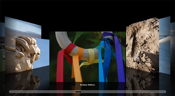
All finished! Take a look at the end result again. And here’s another version with album covers instead of photos. Nice!
Cover Flow is a pretty neat effect, and it would have been impossible to do smoothly within a browser until fairly recently. Thanks to WebKit’s excellent support for hardware-accelerated 3D transforms and transitions, we can now produce something pretty close to the native Cover Flow, all running within a browser.
I hope you enjoyed reading this article, and found the techniques useful. As always, I’d love to hear your comments below. Have fun!
Here’s a demo I set up that showcase how to obtain a Coverflow effect by relying only upon CSS properties. http://bit.ly/css_coverflow.
Thanks to your article now I know how to add reflection below each card 🙂 Good work!
@spx2: Cool! Don’t forget you can wrap each image in a black-background (or white-background) div if you want to stop the background cards leaking through to the foreground cards.
thanks @matt ! I’ve tried to do that but somehow it fails and removes the opacity of the image. Sure I’m missing something 🙂 thanks for the tip!
Wonderful script! Just had to add a little fix for img height in iPhone (cache problem) :
after :
add :
//cache fix
var img = div.find("img");
img.css( 'height', slideHeight );
And optionally replace “var windowHeight = $(window).height();” with “var windowHeight = $(‘#gallery’).height();”
I’m getting the delay you mentioned on my iPhone 4 – does anyone know what’s causing this? Would be perfect otherwise. Thanks!
@hueston: I’m beginning suspect this is an inherent delay with CSS transitions on Mobile Safari. Another demo I did using jQuery Mobile transitions has a similar delay:
http://www.elated.com/articles/jquery-mobile-masterclass-simple-twitter-app/
I expect this will improve as iOS (and iOS devices) evolve and get faster. If I find any workaround in the meantime, I’ll post here!
how can i add a action to the center image?
@jecht: Modify the anonymous ‘#gallery div’ click handler function defined inside init(). If the clicked div isn’t the current slide, jump to that slide as normal. However, if it is the current slide, do whatever action you want to do.
Hi,
Great script!
However, when I add many photos (I have hundreds), it works OK on the PC but dumps out both on the iPad and Android.
Any fix on this?
Thanks so much!
Warmest regards~
@andrealing: Glad you like it! I expect you’re running into memory issues on your mobile devices, since these browsers have a lot less RAM available. The only workaround I can think of would be to dynamically load the images on an as-needed basis, then remove the image objects from memory when they’ve gone out of view. But this would of course involve more network traffic and slower response times as the user scrolls back and forth through the gallery.
The easier solution would be to split your photos into multiple galleries 🙂