
The web is a fast-moving industry, and it seems as if a new web technology buzzword emerges every time you blink. From Ajax to WOFF, the array of buzzwords — and the technologies behind them — can be quite bewildering at times.
How are you, dear web developer, to keep up with it all?!
In this article I list 25 key web buzzwords that every modern web developer should understand. For each buzzword, I explain its meaning, talk about why the technology is useful, and include a few links for further reading.
Enjoy!
960 Grid System

The 960 Grid System is a set of standardised templates that make it easier to create web layouts. Each template consists of a number of columns (12 or 16 being the most common), with 10 pixels of margin on each side of each column.
To create your actual web page columns, you just combine columns in the grid. For example, you might base a 2-column page layout on the 12-column template, with the main left-hand column taking up 8 columns and the right-hand sidebar taking up 4 columns.
As well as templates for Fireworks, InDesign, Illustrator, Photoshop and many more apps, 960.gs also comes with battle-tested CSS files that include handy classes for creating multi-column layouts using any combination of column widths you desire. It’s a very nice system that makes it easy to design, prototype and build web layouts.
Here’s a good tutorial on using the 960 Grid System.
Ajax

Ajax — Asynchronous JavaScript and XML — is a collection of technologies that allows a web page to exchange data with a web server without having to reload the page.
Typically, when a browser wants to request more information from the server, or send data such as a form to the server, the browser needs to reload the page. With Ajax, JavaScript in the page can communicate directly with the server using the XMLHttpRequest object, sending data and retrieving new data.
Writing reliable cross-browser Ajax code is quite a lengthy, tedious process, but libraries such as jQuery make life a lot easier.
Ajax makes it possible to give a web page the feel of a desktop application, and this has spawned a whole new generation of web-based applications.
Here’s a basic tutorial showing how to create an Ajax-enabled web page.
Canvas

Canvas is an HTML5 technology that makes it easy to draw shapes, manipulate images, and create animations within the browser window.
To use it, you add a Canvas element to your page with the <canvas> tag. You can then call various JavaScript methods to draw within the element. For example, you can draw lines, rectangles and circles; draw filled shapes in any colour; and insert bitmap images.
Here’s a tutorial that shows how to create an animated pie chart using Canvas.
CDN

CDN stands for Content Delivery Network. Typically, a CDN is a collection of servers placed at strategic points on the internet. Each server holds a copy of the data to be delivered (such as a movie file or code library).
When a user requests the file from a central server, the server redirects them to the optimal server on the CDN (typically the server closest to the user). The user’s browser or app then downloads the file from this new, closer server.
A CDN can improve download speeds and reliability for the end user, as well as reduce the load on the hosting server’s network.
Google’s Libraries API is a well-known example of a CDN.
Cloud computing

Cloud computing is a fairly nebulous (pun intended) phrase, and can mean different things to different people. Broadly speaking, it’s a new way of thinking about how to deliver computing resources over the internet such as applications, services, and storage.
Cloud computing differs from more traditional client-server models in that a cloud service is more like a utility — for example, an electricity provider. Rather than purchasing or renting a specific server (or group of servers) to perform a service, you instead pay a subscription to use the service you want. The details of how that service is delivered, including the nature and location of the servers, are abstracted away.
Cloud computing offers a number of advantages over the traditional approach:
- No upfront costs: You don’t need to spend money on servers and software upfront; you just rent what you need.
- Scalability: No worries about running out of server disk space or RAM. If you have a spike in demand, the service scales to handle it.
- Ease of use: Since you don’t have to know the low-level details of how a service is provided, cloud computing tends to be more straightforward to set up and use.
Common examples of cloud computing services that are currently being offered include:
- Web hosting (for example, Rackspace Cloud)
- Data storage (such as Amazon S3)
- Software as a service (for example, Google Apps)
CSS3

CSS level 3 (CSS3) is the current specification of CSS (Cascading Style Sheets). CSS lets you style elements in a web page, giving you control over things like fonts, colours, sizes, borders, margins, padding, and positioning.
CSS3 adds all sorts of fun new features to the mix, including:
- Rounded corners on elements
- Drop shadows
- Using images for borders
- Multi-column layouts
- Transitions, transforms, and animations
@font-facefor including downloadable web fonts- Multiple backgrounds on an element
As always, current browser support for many of these features is patchy. However, support is getting better all the time, and there are many excellent JavaScript fallbacks available for things like rounded corners and drop shadows.
CSS3.Info is a good site for keeping up to date on the latest CSS3 developments.
CSS sprites
CSS sprites are a way of getting a single image to serve the purpose of many images in a web page. This can make the page quicker to load, since the browser only has to request one image.
The basic idea is that you use the same image as the background of several different page elements (buttons, headings, and so on). The image is typically quite large, and contains many smaller images, such as icons, buttons, and logos, within it.
Since the page elements are smaller than the image, only a small part of the image is shown within each element. By controlling the position of the background image for each element, you can display a different part of the sprite image for the element.
This technique is also often used to create rollover buttons.
Find out how to create CSS sprites.
Doctype
A doctype — or Document Type Declaration, to give it its full name — is a line of code at the top of an SGML or XML document, such as an HTML or XHTML web page.
The doctype typically links to a document type definition (DTD), which is a formal definition of the language used by the document in question. In other words, the doctype is used to specify exactly which language the document is written in.
Here’s a doctype for an HTML4 Strict web page:
<!DOCTYPE HTML PUBLIC
  "-//W3C//DTD HTML 4.01//EN"
  "http://www.w3.org/TR/html4/strict.dtd">
HTML5 works a bit differently to older versions of HTML, in that it doesn’t reference a document type definition at all. Here’s the doctype for an HTML5 page:
<!DOCTYPE HTML>
While required, the HTML5 doctype is purely there for legacy reasons. Including the doctype line prevents browsers from entering quirks mode and introducing strange layout bugs.
Find out more about the HTML5 doctype.
DOM
The DOM, or Document Object Model, is a way of representing the elements and attributes in a web page as objects. A programming language — typically JavaScript — can then access these objects through the DOM API (application programming interface).
A web page’s DOM can be viewed as a tree of elements, with the html element at the root of the tree.
As a simple example, say you have the following markup in your web page:
<p id="myParagraph">Here's a bit of text</p>
You could then use JavaScript to access the paragraph as a DOM object, and display its contents, as follows:
alert( document.getElementById("myParagraph").firstChild.nodeValue );
Want to know more about the DOM? I’ve written a few tutorials on the subject that you might enjoy.
Geolocation API

An increasing number of websites and web apps are including functionality that depend on knowing on the user’s location. Examples include messaging services such as Twitter, photo sites such as Flickr, and mapping applications like Google Maps.
The Geolocation API gives JavaScript apps a standard interface for accessing information on the user’s current location. All an app has to do is call the navigator.geolocation.getCurrentPosition() method to retrieve information about the user’s position, including latitude, longitude, and the time that the location was retrieved.
The Geolocation API is currently supported by Firefox, Chrome and Opera, as well as iPhone and Android. IE7+ support can be added by using Gears.
Find out more about geolocation, and try out a demo, over at Mozilla.com.
HTML5

HTML5 is currently one of the hottest buzzwords on the web, but what is it exactly?
At its core, HTML5 is the latest version of HTML — the markup language that has powered all websites since the birth of the web. It’s backwards-compatible with HTML4, and also introduces some new — and very useful — elements, such as <canvas> and <video>.
However, there’s a lot more to HTML5 than some new tags. HTML5 features include:
- Canvas
- Audio and video playback without needing to use Flash
- Geolocation
- Powerful, self-validating Web forms
- Web workers
- Microdata
- …and lots more!
HTML5 also introduces new APIs for controlling all this stuff through JavaScript, making it possible to write powerful web apps that can run without plugins such as Flash.
HTML5 is a work in progress, and support for HTML5 features varies wildly between different browsers. However, support is improving all the time, and it’s already perfectly possible to write useful HTML5 pages and applications.
Want to learn more about HTML5? Here’s a good visual overview, and here’s an excellent online book on the topic. For an example of the power of HTML5, check out The Wilderness Downtown. Amazing stuff!
HTML5 Boilerplate
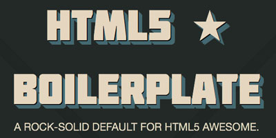
What with all these new emerging web technologies — HTML5, CSS3, @font-face and Ajax — it’s quite a challenge for the average web developer to keep on top of all the latest tricks needed to make everything run smoothly, across all browsers. When building a new site, our poor developer has to contend with CSS resets, mobile browsers, site performance, progressive enhancement, future-proofing, and of course, Internet Explorer!
Enter HTML5 Boilerplate. This is a set of HTML, CSS and other files to use as a basis for a new site. The files are loaded with tons of useful tricks and code snippets to help you build awesome sites. You just download the files, strip out the chunks of code you don’t need, and start adding your own code and content. Couldn’t be easier!
jQuery (and friends)

As the web has evolved, web apps have been getting more and more complex. Since it’s quite tedious (and hard) to write lots of complex, cross-browser JavaScript code, many JavaScript libraries have sprung up to make life easier.
jQuery is a very popular JavaScript library. It abstracts away a lot of the nitty-gritty of building web apps, such as selecting page elements for manipulation, creating animated effects, and making Ajax calls.
While jQuery is currently the most popular JavaScript library, there are many others out there, including:
Each library has its strengths and weaknesses. For example, MooTools provides a complete framework to help you write more elegant, modular JavaScript, but it has a steeper learning curve than jQuery.
Here’s a good discussion on choosing a JavaScript library.
JSON

JSON (JavaScript Object Notation) is a simple way to exchange data between 2 applications. It’s typically used by Ajax-enabled web pages to receive data from the server. It’s often used as an alternative to XML because it’s more lightweight.
Here’s a simple example of a JSON message:
{
  "widgetName": "MegaWidget",
  "price": 39.99,
  "stockLevel" : 14,
  "options": {
    "colour": "red",
    "size: "large"
  }
}
There are free code libraries — written in practically every programming language — that you can use to create and parse JSON messages.
Find out more about JSON, and read the spec, over at json.org.
LAMP

LAMP is an acronym that stands for Linux, Apache, MySQL, PHP — the 4 cornerstones of an open-source web server setup. This is one of the most commonly-used setups on the web, and is used to power a huge number of websites and web applications.
The ‘P’ in LAMP can also stand for Perl or Python — 2 other popular web programming languages.
Other variants include LAPP (which uses PostgreSQL instead of MySQL), WAMP (which runs on Windows instead of Linux), and MAMP (which runs on Mac OS X).
There are many free LAMP software packages that you can download and install to get a web server running on your computer. A popular one is XAMPP.
Minification

Minification is the process of removing unnecessary characters from source code, in order to make it download and/or run faster. It’s often used with JavaScript, and sometimes HTML and CSS too.
Many unnecessary elements can be removed from a typical source code file, including:
- Whitespace
- Newlines
- Comments
- Block delimiters (braces)
In addition, a minifier can reduce long variable names (such as myLongVariableName) to shorter names (such as x).
There are many free minifiers out there. Here’s one for JavaScript, and here’s one for HTML.
Minification differs from compression, in that a compressed file needs to be decompressed before it can be used. A minified file, while no longer human-readable, can still be run as-is by the interpreter. Often minification is used along with compression to achieve the smallest possible file sizes.
Modernizr

Modernizr is a small JavaScript library to make it easy to detect which cutting-edge HTML5 and CSS3 features the currently-running browser supports. We’re talking things like border-radius (for rounded corners), box-shadow (for drop shadows), HTML5 audio/video (and which codecs are supported), Canvas, and so on.
You can then use this feature detection to progressively enhance your web pages — that is, start with a basic design and only add cutting-edge features if the browser supports it.
Modernizr makes it very easy to determine which features are supported, because it adds classes to the page’s html element. For example, if the browser supports border-radius then Modernizr adds the class borderradius to the html element. If the browser doesn’t support it then Modernizr adds no-borderradius. You can then write CSS like this:
.borderradius #myDiv {
  /* properties for browsers that support border-radius */
}

.no-borderradius #myDiv {
  /* fallback properties for browsers that don't */
}
For example, if your chosen border looks great when curved, but terrible when straight, then you can place properties under .no-borderradius #myDiv to style the border differently for browsers that don’t support border-radius.
There’s a good Modernizr tutorial over on A List Apart.
Non-blocking JavaScript
Many web pages include external JavaScript files by using <script src="...">. Unfortunately, while a JavaScript file is downloading, the browser stops downloading the rest of the page. If the JavaScript file is large, or the network connection is slow, then this can mean a frustrating wait for users.
One way to alleviate the problem is to put all <script src="..."> tags at the end of the page, so that other elements can download first. However, users still have to suffer that pause towards the end of the page load while the JavaScript is downloaded and executed.
The solution to this problem is to write non-blocking JavaScript. This causes the script file to load in parallel with the other elements in the page, without holding everything up. Typically, you do this by adding the script dynamically to the DOM, rather than using a <script src="..."> tag. For example:
var myscript = document.createElement( 'script' );
myscript.src = 'myscript.js';
var head = document.getElementsByTagName( 'head' )[0];
head.appendChild( myscript );
For a thorough explanation of non-blocking JavaScript, see Non-blocking JavaScript Downloads.
Quirks mode
Back in the dark old days of the web, browsers were pretty terrible at sticking to the HTML and CSS standards. They would do things like including an element’s padding inside the element, instead of the padding being outside the element’s width and height (the so-called IE box model bug). They would also handle tables and images in odd ways.
Fortunately, modern browsers follow the standards much more faithfully. However, many web pages — both old and new — are coded to fit in with the quirks of these old browsers, rather than following standards. In order to provide backwards compatibility, many modern browsers include a quirks mode, which attempts to render pages using the old, quirky way of doing things.
Generally speaking, you put a browser into quirks mode by omitting the doctype, although you can also trigger it by using some specific doctypes. Here’s a useful table showing how to trigger quirks mode in various browsers.
Unicode

Unicode is a universal way to encode text written in practically any of the world’s writing systems, including Western, Arabic, Chinese, Japanese and Thai. Contrast Unicode with ASCII, which can only work with a limited number of (mainly Western) character sets.
Although it’s been around for a couple of decades now, Unicode has only recently started to hit the mainstream in terms of web development, as various popular web browsers, platforms and programming languages start to embrace it fully.
Whereas ASCII characters are 1 byte long, Unicode characters are usually 2-4 bytes in length. This can cause problems with programming languages and scripts that expect 1 character to equal 1 byte. Such languages and scripts need to be updated to cope with Unicode.
The most common way to use Unicode in a web page is using UTF-8 encoding. You can indicate that a web page is encoded using UTF-8 by placing the following line of code inside the page’s head element:
<meta http-equiv="Content-Type" content="text/html; charset=UTF-8" />
The Unicode Consortium has a list of useful Unicode character charts for reference.
UX

Many web designers these days talk about the “UX” of a website, meaning “user experience”. This term encompasses the whole relationship that a user has with a website, from usability and accessibility through to their feelings on the site’s visual design, interface, branding, and marketing message.
By definition, UX is a highly subjective thing. That said, it can be beneficial for a website designer to think about the whole experience that users have with the site, rather than focusing on a single area such as the visual design.
UX Booth is a good blog covering UX and usability issues.
WebSockets

WebSockets is a new HTML5 feature that enables a JavaScript web application to open a bidirectional TCP connection between the browser and the server. What this means in English is that the server can now push new data to the browser, rather than the browser having to continuously check for new data.
It also means much faster data transfer compared to the current Ajax approach, where a new connection is opened each time the web app wants to talk to the server.
The result of all this should be much smoother web apps and, ultimately, the death of Ajax as a means of transferring data between a JavaScript web app and a web server.
WebSockets are currently supported by Firefox 4, Chrome 4 and Safari 5. Opera will likely support it at some point. IE9… who knows?
Web storage

Web storage is a new specification (often lumped together with HTML5) that allows JavaScript apps to store data in the user’s browser. In many ways, web storage is “cookies on steroids”, being both more powerful and more flexible than cookies.
You can store a lot more data than with cookies (typically 5MB of data per domain). You can store data per tab or window session using the sessionStorage object, or store data longer term using the localStorage object.
Here’s a good tutorial on web storage that explains how to use both session storage and local storage.
Web Workers

One of the snags with JavaScript running in a browser is that it’s single-threaded. In other words, a script can only do one thing at a time.
For simple scripts that run quickly, this isn’t usually a problem. However, as web applications get ever more complex, they can tend to become sluggish for the user, especially on mobile devices. One of the main reasons for this is JavaScript’s single-threaded nature. If a script is performing complex calculations, the user has to wait until it’s finished before they can continue using the app’s user interface.
Web Workers are a new specification that attempts to alleviate this problem. While not the same as true multi-threading, they do allow chunks of heavyweight JavaScript code to run in the background, without slowing down or blocking the user interface. The result is a snappier web application that responds more quickly to the user.
Web Workers are currently supported by Firefox, Safari, Chrome and Opera. IE doesn’t support them currently, but IE9 might support it. Fingers crossed, eh!
The Opera dev site has a good intro to Web Workers, with some code examples.
WOFF

For a while now, web developers have been able to include downloadable fonts in their pages using the CSS @font-face rule. This is great, as it means that designers are no longer limited to using the small range of system fonts (Arial, Times and so on) for text in their web pages.
Unfortunately, @font-face has been slow to take off, mainly due to licensing and browser compatibility issues. Services like Typekit and Font Squirrel have sprung up to help with these issues, by providing a way to use properly-licensed fonts that work across all modern browsers.
WOFF — the Web Open Font Format — aims to solve these problems once and for all. It’s a new file format that can contain TrueType, OpenType and Open Font Format fonts. It offers built-in compression, as well as licensing information to help ensure that fonts are properly licensed for use. What’s more, since it’s a standard, we can expect all modern browsers to support it soon (yes, even IE9 seems likely).
This means that web designers will be able to download a WOFF web font (whether free or paid), upload it to their site, link to it with @font-face, and have their text look gorgeous, without any extra fussing. Lovely!
HTML5Rocks has a good tutorial on using @font-face, along with a table showing current browser support.
Summary
In this post I’ve taken a look at 25 common web technology buzzwords that are floating around at the moment. I hope you found the list useful (and entertaining!).
Do you have any additions to the list? Or maybe there’s a buzzword that you’d like me to explain? If so, please feel free to comment below. Thanks! 🙂
[Achilles & Ajax photo credit: clairity]
Great article, clarifies a lot of the more common web acronyms that you may hear day-to-day.
I often find that people use the words JavaScript, jQuery, AJAX and DHTML interchangeably whereas in fact they are all different technologies/implementations that use JavaScript.
PS: Does anyone talk about DHTML any more?
Thanks Ben. 🙂 I actually had DHTML in there originally but then took it out, figuring that it’s not very “of-the-moment” these days! Here’s what I wrote:
Dynamic HTML
The term “dynamic HTML”, or DHTML, has been around for years. It refers to the technique of altering the contents of a Web page after it has been downloaded from the server. Usually you do this by using JavaScript to modify the page’s DOM. These days it’s common to use a JavaScript library such as jQuery to make the job easier.
Whenever you see a Web page containing elements that can be toggled or expanded/contracted, or elements that slide in or out, you’re looking at dynamic HTML in action.
Since the term has negative connotations with the early days of JavaScript and cross-browser nightmares, it’s not used as much as it used to be. Developers prefer terms such as “DOM scripting” or “DOM manipulation” these days.
Cheers,
Matt
Matt,
Yes, a good summation of DHTML. I don’t like using the term as I feel it does feel a bit antiquated now and reminds my of badly done dropdown navigation menus. 🙂
Having said that, DHTML does do a good job of describing all those various implement of HTML with …
– Ben
One guy can’t thank you guys, and other readers, enough for this free service you provide us here. (Not free? Ehehehe!)
Well, for me, from my point of view, our way of saying thanks means that at least we should drop a word or two thanking for all the trouble a huge post like this must have had.
Thank you! (Going to read it all later!)
Cheers from Portugal
Márcio Guerra
Thanks Márcio – yes it did take a long time to write that one. 🙂