
In this tutorial I’m going to show you how to build a lovely, interactive pie chart using the latest HTML5 technologies. Not that long ago, this kind of thing was only practical to do with Flash. Now, thanks to advances such as the HTML5 canvas element, we can create pretty nifty animated effects using nothing but JavaScript, CSS, and a small sprinkling of maths!
Step 1. Create the markup
Here’s the markup for our chart page:
<!DOCTYPE html>
<html xmlns="http://www.w3.org/1999/xhtml">
<head>
<title>Elated.com | Snazzy Animated Pie Chart with HTML5 and jQuery - Demo</title>
<meta http-equiv="Content-Type" content="text/html;charset=utf-8" >
</head>
<body>
<div id="container">
<div class="wideBox">
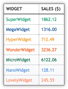
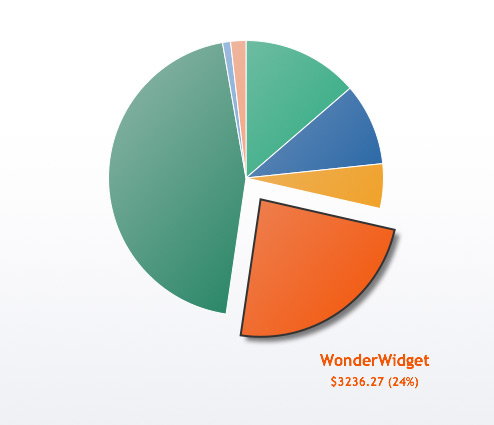
<h1>Widgets Sold in 2010</h1>
<p>Click a colour in the chart, or an item in the table, to pull out a slice! <a href="#">Back to Tutorial</a></p>
</div>
<canvas id="chart" width="600" height="500"></canvas>
<table id="chartData">
<tr>
<th>Widget</th><th>Sales ($)</th>
</tr>
<tr style="color: #0DA068">
<td>SuperWidget</td><td>1862.12</td>
</tr>
<tr style="color: #194E9C">
<td>MegaWidget</td><td>1316.00</td>
</tr>
<tr style="color: #ED9C13">
<td>HyperWidget</td><td>712.49</td>
</tr>
<tr style="color: #ED5713">
<td>WonderWidget</td><td>3236.27</td>
</tr>
<tr style="color: #057249">
<td>MicroWidget</td><td>6122.06</td>
</tr>
<tr style="color: #5F91DC">
<td>NanoWidget</td><td>128.11</td>
</tr>
<tr style="color: #F88E5D">
<td>LovelyWidget</td><td>245.55</td>
</tr>
</table>
<div class="wideBox">
<p>© Elated.com | <a href="#">Back to Tutorial</a></p>
<p style="font-size: .8em"><a rel="license" href="http://creativecommons.org/licenses/by/3.0/"><img alt="Creative Commons License" style="border-width:0" src="http://i.creativecommons.org/l/by/3.0/88x31.png" /></a><br />This <span xmlns:dc="http://purl.org/dc/elements/1.1/" href="http://purl.org/dc/dcmitype/Text" rel="dc:type">work</span> by <a xmlns:cc="http://creativecommons.org/ns#" href="http://www.elated.com/" property="cc:attributionName" rel="cc:attributionURL">http://www.elated.com/</a> is licensed under a <a rel="license" href="http://creativecommons.org/licenses/by/3.0/">Creative Commons Attribution 3.0 Unported License</a>.</p>
</div>
</div>
</body>
</html>
The markup is pretty simple. It contains:
- A
"container"divto wrap and centre the content - An HTML5
canvaselement for the pie chart - A
tableelement containing the chart data - Header and footer boxes containing the chart title, copyright and so on
Notice that the tr (table row) elements in the table are all given their own colours. Later, we’ll use our JavaScript to read these colour values and use them to colour the corresponding pie chart slices.
Step 2. Create the CSS
Now we’ve created our basic HTML page, let’s add some CSS to style the various elements in the page:
<style>

body {
  background: #fff;
  color: #333;
  font-family: "Trebuchet MS", Verdana, Arial, Helvetica, sans-serif;
  font-size: 0.9em;
  padding: 40px;
}

.wideBox {
  clear: both;
  text-align: center;
  margin-bottom: 50px;
  padding: 10px;
  background: #ebedf2;
  border: 1px solid #333;
  line-height: 80%;
}

#container {
  width: 900px;
  margin: 0 auto;
}

#chart, #chartData {
  border: 1px solid #333;
  background: #ebedf2 url("images/gradient.png") repeat-x 0 0;
}

#chart {
  display: block;
  margin: 0 0 50px 0;
  float: left;
  cursor: pointer;
}

#chartData {
  width: 200px;
  margin: 0 40px 0 0;
  float: right;
  border-collapse: collapse;
  box-shadow: 0 0 1em rgba(0, 0, 0, 0.5);
  -moz-box-shadow: 0 0 1em rgba(0, 0, 0, 0.5);
  -webkit-box-shadow: 0 0 1em rgba(0, 0, 0, 0.5);
  background-position: 0 -100px;
}

#chartData th, #chartData td {
  padding: 0.5em;
  border: 1px dotted #666;
  text-align: left;
}

#chartData th {
  border-bottom: 2px solid #333;
  text-transform: uppercase;
}

#chartData td {
  cursor: pointer;
}

#chartData td.highlight {
  background: #e8e8e8;
}

#chartData tr:hover td {
  background: #f0f0f0;
}

</style>
Again, no big surprises here. The CSS contains rules for the page body, the wide header/footer boxes, the container, the #chart canvas element, and the #chartData table element.
A couple of points to note:
- The
#chartand#chartDataelements are given a subtle gradient background, created using the imagegradient.png(included in the code download). Yes, you can even have background images oncanvaselements! - We’ve used the CSS3
box-shadowproperty (and its vendor-specific equivalents) to add a drop shadow to the data table. (While it’s also possible to add a drop shadow to thecanvaselement, I found that this really slowed down the pie chart animation on WebKit browsers.)
Step 3. Include the jQuery and ExplorerCanvas libraries
Now we’re ready to start writing our JavaScript code. First of all, include 2 libraries:
<script src="http://ajax.googleapis.com/ajax/libs/jquery/1.4.2/jquery.min.js"></script>
<!--[if IE]>
<script src="http://explorercanvas.googlecode.com/svn/trunk/excanvas.js"></script>
<![endif]-->
<script>
- jQuery
This should be fairly self-explanatory. If not, you might like to read our other jQuery tutorials! - ExplorerCanvas
Internet Explorer — bless it — doesn’t supportcanvas. (IE 9 might or might not, at the time of writing.) Fortunately some very clever coders created ExplorerCanvas, a library that emulates most of the canvas methods and properties using IE’s SVG capabilities. It’s not perfect, but it’ll do the job for us. Since only IE needs this library, we use conditional comments to load this library just for IE.
We’ve linked directly to both these libraries on Google’s CDN, but you could just as easily download the 2 .js files and link to them on your own site.
Step 4. Create the main function, config settings, and useful variables
We’ll wrap our code in a main function called pieChart(). That way, we can keep all functions and variables related to the chart in one place, and not pollute the global scope. We’ll then use jQuery to call pieChart() when the page’s DOM is ready.
Let’s start by putting various useful configuration settings inside pieChart():
// Run the code when the DOM is ready
$( pieChart );

function pieChart() {

  // Config settings
  var chartSizePercent = 55;                        // The chart radius relative to the canvas width/height (in percent)
  var sliceBorderWidth = 1;                         // Width (in pixels) of the border around each slice
  var sliceBorderStyle = "#fff";                    // Colour of the border around each slice
  var sliceGradientColour = "#ddd";                 // Colour to use for one end of the chart gradient
  var maxPullOutDistance = 25;                      // How far, in pixels, to pull slices out when clicked
  var pullOutFrameStep = 4;                         // How many pixels to move a slice with each animation frame
  var pullOutFrameInterval = 40;                    // How long (in ms) between each animation frame
  var pullOutLabelPadding = 65;                     // Padding between pulled-out slice and its label
  var pullOutLabelFont = "bold 16px 'Trebuchet MS', Verdana, sans-serif";  // Pull-out slice label font
  var pullOutValueFont = "bold 12px 'Trebuchet MS', Verdana, sans-serif";  // Pull-out slice value font
  var pullOutValuePrefix = "$";                     // Pull-out slice value prefix
  var pullOutShadowColour = "rgba( 0, 0, 0, .5 )";  // Colour to use for the pull-out slice shadow
  var pullOutShadowOffsetX = 5;                     // X-offset (in pixels) of the pull-out slice shadow
  var pullOutShadowOffsetY = 5;                     // Y-offset (in pixels) of the pull-out slice shadow
  var pullOutShadowBlur = 5;                        // How much to blur the pull-out slice shadow
  var pullOutBorderWidth = 2;                       // Width (in pixels) of the pull-out slice border
  var pullOutBorderStyle = "#333";                  // Colour of the pull-out slice border
  var chartStartAngle = -.5 * Math.PI;              // Start the chart at 12 o'clock instead of 3 o'clock

  // Declare some variables for the chart
  var canvas;                       // The canvas element in the page
  var currentPullOutSlice = -1;     // The slice currently pulled out (-1 = no slice)
  var currentPullOutDistance = 0;   // How many pixels the pulled-out slice is currently pulled out in the animation
  var animationId = 0;              // Tracks the interval ID for the animation created by setInterval()
  var chartData = [];               // Chart data (labels, values, and angles)
  var chartColours = [];            // Chart colours (pulled from the HTML table)
  var totalValue = 0;               // Total of all the values in the chart
  var canvasWidth;                  // Width of the canvas, in pixels
  var canvasHeight;                 // Height of the canvas, in pixels
  var centreX;                      // X-coordinate of centre of the canvas/chart
  var centreY;                      // Y-coordinate of centre of the canvas/chart
  var chartRadius;                  // Radius of the pie chart, in pixels

  // Set things up and draw the chart
  init();
Most of these lines should be easy to understand by looking at the comments in the code. A few warrant closer inspection:
chartSizePercent- To allow room for pulling out slices and displaying labels, we want the actual pie chart to be a fair bit smaller than the canvas. In this case, 55% is a good setting.
chartStartAngle- By default, angles in JavaScript — as in most other languages — are specified in radians, where 0 radians is the 3 o’clock position. Since we want to start our chart from 12 o’clock, we’ll use this setting to subtract π/2 radians — that is, a quarter turn — from various angles in the code. I’ve explained this visually in the figure below.
currentPullOutSliceandcurrentPullOutDistance- Since we’ll be animating a slice as it pulls out from the pie, we need these variables to track the animation.
currentPullOutSlicetracks which slice is being pulled out, or has been pulled out (a value of -1 means that no slices are pulled out), andcurrentPullOutDistancetracks how much the slice has been pulled out so far. animationId- This will hold the value returned by
setInterval()when we create the animation. It’s a numeric ID that we can then pass toclearInterval()when we want to end the animation. chartData- We’ll use this array to store data about each slice in the chart, including its label and value (pulled from the HTML table), and its start and end angles.
chartColours- This array will hold the colour of each slice in the chart, again pulled from the HTML table.
init()- The last line of code calls an
init()function, which sets up the chart and gets things going. We’ll write this function next!
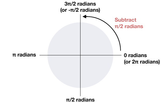
chartStartAngle to subtract π/2 radians (a quarter turn) from the slice angles when drawing the chart.Step 5. Initialise the chart
We’re now ready to set up our chart. Let’s write an init() function to do all the setup for us:
  /**
   * Set up the chart data and colours, as well as the chart and table click handlers,
   * and draw the initial pie chart
   */

  function init() {

    // Get the canvas element in the page
    canvas = document.getElementById('chart');

    // Exit if the browser isn't canvas-capable
    if ( typeof canvas.getContext === 'undefined' ) return;

    // Initialise some properties of the canvas and chart
    canvasWidth = canvas.width;
    canvasHeight = canvas.height;
    centreX = canvasWidth / 2;
    centreY = canvasHeight / 2;
    chartRadius = Math.min( canvasWidth, canvasHeight ) / 2 * ( chartSizePercent / 100 );

    // Grab the data from the table,
    // and assign click handlers to the table data cells

    var currentRow = -1;
    var currentCell = 0;

    $('#chartData td').each( function() {
      currentCell++;
      if ( currentCell % 2 != 0 ) {
        currentRow++;
        chartData[currentRow] = [];
        chartData[currentRow]['label'] = $(this).text();
      } else {
       var value = parseFloat($(this).text());
       totalValue += value;
       value = value.toFixed(2);
       chartData[currentRow]['value'] = value;
      }

      // Store the slice index in this cell, and attach a click handler to it
      $(this).data( 'slice', currentRow );
      $(this).click( handleTableClick );

      // Extract and store the cell colour
      if ( rgb = $(this).css('color').match( /rgb((d+), (d+), (d+)/) ) {
        chartColours[currentRow] = [ rgb[1], rgb[2], rgb[3] ];
      } else if ( hex = $(this).css('color').match(/#([a-fA-F0-9]{2})([a-fA-F0-9]{2})([a-fA-F0-9]{2})/) ) {
        chartColours[currentRow] = [ parseInt(hex[1],16) ,parseInt(hex[2],16), parseInt(hex[3], 16) ];
      } else {
        alert( "Error: Colour could not be determined! Please specify table colours using the format '#xxxxxx'" );
        return;
      }

    } );

    // Now compute and store the start and end angles of each slice in the chart data

    var currentPos = 0; // The current position of the slice in the pie (from 0 to 1)

    for ( var slice in chartData ) {
      chartData[slice]['startAngle'] = 2 * Math.PI * currentPos;
      chartData[slice]['endAngle'] = 2 * Math.PI * ( currentPos + ( chartData[slice]['value'] / totalValue ) );
      currentPos += chartData[slice]['value'] / totalValue;
    }

    // All ready! Now draw the pie chart, and add the click handler to it
    drawChart();
    $('#chart').click ( handleChartClick );
  }
Note that init(), as well as all the other functions we’ll create from now on, should go inside the outer pieChart() function. Functions within functions, where the inner function accesses variables declared in the outer function, are known as closures.
The init() function is fairly lengthy, so let’s break it down:
- Get the
canvaselement
First we get the"#chart"canvaselement from the page and store it in an object calledcanvas. We’ll do all of our drawing on the canvas through this object. - Check for
canvassupport in the browser
Before we do anything else, we should check that the browser actually supports the HTML5canvaselement. We do this by seeing if thecanvasobject contains thegetContext()method — a frequently-used method that we’ll use later on. If it doesn’t, then the browser presumably doesn’t supportcanvas, so we exit the function. - Compute and store the canvas and chart dimensions
Since we’ll frequently use values like the canvas width, height, and centre, as well as the chart radius, we compute these values now and store them in variables for use later on. - Grab the data from the table
We use a jQuery selector —$('#chartData td')— to select all the data cells in the table. We can then iterate through these cells with the jQueryeach()method. For each cell, we determine if it’s a label (e.g. “SuperWidget”) or a value (e.g. “1862.12”) cell, based on whether it’s in the left or right column. We then store the cell contents under the'label'or'value'key in an associative array, which we then place inside thechartDataarray. - Store the slice index with each table cell, and assign a
clickhandler to the cell
While we’re looping through the table cells, we store the current row index (and therefore slice index) in a key called'slice'inside the jQuery object holding the table cell. We do this using the handy jQuerydata()method. That way, we can easily find out which slice a cell refers to whenever the cell is clicked on. We also assign aclickevent handler function,handleTableClick(), to the cell, so that when the cell is clicked on we can animate the chart appropriately. We’ll create this function in a moment. - Extract the cell colour and store it in the
chartColoursarray
In the last part of the loop, we use jQuery to extract the colour of the cell by looking at itscolorCSS property. We then store its colour in thechartColorsarray, as a 3-element nested array containing the red, green, and blue values (in decimal).Most browsers return an element’s colour in the format
"rgb(r, g, b)". However, some browsers (*cough* IE *cough*) simply return the colour in whatever format it was specified in the CSS (e.g."#RRGGBB"). So our code uses regular expressions to check for both scenarios. - Compute and store the start and end angles of each slice
We’ll need to know the angles at which each pie slice starts and ends fairly often throughout the code, so we’ll pre-compute them here and store them in'startAngle'and'endAngle'elements of the associative array insidechartData. We do this by looping through the slices, usingcurrentPosto keep a record of the running total as a ratio of the grand total (between 0 and 1). We can then multiply this running total by 2π radians (a whole turn) to get the start and end angles for each slice.The slice angles stored in
chartDatarun from 0 to 2π (3 o’clock to 3 o’clock). We’ll need to offset these angles using thechartStartAnglevariable when we actually draw the slices, so that the pie starts from 12 o’clock instead. - Draw the chart and attach a
clickhandler to thecanvas
Finally, ourinit()function calls adrawChart()function to draw the initial pie chart. (We’ll create this function later.) It also assigns aclickevent handler function,handleChartClick(), to thecanvaselement, so that when the chart is clicked we can pull out or push in a slice as appropriate. We’ll write this function next.
Step 6. Write a click handler for the pie chart
We now need to write our handleChartClick() event handler function. This is called automatically whenever the user clicks inside the canvas element.
Here’s the code for the function:
  /**
   * Process mouse clicks in the chart area.
   *
   * If a slice was clicked, toggle it in or out.
   * If the user clicked outside the pie, push any slices back in.
   *
   * @param Event The click event
   */

  function handleChartClick ( clickEvent ) {

    // Get the mouse cursor position at the time of the click, relative to the canvas
    var mouseX = clickEvent.pageX - this.offsetLeft;
    var mouseY = clickEvent.pageY - this.offsetTop;

    // Was the click inside the pie chart?
    var xFromCentre = mouseX - centreX;
    var yFromCentre = mouseY - centreY;
    var distanceFromCentre = Math.sqrt( Math.pow( Math.abs( xFromCentre ), 2 ) + Math.pow( Math.abs( yFromCentre ), 2 ) );

    if ( distanceFromCentre <= chartRadius ) {

      // Yes, the click was inside the chart.
      // Find the slice that was clicked by comparing angles relative to the chart centre.

      var clickAngle = Math.atan2( yFromCentre, xFromCentre ) - chartStartAngle;
      if ( clickAngle < 0 ) clickAngle = 2 * Math.PI + clickAngle;

      for ( var slice in chartData ) {
        if ( clickAngle >= chartData[slice]['startAngle'] && clickAngle <= chartData[slice]['endAngle'] ) {

          // Slice found. Pull it out or push it in, as required.
          toggleSlice ( slice );
          return;
        }
      }
    }

    // User must have clicked outside the pie. Push any pulled-out slice back in.
    pushIn();
  }
As with all jQuery event handlers, handleChartClick() should accept a jQuery Event object as an argument. This Event object contains useful information about the click event, including the coordinates of the point that was clicked in the page.
Let’s break this function down:
- Get the coordinates of the mouse click
We can read the coordinates of the clicked point via thepageXandpageYproperties of theEventobject. However, these coordinates are relative to the page, so we need to subtract the coordinates of the top left corner of thecanvaselement to get the position relative to the canvas. Fortunately this is easy, since thethiskeyword in aclickevent handler refers to the clicked element (thecanvasin this case). We can then read the element’s top left corner position usingoffsetLeftandoffsetTop. - Determine if the click was inside the pie chart
Now we know what part of the canvas was clicked, we need to find out if it was inside the radius of the pie chart. We use Pythagoras’ theorem to work out the distance of the click from the centre of the pie chart. This distance is the hypotenuse of the right triangle formed between the x-axis position of the clicked point relative to the centre, the y-axis position of the clicked point relative to the centre, and the centre itself. If this distance is less than the chart radius then the click was inside the chart. Easy! - Find the slice that was clicked
Assuming the click was inside the pie chart, we then need to work out which slice was clicked. To do this, we first calculate the angle of the click relative to the chart’s x axis using theatan2()function. We subtractchartStartAnglefrom this value to allow for the fact that the pie chart is shifted a quarter turn. Also, sinceatan2()can return negative angles, we add the value to 2π if it’s negative, so that we’re always working with positive angles between 0 and 2π. Now we can loop through the slices until we find the slice whose start and end angles are either side of our adjusted click angle. That’s our clicked slice. - Toggle the clicked slice
Now that we know which slice was clicked, we call a function calledtoggleSlice(), passing in the slice index. This function starts pulling the slice out if it’s currently in, or pushes it back in if it’s currently out. (We’ll write thetoggleSlice()function in a moment.) - If the user clicked outside the chart, push any pulled-out slice back in
If the user clicked outside the chart then it would be nice if any pulled-out slice went back in, so at the end of our function — which is only reached if the user clicked outside the chart — we call apushIn()function that pushes any pulled-out slice back in. (Again, we’ll write thepushIn()function in a moment.)
Step 7. Write a click handler for the table
Our table click handler is actually called whenever the user clicks on a data cell in the table. Its job is to toggle the corresponding pie slice in or out. Here’s the code:
  /**
   * Process mouse clicks in the table area.
   *
   * Retrieve the slice number from the jQuery data stored in the
   * clicked table cell, then toggle the slice
   *
   * @param Event The click event
   */

  function handleTableClick ( clickEvent ) {
    var slice = $(this).data('slice');
    toggleSlice ( slice );
  }
The table click handler is, thankfully, a lot simpler than the chart click handler! Remember how, in the init() function, we stored the slice index with each table cell using the jQuery data() method? This makes it really easy for us to determine which slice to toggle based on the clicked table cell, by simply calling $(this).data('slice').
Step 8. Write a function to toggle a slice in or out
This utility function is called from the 2 click handler functions we just made. Its job is to push in the given slice if it’s pulled out, or pull it out if it’s not:
  /**
   * Push a slice in or out.
   *
   * If it's already pulled out, push it in. Otherwise, pull it out.
   *
   * @param Number The slice index (between 0 and the number of slices - 1)
   */

  function toggleSlice ( slice ) {
    if ( slice == currentPullOutSlice ) {
      pushIn();
    } else {
      startPullOut ( slice );
    }
  }
As you can see, the function doesn’t do the actual pushing or pulling; it defers these operations to the pushIn() and startPullOut() functions, which we’ll write next.
Step 9. Create a function to pull a slice out

When a slice is pulled out, we want to animate the pull-out effect. To do this, we’ll need to use JavaScript’s setInterval() function to draw each animation frame every few milliseconds.
This function, startPullOut(), sets up the animation. It uses setInterval() to call the animation function, animatePullOut(), and also highlights the corresponding data row in the table:
  /**
   * Start pulling a slice out from the pie.
   *
   * @param Number The slice index (between 0 and the number of slices - 1)
   */

  function startPullOut ( slice ) {

    // Exit if we're already pulling out this slice
    if ( currentPullOutSlice == slice ) return;

    // Record the slice that we're pulling out, clear any previous animation, then start the animation
    currentPullOutSlice = slice;
    currentPullOutDistance = 0;
    clearInterval( animationId );
    animationId = setInterval( function() { animatePullOut( slice ); }, pullOutFrameInterval );

    // Highlight the corresponding row in the key table
    $('#chartData td').removeClass('highlight');
    var labelCell = $('#chartData td:eq(' + (slice*2) + ')');
    var valueCell = $('#chartData td:eq(' + (slice*2+1) + ')');
    labelCell.addClass('highlight');
    valueCell.addClass('highlight');
  }
A few notes on this function:
- The call to
setInterval()passes in an anonymous function, which in turn callsanimatePullOut( slice ). This is another example of a closure, since the anonymous function accesses a variable (slice) in the scope of the enclosing function. This ensures thatsetInterval()has access to theanimatePullOut()function, as well as the value ofslice. - We also pass the interval, in milliseconds, to
setInterval(), using the variablepullOutFrameInterval. This causessetInterval()to callanimatePullOut()everypullOutFrameIntervalmilliseconds. setInterval()returns an in interval ID, which we store in the variableanimationId. We can then callclearInterval()with this ID whenever we need to stop the animation.- To highlight the table row, we first remove the
'highlight'class from all cells in the table, then we use the jQuery:eq()selector to find the 2 cells in the target row, and add the'highlight'class to these cells.
Step 10. Create a function to animate the pull-out effect
Now we need to write animatePullOut(), the function that animates each frame of the pull-out effect. This function is pretty simple, since it defers the actual drawing of the frame to the drawChart() function (which we’ll create shortly):
  /**
   * Draw a frame of the pull-out animation.
   *
   * @param Number The index of the slice being pulled out
   */

  function animatePullOut ( slice ) {

    // Pull the slice out some more
    currentPullOutDistance += pullOutFrameStep;

    // If we've pulled it right out, stop animating
    if ( currentPullOutDistance >= maxPullOutDistance ) {
      clearInterval( animationId );
      return;
    }

    // Draw the frame
    drawChart();
  }
As you can see, this function simply adds the value of pullOutFrameStep to currentPullOutDistance to pull out the slice a few more pixels, then calls drawChart() to draw the frame. It also checks if the slice has been pulled out to its maximum distance (maxPullOutDistance). If it has, then the animation is stopped by calling clearInterval().
Step 11. Create a function to push slices back in
This function, pushIn(), is called by the handleChartClick() and toggleSlice() functions whenever we need to push any currently pulled-out slice back into the pie:
  /**
   * Push any pulled-out slice back in.
   *
   * Resets the animation variables and redraws the chart.
   * Also un-highlights all rows in the table.
   */

  function pushIn() {
    currentPullOutSlice = -1;
    currentPullOutDistance = 0;
    clearInterval( animationId );
    drawChart();
    $('#chartData td').removeClass('highlight');
  }
This function resets the currentPullOutSlice and currentPullOutDistance variables, clears any current animation by calling clearInterval(), redraws the chart to reflect the new conditions, and removes highlights from any cells in the table.
Step 12. Write a function to draw the chart
Now we need the function to actually draw the chart! This function, drawChart(), is actually pretty straightforward, since it leaves the drawing work to another function called drawSlice(), which we’ll create next:
  /**
   * Draw the chart.
   *
   * Loop through each slice of the pie, and draw it.
   */

  function drawChart() {

    // Get a drawing context
    var context = canvas.getContext('2d');

    // Clear the canvas, ready for the new frame
    context.clearRect ( 0, 0, canvasWidth, canvasHeight );

    // Draw each slice of the chart, skipping the pull-out slice (if any)
    for ( var slice in chartData ) {
      if ( slice != currentPullOutSlice ) drawSlice( context, slice );
    }

    // If there's a pull-out slice in effect, draw it.
    // (We draw the pull-out slice last so its drop shadow doesn't get painted over.)
    if ( currentPullOutSlice != -1 ) drawSlice( context, currentPullOutSlice );
  }
Let’s look at each step of the function:
- Get a drawing context
In order to draw anything on acanvaselement, you first need to get a drawing context. This is an object that exposes the various canvas drawing methods. To get the context, we callcanvas.getContext(), passing in'2d'to indicate we want a 2D context. (3D canvases are on their way, but still future tech at the time of writing!) - Clear the canvas
Since we’re likely to be drawing an animation frame, we first need to clear the canvas of any previous frame. There are a few different ways to wipe a canvas, but I’ve found that theclearRect()method produces the smoothest animation across a range of browsers. As you’d imagine, this clears a rectangular area of pixels specified by the top-left x and y coordinates of the rectangle, the width, and the height. - Draw all slices except the pull-out slice
Now we can loop through each slice in thechartDataarray and, skipping any pull-out slice for now, draw the slice by callingdrawSlice(). We pass in the drawing context and the index of the slice to draw. - Draw the pull-out slice
Finally, we can draw the slice that’s currently being pulled out (or has been pulled out). We check if there is a pull-out slice by looking at the value ofcurrentPullOutSlice. If there is, then we calldrawSlice()once again, this time passing in the index of the pull-out slice.
Why do we draw the pull-out slice last? Because the pull-out slice has a drop shadow. If we drew all slices in order then the slice after the pull-out slice would sometimes paint over part of the drop shadow. Which would look a bit uncool.
Step 13. Build a function to draw each slice in the chart
Now, at last, we come to the function that is, in many ways, the heart of the script. drawSlice() takes the drawing context that we retreived in drawChart(), as well as the index of the slice to draw, then draws the slice on the canvas:
  /**
   * Draw an individual slice in the chart.
   *
   * @param Context A canvas context to draw on
   * @param Number The index of the slice to draw
   */

  function drawSlice ( context, slice ) {

    // Compute the adjusted start and end angles for the slice
    var startAngle = chartData[slice]['startAngle']  + chartStartAngle;
    var endAngle = chartData[slice]['endAngle']  + chartStartAngle;

    if ( slice == currentPullOutSlice ) {

      // We're pulling (or have pulled) this slice out.
      // Offset it from the pie centre, draw the text label,
      // and add a drop shadow.

      var midAngle = (startAngle + endAngle) / 2;
      var actualPullOutDistance = currentPullOutDistance * easeOut( currentPullOutDistance/maxPullOutDistance, .8 );
      startX = centreX + Math.cos(midAngle) * actualPullOutDistance;
      startY = centreY + Math.sin(midAngle) * actualPullOutDistance;
      context.fillStyle = 'rgb(' + chartColours[slice].join(',') + ')';
      context.textAlign = "center";
      context.font = pullOutLabelFont;
      context.fillText( chartData[slice]['label'], centreX + Math.cos(midAngle) * ( chartRadius + maxPullOutDistance + pullOutLabelPadding ), centreY + Math.sin(midAngle) * ( chartRadius + maxPullOutDistance + pullOutLabelPadding ) );
      context.font = pullOutValueFont;
      context.fillText( pullOutValuePrefix + chartData[slice]['value'] + " (" + ( parseInt( chartData[slice]['value'] / totalValue * 100 + .5 ) ) +  "%)", centreX + Math.cos(midAngle) * ( chartRadius + maxPullOutDistance + pullOutLabelPadding ), centreY + Math.sin(midAngle) * ( chartRadius + maxPullOutDistance + pullOutLabelPadding ) + 20 );
      context.shadowOffsetX = pullOutShadowOffsetX;
      context.shadowOffsetY = pullOutShadowOffsetY;
      context.shadowBlur = pullOutShadowBlur;

    } else {

      // This slice isn't pulled out, so draw it from the pie centre
      startX = centreX;
      startY = centreY;
    }

    // Set up the gradient fill for the slice
    var sliceGradient = context.createLinearGradient( 0, 0, canvasWidth*.75, canvasHeight*.75 );
    sliceGradient.addColorStop( 0, sliceGradientColour );
    sliceGradient.addColorStop( 1, 'rgb(' + chartColours[slice].join(',') + ')' );

    // Draw the slice
    context.beginPath();
    context.moveTo( startX, startY );
    context.arc( startX, startY, chartRadius, startAngle, endAngle, false );
    context.lineTo( startX, startY );
    context.closePath();
    context.fillStyle = sliceGradient;
    context.shadowColor = ( slice == currentPullOutSlice ) ? pullOutShadowColour : "rgba( 0, 0, 0, 0 )";
    context.fill();
    context.shadowColor = "rgba( 0, 0, 0, 0 )";

    // Style the slice border appropriately
    if ( slice == currentPullOutSlice ) {
      context.lineWidth = pullOutBorderWidth;
      context.strokeStyle = pullOutBorderStyle;
    } else {
      context.lineWidth = sliceBorderWidth;
      context.strokeStyle = sliceBorderStyle;
    }

    // Draw the slice border
    context.stroke();
  }
Let’s take a deeeep breath, and work through each step of this function. (Actually, it’s not really that bad, just a bit long!)
- Compute the adjusted slice angles
Remember that the slice angles in thechartDataarray start from 0 radians (3 o’clock), but we want our chart to start from 12 o’clock. So we need to subtract a quarter turn from the slice angles before we use them to draw the slice. We do this using thechartStartAnglevariable, storing the results instartAngleandendAngle. - For a pull-out slice, offset the slice from the centre
The next block of code checks to see if we’re drawing a pull-out slice. If we are, then we need to offset the slice from the centre. To do this, we compute the angle of the middle of the slice (halfway between the start and end angle), and work out the number of pixels to pull the slice out by multiplyingcurrentPullOutDistanceby the result of theeaseOut()function (more on this function in a moment). We can then use simple trigonometry — cosine and sine — to compute the new start position for the slice. - For a pull-out slice, draw the label and set the drop shadow
After computing the start position for the pull-out slice, we then draw the text label, which consists of the label from the table (e.g. “SuperWidget”), along with the value (e.g. “$1862.12”) and the percentage of the total value. Most of this code should be self-explanatory.context.fillText()expects the text to draw, followed by the X and Y coordinates of the point to start the text. Again, we compute these X and Y values using cosine and sine, adding a bit of padding (pullOutLabelPadding) to the distance from the centre to allow plenty of room for the label. - For a regular slice, draw the slice from the centre
If the slice isn’t a pull-out slice then we just set the slice’s start coordinates to be the centre of the pie. - Set up the gradient
Our gradient fill adds a bit of extra pizazz to the chart. We usecontext.createLinearGradient()to create a gradient running from the top left of the canvas to three-quarters of the way across and down the canvas. Then we calladdColorStop()on the gradient to add 2 colour stops: the gradient start colour at the start of the gradient ("#ddd", or light grey, in our settings), and the slice colour at the end of the gradient. - Draw the slice
To draw the segment, we first start a path by callingbeginPath(). Then we move to the start point usingmoveTo(), then draw an arc usingarc(). This function draws a straight line from the current position out to the start angle of the arc, then draws the arc to the end angle. We then complete the segment shape with anotherlineTo()back to the start, and finish the path withclosePath(). Then we specify the gradient for the fill style, add the drop shadow if it’s a pull-out slice, and callfill()to fill the slice.The last argument to
arc()—false— tells the function to draw the arc clockwise instead of anticlockwise.The shadow colours are specified using
rgbaformat, where the last value is the opacity. So"rgba( 0, 0, 0, 0 )"draws the shadow with zero opacity, effectively turning off the shadow when it’s not needed. - Draw the slice border
Finally, we draw a thin white border around the slice if it’s a regular slice, or a thicker dark border if it’s a pulled-out slice. We get the widths and colours from the variables we created in theinit()function, and set thecontext.lineWidthandcontext.strokeStyleproperties accordingly. We then draw the border by callingcontext.stroke().
Step 14. Create an easing function
Our very last function is called an easing function. It’s called by drawSlice(), and its job is to adjust the position of the slice as it animates so that it appears to slow down towards the end of the animation:
  /**
   * Easing function.
   *
   * A bit hacky but it seems to work! (Note to self: Re-read my school maths books sometime)
   *
   * @param Number The ratio of the current distance travelled to the maximum distance
   * @param Number The power (higher numbers = more gradual easing)
   * @return Number The new ratio
   */

  function easeOut( ratio, power ) {
    return ( Math.pow ( 1 - ratio, power ) + 1 );
  }
This is a bit of a mishmash of various easing functions I found on the web, and frankly I’m not entirely sure how it works, but it does. 🙂 The basic idea is that you pass it the ratio (how far along the path the slice currently is), and the power (how abruptly it should slow down). The function then returns the new ratio, adjusted so that the slice takes bigger steps at the start of the animation, and smaller steps towards the end.
There’s some great info on easing functions over at ActionScript.org.
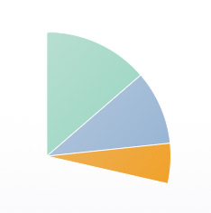
The end result
Here’s the demo again. I’m pretty pleased with the result: a pie chart that is both snazzy and useful! But does it work well across all browsers? Well, nearly. Here’s how it runs on my somewhat long-in-the-tooth Core Duo iMac:
- Firefox 4 Beta 2
- Lovely and smooth. No problems here!
- Opera 10.6
- Ditto.
- Safari 5 and Chrome 5 (and presumably other WebKit browsers)
- Fairly smooth, but no drop shadow on the pulled-out slice. It seems that, with the current WebKit, you can have a gradient or a drop shadow on a
canvaspath, but not both, since the drop shadow appears if you turn off the gradient. - Mobile Safari, iPhone 3G, iOS 4.0.1
- Pretty damn slow, but then so’s the rest of my phone since I upgraded to iOS 4. (Thanks Apple!) I’m guessing it’d be acceptable on an iPhone 3GS or 4 – comments anyone?
- Internet Explorer 8
- A bit jittery as you’d expect, since the whole thing’s being emulated through SVG. Slower than other browsers, and the labels jump around a bit as the slices are animated. The gradients are per-slice rather than global, and there are no drop shadows anywhere. Still, amazing it works at all really! And I expect running it on an old Mac through VMware doesn’t help much either…
- Internet Explorer 7
- Same as IE8, except that it gets the point you click wrong, so you have to click to the left of the chart to pull out the segments. Bad IE7, no biscuit for you! It’s probably caused by the
margin: auto;on the container, or it may be a jQuery bug. I may look into this (or I may not — it is a dying browser, after all.) - Internet Explorer 6
- I can’t bring myself to look. 🙂
I hope you enjoyed this journey through the world of the HTML5 canvas element, and found it useful! I certainly learned a lot while writing the tutorial.
The code is CC-licensed so feel free to use it in your own projects. Have fun — and as always, please let me know your thoughts and suggestions in the comments below! 🙂
Demo works on iPhone 3GS. Slightly jittery, but perfectly usable. Sweet!
@nanoamp: That’s great to hear, thanks! 🙂
I also tried it on the Android emulator yesterday and it was very slooooow (probably cos of the slow Mac it was running on), but it did work!
Very nice, look’s beutiful!
Just want to point out that the angle at 12-o’clock should in fact be pi/2 which means you should add that to 0 or subtract pi/2 from pi like:
pi-(pi/2) = pi/2 = pi*5/2 and so on..
But other than that the code works very nice indeed. Very nice commented and very nice result! Good job!
@Nitzarn: Not sure I follow. pi/2 is 6 o’clock since it’s working clockwise from 3 o’clock. So 12 o’clock is -pi/2.
The code seems to work OK to me!
Yes I also agreed that the code works, just wanted to point out that from a strict mathematical view, angles are counted counter-clockwise as the positive direction from 3-o’clock.
However the code works great!
@Nitzarn: I see what you’re saying. Yes, in mathematics, angles tend to work in an anticlockwise direction, but the canvas drawing functions work clockwise by default. (arc() has an ‘anticlockwise’ parameter if you want it to work anticlockwise instead.)
Very nice Tutorial. How about live data manipulation and slice growth?
@stevebor1: Thanks for your comment. Do you mean Ajax updating of the chart from a live data source? That would be a fun project 🙂
@matt: Yes live ajax updating.
I have been searching for so long and tried many of the flash charts (flash charts pro, fusioncharts) and js charts. With all you can update the data set, however it redraws the entire chart. I am in need of an actual live growth from old point to new point. no one offers this.
@stevebor1: I don’t think it would be too hard to do actually. There are quite a few jQuery plugins out there that can do Ajax push:
http://www.google.com/search?q=jquery+ajax+push
Once you receive the new data values then all you’d need to do is update the HTML table and chartData array, then call drawChart() to update the chart itself.
Cheers,
Matt
Yes, that is the easy part, the part that no one has is the dynamic ‘growing’ effect. the chart should visually grow and shrink slices based on new values.
@stevebor1: That’s what would happen. You’d just call drawChart() to redraw the chart, which will grow and shrink the slices.
Its wonderful to see the demo and the clarity in he images – HTML5 and Juery are terrific.
I was just tying to get a mouseover version of the above rather than a clickable version..
I enmass replaced click by mouseover – so when I mouseiver the widget the chart moves but only on moving over the chart – it doesnt — how to rectify it
Also any plans of candle stock charts in the same?
@ajmal017: You want mousemove, not mouseover:
http://api.jquery.com/mousemove/
(mouseover will only trigger once when the cursor first moves inside the canvas element. Nothing will happen when you then move the cursor over the pie slices.)
Then you’ll need to modify the handleChartClick() handler to manually detect (using math) if the cursor has just moved into or out of a slice. If it has, then pull out or push in the slice as appropriate.
This is a fantastic tool, however, once I finished testing it and tried to put it into our actual web-based program the pie pieces stop moving in and out when clicked (name and percentage pop-up text do not appear either), and when you click on the menu on the right the pie piece attached to it disappears.
I’ve traced the issue to the prototype.js file that we have hooked up to the program, but I have no idea where to narrow it down from there. Has anybody come to this brick wall before? I really want to use this chart and would hate to not be able to due to something like this. Thanks in advance!
@cross01: Prototype doesn’t play nicely with jQuery in the same page. However you can use jQuery.noConflict() to work around this:
http://docs.jquery.com/Using_jQuery_with_Other_Libraries
Thank you for your reply, Matt. We knew that prototype.js was a pain, and we had tried the jQuery.noConflict() before too… but you got us thinking about checking on a new version of jQuery, and we found out that our version was 1.4.1. We upgraded to 1.6.1, changed some of our Ajax calls, and now it works like a dream. If this wasn’t an offline project that needed to be self-contained we’d just link to an online jQuery library and always have the newest version, instead we’ll just have to be diligent and continue to check jQuery.com.
Thank you for your quick assistance! You rock!
@cross01: Great stuff – glad you got it working 🙂
Silly question here: We have a pie chart where the pie pieces are 2000, 60, and 3. The 3 pie piece shows up as “0%”, and it’s piece on the whole pie does not show any color because of this, making it appear to not be there. Like I said, silly question, but can we somehow get that pie piece’s color to appear even as a sliver on the chart (we can see the “3” in the key on the side, we just want to see that bit of color in the pie itself)? Thanks!
@cross01: Here’s a reworked chunk of the init() function. It’s a bit of a hack but should give you a starting point!
// Now compute and store the start and end angles of each slice in the chart data var currentPos = 0; // The current position of the slice in the pie (from 0 to 1) for ( var slice in chartData ) { var value = chartData[slice]['value']; if ( value < (totalValue / 300) ) { totalValue += ( totalValue / 300 ); value = totalValue / 300; } chartData[slice]['startAngle'] = 2 * Math.PI * currentPos; chartData[slice]['endAngle'] = 2 * Math.PI * ( currentPos + ( value / totalValue ) ); currentPos += value / totalValue; }That seems to be exactly what we’re looking for. Thank you again for your help!
Hi there,
The pie chart is not showing up in IE 8 for me. Just to make sure it wasn’t my modified code, I uploaded the source file and still not showing up in IE 8.
Has the explorercanvas api changed?
@rexonms: Strange! It worked fine at the time I wrote the tutorial. Could be a problem with the version of excanvas and/or jQuery that the tutorial links to.
I can sometimes get it to work by reloading the page. It’s intermittent.
You could try downloading the latest version of excanvas (r3) from http://code.google.com/p/explorercanvas/ and installing it locally. That might fix the problem. Also try linking to the latest version of jQuery (1.6.2).
Here are some other tips that might help:
http://stackoverflow.com/questions/941170/does-anyone-could-make-excanvas-work-in-ie-8-with-jquery
Matt
I love your pie charts and the tutorial(s). I’ve made some modification to your pie charts and in the end, I’ve got a funny thing happening that I thought maybe you could help me with. I’ve put your pie chart in an ASP.NET page, it works fine (using function pageLoad(sender, args) in the scripts so that it reloads after an AsyncPostBack update). Then I replaced your table with a <asp:Gridview> inside an UpdatePanel. What I want to do is change the table data, and thereby the pie chart on the page. And it works. Here’s the problem, I’ve got ghosting. More than that, sometimes, when I click, I get the old pie chart back. But more often, which I click on a piece of the pie, I sometimes get a quick flicker of the previous pie chart, and the slice of pie that is moving is the old slice (in the flicker) and the current slice moves as well. And like I said, sometimes I get the swapping of the pie charts altogether. In fact, every click will toggle me between pie charts when it’s in that state (might have to do with where the mouse is). It’s all very cool if that was what I wanted, but it’s not. Do you know what needs to happen to clear the other pie chart out of memory so the new pie chart will function without the ghost haunting us? I think that will fix it but I’m not sure where that should be done. Thank You.
S.
@seddleman: I’m afraid I know very little about ASP.NET so I’m not sure I can help much. I can put forward a couple of theories though:
1) Your table is somehow changing all the time, so that the data that my pie chart code reads is constantly changing as it draws the chart.
2) You’ve somehow ended up with 2 canvas elements on top of each other, and they’re fighting over which one should be on top! (Check for this using your browser’s DOM inspector.)
Also take a look at your JavaScript console for errors, and see if the problem is the same across all browsers.
Thanks Matt, for your reply. It’s been an interesting working with your pie charts. The solution to my problem was to unbind all the #chart ‘click’s prior to defining them, that way each new pie chart gets a fresh start. It works very well, thanks for your post. I’ve learned a lot by manipulating and changing the charts.
seddleman
@seddleman: Glad you got it working 🙂
great tutorial! thanks for sharing.
What a useful tutorial! Thanks for posting…
I have one simple question:
I want to update the chart without refreshing the whole page. I am done with writing a jQuery code for updating the HTML table. [done it with the jQuery function: .load]
OK now I would like to know the next step to achieve my goal.
Could you help? Thanks Matt!
@jshamley: Thanks 🙂
@akos: Can you not just call init() to redraw the chart?
Hi Matt
Great piece of work and tutorial 🙂 I’m looking to adapt the graph slightly. I want each piece of pie to have its own background-image attached to it. Is this easily done?
Ive been trying for a while with no luck
Any ideas?
Cheers
Skeddy
@skeddy: Tricky since the chart is done with canvas. You’d have to load the image into a JavaScript object, then (I think) place the image in the right position on the canvas using drawImage(), and clip the image to the shape of the slice somehow using clip().
drawImage():
https://developer.mozilla.org/en/Canvas_tutorial/Using_images
clip():
https://developer.mozilla.org/samples/canvas-tutorial/6_2_canvas_clipping.html
No idea if this would work but it’s all I can think of right now!
Thanks Matt
Great article.
I need one pie chart after another on the same web page. The first table i gave an id of chartData as in the example but what would you call the second ? Is there any simple way to do this so they both work or does the code need a some re writing/enhancement.
Thanks
David
@dklugmann: The easiest, if hacky, approach would be to put 2 iframes in your page, and load a separate pie chart page into each iframe.
The more elegant, but long-winded approach would be to rewrite all the pie chart code to hold an array of charts, each with their own arrays of data and their own canvas elements.
Matt
Thanks. I appreciate the response and thanks for writing some great code in the first place.
David
You’re welcome, David! I hope you manage to get it working.
Hi Matt
Did you ever find the answer why this doesnt should an image under ie8 ? Looks great in frefox but nothing in ie8.
Thanks
David
Matt
I think the ie7 and ie8 issues are a timing issue.
The line in the init function
if ( typeof canvas.getContext === ‘undefined’ ) return;
was giving undefined as the canvas element had not yet loaded.
I changed the call to pieChart() to be called via a body onload.
<body onload=”pieChart();”>
it then works in IE.
Hope that is of use to someone.
David
great work, I have one query w.r.t this graph , when I use mousemove instead of click event for handling the movement of the slices in pie(for moving the pie pieces while mouse hovers over it ) the pie pieces movement isn’t smooth .
Eg:
$(‘#chart’).mousemove( handleChartClick );
Can you give me some suggestions on it.
Thanks
Sajeev
http://sajeev4u.blogspot.com
Matt,
First of all, thanks for this great guide. It has been really helpfull.
I’m am trying to pull out several slices with the help of checkboxes, but i kinda get stuck on that end unfortunately.
I added a peace of code to make sure that the percentage will be shown in my table, but also that every row in the tabel gets a checkbox. This is the following code:
function procentTable()
{
var currentRow = -1;
var currentCell = 0;
var currentProcent = 0;
$(‘#chartData td’).each
(
function()
{
currentCell++;
if ( currentCell % 2 != 0 )
{
currentRow++;
currentProcent++;
}
else
{
var percentvalue = “” + ( parseFloat( chartData[currentRow][‘value’] / totalValue * 100).toFixed(2)) + “%”;
var percentRow = document.getElementById(‘chartData’).rows[currentProcent];
var cell = percentRow.insertCell(2);
cell.innerHTML = percentvalue;
var select = percentRow.insertCell(3);
select.innerHTML = “<input type=’checkbox’ onclick=’toggleSlice( “+currentProcent+”)’>”;
}
I wonder if it’s possible that as soon as i check several boxes, several slices will pull out. And as soon as i click the slice itself, or the informatie in the table only that one will remain.
i hope it’s not that big of a deal to help me out.
Thanks and greetz,
Dumdi
[Edited by Dum_Di_Dum on 27-Feb-12 06:38]
@sajeev: See: http://www.elated.com/forums/topic/5000/#post20742
@Dum_Di_Dum: Hard to work out what’s going on by just reading code. Please post the URL of your chart page so I can take a look.
Hi matt,
Cheers for you response!
Ofcourse i can URL my chart, sorry about that.
The change of most importance is this function procentTable()
// Run the code when the DOM is ready
$( pieChart );

function pieChart() {

  // Config settings
  var chartSizePercent = 55;                        // De grootte van de circle (in procent)
  var sliceBorderWidth = 1;                         // De grootte (in pixels) van de randen van de stukken
  var sliceBorderStyle = "#fff";                    // Kleur van de rand rondom de stukken
  var sliceGradientColour = "#1F1C1C";              // Kleur om 1 kant van de gradient aan te geven (hier kun je de diagram lichter of donkerder maken
  var maxPullOutDistance = 20;                      // Hier kan je de uitschuif verte mee bepalen
  var pullOutFrameStep = 2;                         // Hier geef je de uitschuif snelheid aan
  var pullOutFrameInterval = 55;                    // Geef hier aan hoe snel het uischuiven moeten gaan
  var pullOutLabelPadding = 65;                     // De verte dat de tekst staat na het uitschuiven
  var pullOutLabelFont = "bold 18px 'Trebuchet MS', Verdana, sans-serif";  // Tekst gegevens (titel)
  var pullOutValueFont = "bold 12px 'Trebuchet MS', Verdana, sans-serif";  // Tekst gegevens
  var pullOutValuePrefix = "Aantal: ";              // Tekst die voor de tekst moet komen te staan bij het uitschuiven
  var pullOutShadowColour = "rgba( 0, 0, 0, .5 )";  // Colour to use for the pull-out slice shadow
  var pullOutShadowOffsetX = 10;                    // X-offset (in pixels) Hoever de schaduw moet gaan
  var pullOutShadowOffsetY = 10;                    // Y-offset (in pixels) Hoever de schaduw moet gaan
  var pullOutShadowBlur = 25;                       // De Donkerheid van de schaduw
  var pullOutBorderWidth = 2;                       // De dikte van de rand als het stuk uitgeschoven is
  var pullOutBorderStyle = "#333";                  // De kleur van de rand als het uitgeschoven is
  var chartStartAngle = -.5 * Math.PI;              // Start de chart op 12u

  // Declare some variables for the chart
  var canvas;                       // The canvas element in the page
  var currentPullOutSlice = -1;     // Welke slice er al standaard uitgeschoven moet zijn (-1 is geen slice)
  var currentPullOutDistance = 0;   // How many pixels the pulled-out slice is currently pulled out in the animation
  var animationId = 0;              // Tracks the interval ID for the animation created by setInterval()
  var chartData = [];               // Chart data (labels, values, and angles)
  var chartColours = [];            // Kleuren van de slices (die matche met die van de tabel
  var totalValue = 0;               // Total of all the values in the chart
  var canvasWidth;                  // Width of the canvas, in pixels
  var canvasHeight;                 // Height of the canvas, in pixels
  var centreX;                      // X-coordinate of centre of the canvas/chart
  var centreY;                      // Y-coordinate of centre of the canvas/chart
  var chartRadius;                  // Radius of the pie chart, in pixels

  // Set things up and draw the chart
  init();


  /**
   * Set up the chart data and colours, as well as the chart and table click handlers,
   * and draw the initial pie chart
   */

  function init() {

    // Get the canvas element in the page
    canvas = document.getElementById('chart');

    // Exit if the browser isn't canvas-capable
    if ( typeof canvas.getContext === 'undefined' ) return;

    // Initialise some properties of the canvas and chart
    canvasWidth = canvas.width;
    canvasHeight = canvas.height;
    centreX = canvasWidth / 2;
    centreY = canvasHeight / 2;
    chartRadius = Math.min( canvasWidth, canvasHeight ) / 2 * ( chartSizePercent / 100 );

    // Grab the data from the table,
    // and assign click handlers to the table data cells

    var currentRow = -1;
    var currentCell = 0;

    $('#chartData td').each( function() {
      currentCell++;
      if ( currentCell % 2 != 0 ) {
        currentRow++;
        chartData[currentRow] = [];
        chartData[currentRow]['label'] = $(this).text();
      } else {
       var value = parseFloat($(this).text());
       totalValue += value;
       value = value.toFixed(0);
       chartData[currentRow]['value'] = value;
      }

      // Store the slice index in this cell, and attach a click handler to it
      $(this).data( 'slice', currentRow );
      $(this).hover( handleTableClick );


      // Extract and store the cell colour
      if ( rgb = $(this).css('color').match( /rgb((d+), (d+), (d+)/) ) {
        chartColours[currentRow] = [ rgb[1], rgb[2], rgb[3] ];
      } else if ( hex = $(this).css('color').match(/#([a-fA-F0-9]{2})([a-fA-F0-9]{2})([a-fA-F0-9]{2})/) ) {
        chartColours[currentRow] = [ parseInt(hex[1],16) ,parseInt(hex[2],16), parseInt(hex[3], 16) ];
      } else {
        alert( "Error: Colour could not be determined! Please specify table colours using the format '#xxxxxx'" );
        return;
      }

    } );

	procentTable ();

    // Now compute and store the start and end angles of each slice in the chart data

    var currentPos = 0; // The current position of the slice in the pie (from 0 to 1)

    for ( var slice in chartData ) {
      chartData[slice]['startAngle'] = 2 * Math.PI * currentPos;
      chartData[slice]['endAngle'] = 2 * Math.PI * ( currentPos + ( chartData[slice]['value'] / totalValue ) );
      currentPos += chartData[slice]['value'] / totalValue;
    }

    // All ready! Now draw the pie chart, and add the click handler to it
    drawChart();
    $('#chart').click ( handleChartClick );
  }

	function procentTable()
	{

		var currentRow = -1;
		var currentCell = 0;
		var currentProcent = 0;

		$('#chartData td').each
		(
			function()
			{
				currentCell++;
				if ( currentCell % 2 != 0 )
				{
					currentRow++;
					currentProcent++;

				}
				else
				{
					var percentvalue = "" + ( parseFloat( chartData[currentRow]['value'] / totalValue * 100).toFixed(2)) + "%";
					var percentRow = document.getElementById('chartData').rows[currentProcent];
					var cell = percentRow.insertCell(2);
					cell.innerHTML = percentvalue;
					var select = percentRow.insertCell(3);
					select.innerHTML = "<input type='checkbox' onclick='toggleSlice( "+currentProcent+")'>";
				}
				      $(cell).data( 'slice', currentRow );
					  $(cell).hover( handleTableClick );
					  $(select).data( 'slice', currentRow );
					  $(select).hover( handleTableClick );

				// Store the slice index in this cell, and attach a click handler to it
				//$(this).data( 'slice', currentRow );
				//$(this).click( handleTableClick );
			}
	    );
	}

  /**
   * Process mouse clicks in the chart area.
   *
   * If a slice was clicked, toggle it in or out.
   * If the user clicked outside the pie, push any slices back in.
   *
   * @param Event The click event
   */

  function handleChartClick ( clickEvent ) {

    // Get the mouse cursor position at the time of the click, relative to the canvas
    var mouseX = clickEvent.pageX - this.offsetLeft;
    var mouseY = clickEvent.pageY - this.offsetTop;

    // Was the click inside the pie chart?
    var xFromCentre = mouseX - centreX;
    var yFromCentre = mouseY - centreY;
    var distanceFromCentre = Math.sqrt( Math.pow( Math.abs( xFromCentre ), 2 ) + Math.pow( Math.abs( yFromCentre ), 2 ) );

    if ( distanceFromCentre <= chartRadius ) {

      // Yes, the click was inside the chart.
      // Find the slice that was clicked by comparing angles relative to the chart centre.

      var clickAngle = Math.atan2( yFromCentre, xFromCentre ) - chartStartAngle;
      if ( clickAngle < 0 ) clickAngle = 2 * Math.PI + clickAngle;

      for ( var slice in chartData ) {
        if ( clickAngle >= chartData[slice]['startAngle'] && clickAngle <= chartData[slice]['endAngle'] ) {

          // Slice found. Pull it out or push it in, as required.
          toggleSlice ( slice );
          return;
        }
      }
    }

    // User must have clicked outside the pie. Push any pulled-out slice back in.
    pushIn();
  }


  /**
   * Process mouse clicks in the table area.
   *
   * Retrieve the slice number from the jQuery data stored in the
   * clicked table cell, then toggle the slice
   *
   * @param Event The click event
   */

  function handleTableClick ( clickEvent ) {
    var slice = $(this).data('slice');
    toggleSlice ( slice );
  }


  /**
   * Push a slice in or out.
   *
   * If it's already pulled out, push it in. Otherwise, pull it out.
   *
   * @param Number The slice index (between 0 and the number of slices - 1)
   */

  function toggleSlice ( slice ) {
    if ( slice == currentPullOutSlice ) {
      pushIn();
    } else {
      startPullOut ( slice );
    }
  }


  /**
   * Start pulling a slice out from the pie.
   *
   * @param Number The slice index (between 0 and the number of slices - 1)
   */

  function startPullOut ( slice ) {

    // Exit if we're already pulling out this slice
    if ( currentPullOutSlice == slice ) return;

    // Record the slice that we're pulling out, clear any previous animation, then start the animation
    currentPullOutSlice = slice;
    currentPullOutDistance = 0;
    clearInterval( animationId );
    animationId = setInterval( function() { animatePullOut( slice ); }, pullOutFrameInterval );

    // Highlight the corresponding row in the key table
    $('#chartData td').removeClass('highlight');
    var labelCell = $('#chartData td:eq(' + (slice*4) + ')');
    var valueCell = $('#chartData td:eq(' + (slice*4+1) + ')');
    var percentCell = $('#chartData td:eq(' + (slice*4+2) + ')');
    var selectCell = $('#chartData td:eq(' + (slice*4+3) + ')');
    labelCell.addClass('highlight');
    valueCell.addClass('highlight');
   percentCell.addClass('highlight');
   selectCell.addClass('highlight');
  }


  /**
   * Draw a frame of the pull-out animation.
   *
   * @param Number The index of the slice being pulled out
   */

  function animatePullOut ( slice ) {

    // Pull the slice out some more
    currentPullOutDistance += pullOutFrameStep;

    // If we've pulled it right out, stop animating
    if ( currentPullOutDistance >= maxPullOutDistance ) {
      clearInterval( animationId );
      return;
    }

    // Draw the frame
    drawChart();
  }


  /**
   * Push any pulled-out slice back in.
   *
   * Resets the animation variables and redraws the chart.
   * Also un-highlights all rows in the table.
   */

  function pushIn() {
    currentPullOutSlice = -1;
    currentPullOutDistance = 0;
    clearInterval( animationId );
    drawChart();
    $('#chartData td').removeClass('highlight');
  }


  /**
   * Draw the chart.
   *
   * Loop through each slice of the pie, and draw it.
   */

  function drawChart() {

    // Get a drawing context
    var context = canvas.getContext('2d');

    // Clear the canvas, ready for the new frame
    context.clearRect ( 0, 0, canvasWidth, canvasHeight );

    // Draw each slice of the chart, skipping the pull-out slice (if any)
    for ( var slice in chartData ) {
      if ( slice != currentPullOutSlice ) drawSlice( context, slice );
    }

    // If there's a pull-out slice in effect, draw it.
    // (We draw the pull-out slice last so its drop shadow doesn't get painted over.)
    if ( currentPullOutSlice != -1 ) drawSlice( context, currentPullOutSlice );
  }


  /**
   * Draw an individual slice in the chart.
   *
   * @param Context A canvas context to draw on
   * @param Number The index of the slice to draw
   */

  function drawSlice ( context, slice ) {

    // Compute the adjusted start and end angles for the slice
    var startAngle = chartData[slice]['startAngle']  + chartStartAngle;
    var endAngle = chartData[slice]['endAngle']  + chartStartAngle;

    if ( slice == currentPullOutSlice ) {

      // We're pulling (or have pulled) this slice out.
      // Offset it from the pie centre, draw the text label,
      // and add a drop shadow.

      var midAngle = (startAngle + endAngle) / 2;
      var actualPullOutDistance = currentPullOutDistance * easeOut( currentPullOutDistance/maxPullOutDistance, .8 );
      startX = centreX + Math.cos(midAngle) * actualPullOutDistance;
      startY = centreY + Math.sin(midAngle) * actualPullOutDistance;
      context.fillStyle = 'rgb(' + chartColours[slice].join(',') + ')';
      context.textAlign = "center";
      context.font = pullOutLabelFont;
      context.fillText( chartData[slice]['label'], centreX + Math.cos(midAngle) * ( chartRadius + maxPullOutDistance + pullOutLabelPadding ), centreY + Math.sin(midAngle) * ( chartRadius + maxPullOutDistance + pullOutLabelPadding ) );
      context.font = pullOutValueFont;
      context.fillText( pullOutValuePrefix + chartData[slice]['value'] + " (" + ( parseFloat( chartData[slice]['value'] / totalValue * 100).toFixed(2) ) +  "%)", centreX + Math.cos(midAngle) * ( chartRadius + maxPullOutDistance + pullOutLabelPadding ), centreY + Math.sin(midAngle) * ( chartRadius + maxPullOutDistance + pullOutLabelPadding ) + 20 );
      context.shadowOffsetX = pullOutShadowOffsetX;
      context.shadowOffsetY = pullOutShadowOffsetY;
      context.shadowBlur = pullOutShadowBlur;

    } else {

      // This slice isn't pulled out, so draw it from the pie centre
      startX = centreX;
      startY = centreY;
    }

    // Set up the gradient fill for the slice
    var sliceGradient = context.createLinearGradient( 0, 0, canvasWidth*.75, canvasHeight*.75 );
    sliceGradient.addColorStop( 0, sliceGradientColour );
    sliceGradient.addColorStop( 1, 'rgb(' + chartColours[slice].join(',') + ')' );

    // Draw the slice
    context.beginPath();
    context.moveTo( startX, startY );
    context.arc( startX, startY, chartRadius, startAngle, endAngle, false );
    context.lineTo( startX, startY );
    context.closePath();
    context.fillStyle = sliceGradient;
    context.shadowColor = ( slice == currentPullOutSlice ) ? pullOutShadowColour : "rgba( 0, 0, 0, 0 )";
    context.fill();
    context.shadowColor = "rgba( 0, 0, 0, 0 )";

    // Style the slice border appropriately
    if ( slice == currentPullOutSlice ) {
      context.lineWidth = pullOutBorderWidth;
      context.strokeStyle = pullOutBorderStyle;
    } else {
      context.lineWidth = sliceBorderWidth;
      context.strokeStyle = sliceBorderStyle;
    }

    // Draw the slice border
    context.stroke();
  }


  /**
   * Easing function.
   *
   * A bit hacky but it seems to work! (Note to self: Re-read my school maths books sometime)
   *
   * @param Number The ratio of the current distance travelled to the maximum distance
   * @param Number The power (higher numbers = more gradual easing)
   * @return Number The new ratio
   */

  function easeOut( ratio, power ) {
    return ( Math.pow ( 1 - ratio, power ) + 1 );
  }

};
As you can see i create an checkbox behind every row of the table. My actual question is if there is any possbility that you can pop out the slices of every box that is checked.
I hope you can help me with this one,
Greetz,
Dumdi
[Edited by Dum_Di_Dum on 28-Feb-12 01:34]
This is awesome, however it bugs out if there is an entry of zero – do you know of a way to fix this?
thanks!!
@Dum_Di_Dum: Please post the URL.
@cdavidson: A data item of zero works fine for me. Please post the URL of your page with the problem.
Hi,
nice work.I’m fresh to jquery,so i juz want to know how we can get the values from an external database(like if a json is there),instead of the table.i have searched but most of them gives a vague idea.
@ben_sam: Either:
1) Pull the data from the database in your server-side (PHP?) script and generate the markup for the page, including the #chartData table.
or:
2) Add some JS to the page to pull the data via Ajax/JSON and populate the #chartData table once the page has loaded, then run the pieChart() function to create the chart. You’ll need to write a simple server-side script to retrieve the data from your DB and return it as a JSON object in the response. You might find this helpful:
http://www.elated.com/articles/ajax-with-jquery-a-beginners-guide/
hi can i know wt sholud be done to make above pie chart as a drill down pie chart..
thx in advance
Hi Matt , how to load data from array which is in one javascript file into table..
HI Matt .. why no reply to my question…
can u pls tel me how to load data to chart without table.. if u have any code pls share with me.. thx in advance
Hihi, first off: amazing piechart. The tutorial and code was very beautifully written. I’m having some trouble with the #chartData table. I’m pulling data from two javascript functions. Both returning a string, both print and display fine in the table and both don’t work in the piechart. I’ve illustrated the issue here: http://imgur.com/1eV6V
and here is the troubling code:
<div id="container">
  <canvas id="chart" width="600" height="500"></canvas>

  <table id="chartData">

    <tr>
      <th>Twitter</th><th>Number of Fans</th>
     </tr>

    <tr style="color: #0DA068">
      <td id="link_1"></td><td id="twitter_count1">100</td>
    </tr>

    <tr style="color: #194E9C">
      <td>Test Data2</td><td>100</td>
    </tr>
</div>
Many many thanks!
@maxbye3: I’d need to see your whole page and code really. Can you post it to http://jsfiddle.net/ ?
Bear in mind that, if you’re populating your data table dynamically with JS, you will of course have to run the pie chart code after you’ve populated the table.
Thank you so much Matt for this great stuff.
I am quite new to jquery, yet. I am trying to create the pie chart a little more dynamic. But ending up having the new chart overlapping the previous chart, and I can’t remove the .data(slices) from the previous chart.
I am new to jquery. Please let me know how I can clear the chart datas completely before I can add new chart slices.
I tried
chartData[currentRow] = [];
chartData.empty();
$(this).prev().remove;
Nothing seems to work. Please help. Many thanks
Hi starter,
I don’t totally understand what you’re trying to do, but I’d imagine the easiest approach would be to add/remove rows from your data table as needed, then just call init() again to reinitialise the chart. Does that not work?
It does not work, as it will contain the previous pie chart at the same area. So when I click on the area, it appears both pie chart at the same time. So I need to remove the previous pie chart first. Would like to know how to delete the pie chart history. Sorry for making it confusing. Many thanks
Hi Matt,
You’re an absolute star for helping the community like this.
I’ve re-read my previous post and it’s not clear at all – hopefully this makes more sense.
I want to chart number of Likes on a Facebook page:
var f_page = ["TheHouseofMarley"]; retrieveData(f_page[0]); function retrieveData(teamName) { var baseURL = 'http://graph.facebook.com/'; $.getJSON(baseURL+teamName+"&callback=?", function(data) { $('#FBLikes').append(data.likes) }); };However if I put this number into the chart table:
	   <table id="chartData">

    <tr style="color: #0DA068">
             <td>Number of Likes</td><td><span id='FBlikes'></span> </td>
    </tr>

    <tr style="color: #194E9C">
             <td>MegaWidget</td><td>20000</td>
    </tr>
  </table>
It’s displayed but not recognised by the pie chart, any idea what I’m doing wrong?
I’ve put my code on JSFiddle (http://jsfiddle.net/qmrpG/5/) if you could point me in any type of direction. I would highly appreciate it. Thank ya.
[Edited by maxbye3 on 27-Jun-12 06:39]
Hi maxbye3,
http://jsfiddle.net/qmrpG/5/
you should call the piechart using
piechart();
instead of $(piechart);
Hi Matt,
Thanks for the code! It’s exactly what I was looking for.
I ran into an issue with zero values with ExplorerCanvas (possibly the same issue cdavidson had). The zero value caused the slice to take over the entire pie, obscuring the other slices. To fix it I gave the slice a small value so it was still too small to display but was still enough to avoid the “whole pie” issue. Basically:
became:
Hi Matt,
Thanks so much for the help. I figured out what was going wrong. I had to initialise draw chart inside of the retrieve data function.
var f_page = ["TheHouseofMarley"];

retrieveData(f_page[0]);

function retrieveData(teamName) {
   	var baseURL = 'http://graph.facebook.com/';
    	$.getJSON(baseURL+teamName+"&callback=?",  function(data) {
       	$('#FBLikes').append(data.likes)
        init(); //This is what stumped me
  			});
		};
Anyway, thanks for all the help and I’ve just brought your book!
@starter: Hmm, I’m not sure why that would happen, since every time it draws the chart it clears the canvas (in the drawChart() function). If you can post your chart page on jsfidde/jsbin then we can take a look.
@grapoza: Thanks for the helpful tip 🙂
@maxbye3: Glad you got it working, and thanks for buying the book – hope you like it 🙂
Hi there, I would like to display the chart with data that are extract from ms access. Is it possible to do it in here?
I love your chart, thank you very much for putting it together. I am wondering if there is a way to change the spacing between the label and the value?
Thank you,
April
@april_r: In the table, or the chart?
@matt
sorry, in the chart.
@april_r: I believe the line you’re looking for is in the drawSlice method:
context.fillText( pullOutValuePrefix + chartData[slice]['value'] + " (" + ( parseInt( chartData[slice]['value'] / totalValue * 100 + .5 ) ) + "%)", centreX + Math.cos(midAngle) * ( chartRadius + maxPullOutDistance + pullOutLabelPadding ), centreY + Math.sin(midAngle) * ( chartRadius + maxPullOutDistance + pullOutLabelPadding ) + 20 );The “+ 20” at the end of the line is what you’ll want to change to increase or decrease the spacing between the label and value texts. Alternatively, I’ve put a derivative of Matt’s work up on my website if you want a JavaScript class with getter/setter methods for this value. If you want to give that a shot just PM me and I can send the link to you.
@matt: I just looked over the compatibility chart again, and your note about needing to click to the left of the chart in IE7 sounded similar to or possibly the same as a problem I’d had with it as well. To fix it, I just used jQuery’s .offset() method to get the position of the canvas instead of calculating it myself. That gave me the correct offset in all the browsers I tried. Happy days.
@grapoza
Thank you, that is what I needed.
This chart is amazing.. i need to add another columns to the table , however when i added another 2 columns , the chart does not work. Appreciate your help on this..
The chart is very nice. But, i have some issues and need suggestion from you. Actually in my page, the click event on chart does not work. I think the problem is with div element of the chart. Because if i click outside of chart in the canvas, the toggleslice is called but when i click on chart it does not work. Any suggestions? From the table chart handler works perfectly fine. If you want i can give you my page. Also, I need to display 3 charts on a same page. So do i have to write 3 different init functions or is there any one function that works?
@sampada: Can you post the URL of your chart page so we can see the problem?
I answered your second question here: http://www.elated.com/forums/topic/5000/#post21904
var mouseX = clickEvent.pageX – this.offsetLeft;
var mouseY = clickEvent.pageY – this.offsetTop;
The code above will not work if the canvas is inside a <td> for example.
So i suggest the following modification :
var p = $(‘#’ + name);
var offset = p.offset();
var mouseX = clickEvent.pageX – offset.left
var mouseY = clickEvent.pageY – offset.top
Hey Matt,
Thanks so much for the article and great sample code. I want to make sure I give credit where credit is do. Can you provide the copyright attribution text you’d like me to use in my about page?
Thanks,
Missing
Matt!
Amazing job, thank you very much!
I managed to understand most of the code and to implement it.
A question please, if i want to replace the text about each slice with a picture, how should i do it?
Again, Great job! thank you!
Meschiany
@missing: Just something like “pie chart code courtesy of Matt Doyle” (with a link to the article) is fine!
@meschiany: In drawSlice() you’d need to replace the calls to fillText() with a call to drawImage(): http://www.html5canvastutorials.com/tutorials/html5-canvas-images/
Thank you for this tutorial. I have a question regarding the colors. My chart is created dynamically from my DB. The problem i am having is I can not dynamically change the <tr style=”color: #>?
I tried doing it via javascript but it didn’t work. Is there something I can put into the var chartColours = []; instead of it creating from the HTML
Matt,
Thank you for sharing! This chart is fantastic, and exactly what I was looking for in my current project.
I just have one question… is there anyway to currently control the opacity of the slices (pulled out and inactive) ? What I need to do is essentially add opacity to the un-selected layers so that the selected slice is focused on by its opacity in comparison to the others. (my product manager would rather do that than toggle each slice).
jffgrdnr
@vinsite54: I’d need to see more context to answer your question. How are you pulling the data from the DB? If you’re using Ajax then it should be fairly easy to use JS to change the tr elements as well as the chartColours array.
@jffgrdnr: Glad it helped! You should be able to just replace the rgb() notation in drawSlice() with rgba(), where ‘a’ is the alpha (opacity) value you want to use. ‘a’ ranges from 0 (completely transparent) to 1 (completely opaque).
The pie chart works awesomely, however it clash with Shareaholic scripts.
When Shareaholic script is installed, the piechart will have problem drawing the pullout slice, it will just show blank for that slice.
Using Chrome Developer tools, the error was
“Uncaught TypeError: Object function (){return i} has no method ‘join’ ”
After diving into the script, I made a one line change in function drawChart().
I change from
for ( var slice in chartData ) {to
for ( var slice=0; slice < chartData.length; slice++ ) {Hopefully this will help other who face the same problem.
[Edited by shanai on 30-Apr-13 08:52]
HELLO thanks for this lovely article, my question is i want to display the info (in this case widget …) into one place for example in a little zone just under the pie .
any help please would much appreciated
Hi Matt,
Great Work!!! This is what I am looking for my current project.
I wonder how to change the dollar sign into other currency symbol when I pull up the slice by clicking one of the rows in the table?
Hello
For obtuse909 :
– ligne 99
For my part, to make your interactive graph:
– I wish I could feed the digital values of those four variables calculated following the seizure of the user.
But I do not know
– Or the syntax to be used
– Or the place where he must place the mini script
The only thing I understood was that we must attribute “id” to <td>
Thank you in advance and bravos
PS : Traduction Google
Hi,
First of all pie chart works awesomely, however I have one question….
I would like to know how to detect which of pullOutLabel’s (pullOutLabel or pullOutValue) is clicked when slice is pulled out, and then to redirect to other page depending on which one is clicked.
I m pretty new to jQuery so would appreciate your help.
Thanks in advance.
Hey.
Do you think it would be possible to scale individual slices instead of the whole pie?
Thank you in advance.
Thanks for Sharing..
your Chart is Awesome..
however I just have one question..
how to add links to pie chart slices ?
I would highly appreciate it. Thank you.
“how to add links to pie chart slices ”
It’s a tutorial, the idea is that you use it to learn more about programming by adding your own features to it.
And if you want come back, and tell everyone how to extend it’s functionality.