
jQuery has long been a popular JavaScript library for creating rich interactive websites and web apps. However, since it was designed primarily for desktop browsers, it doesn’t have many features specifically designed for building mobile web apps.
jQuery Mobile is a new project that addresses this shortfall. It’s a framework built on top of jQuery that provides a range of user interface elements and features for you to use in your mobile apps.
The framework is pretty cutting-edge at the time of writing — in fact, the first alpha version was only released last month — but it’s already possible to do some great things with it.
In this article I’ll look at some of the key features and benefits of jQuery Mobile, and show some examples of how this new framework can help you build top-quality mobile apps in next to no time.
For best results, you’ll probably want to view the examples in this article with a mobile device such as iPhone or Android. Alternatively, Safari on the desktop (with a narrow window width) makes a good substitute.
Let’s go!
What does jQuery Mobile do?
- jQuery Mobile makes it easy to develop user interfaces for mobile web apps.
- The interface configuration is markup-driven, which means you can pretty much create your entire basic app interface in HTML, without needing to write a single line of JavaScript. (Of course, you’ll still need to write JavaScript if your app is to do anything useful!)
- It provides a series of new custom events to let you detect mobile and touch specific actions like tap, tap-and-hold, swipe, and orientation change (i.e. rotating the device).
- It uses progressive enhancement to ensure that your app interface works on practically any web-enabled device.
- It uses themes to make it easy to customize the look of your app.
For a really detailed look at jQuery Mobile — and how you can use it to build great mobile apps — check out my upcoming book: Master Mobile Web Apps with jQuery Mobile.
The jQuery Mobile page structure
Most of the pages in your jQuery Mobile web apps will follow this basic template:
<!DOCTYPE html>
<html>
  <head>
  <title>Page Title</title>
  <link rel="stylesheet" href="http://code.jquery.com/mobile/1.0a1/jquery.mobile-1.0a1.min.css" />
  <script src="http://code.jquery.com/jquery-1.4.3.min.js"></script>
  <script src="http://code.jquery.com/mobile/1.0a1/jquery.mobile-1.0a1.min.js"></script>
</head>
<body>

<div data-role="page">

  <div data-role="header">
    <h1>Page Title</h1>
  </div>

  <div data-role="content">
    <p>Page content goes here.</p>
  </div>

  <div data-role="footer">
    <h4>Page Footer</h4>
  </div>
</div>

</body>
</html>
To use jQuery Mobile, you first need to include 3 things in your page:
- The jQuery Mobile CSS file (
jquery.mobile-1.0a1.min.css) - The jQuery library (
jquery-1.4.3.min.js) - The jQuery Mobile library (
jquery.mobile-1.0a1.min.js)
In the above page, I’ve linked directly to these files on the jQuery CDN, but if you prefer you can download the files and host them on your own server.
As you can see, the page content itself is wrapped in a div with a data-role attribute of "page". This lets jQuery Mobile know where the content is in the markup.
data- attributes are a wonderful new feature of HTML5 that let you add any attributes you like to an element. All you have to do is start your attribute name with the data- prefix.
Within the "page" div, there are further "header", "content" and "footer" divs. They are all optional, although you’ll probably want to include at least the "content" div:
<div data-role="header">- This lets you create a toolbar at the top of the page, used for things like the page title and buttons. (Typically there is at least a “Back” button which the user can tap to return to the previous page.) By adding
data-position="fixed"to the header, you can make sure the header always stays at the top of the screen. <div data-role="content">- Contains the main content of the page, such as text, images, buttons, lists, forms, and so on.
<div data-role="footer">- Creates a toolbar at the bottom of the page, which is useful for things like main function buttons. By adding
data-position="fixed"to the footer, you can make sure it always stays at the bottom of the screen.
Pages within pages
One of the nice things about the above page structure is that you can actually create several “pages” within a single HTML page. This means that the browser only has to fetch 1 page, resulting in a smoother experience for the user. Here’s an example:
<!DOCTYPE html>
<html>
  <head>
  <title>jQuery Mobile: Pages within Pages</title>
  <link rel="stylesheet" href="http://code.jquery.com/mobile/1.0a1/jquery.mobile-1.0a1.min.css" />
  <script src="http://code.jquery.com/jquery-1.4.3.min.js"></script>
  <script src="http://code.jquery.com/mobile/1.0a1/jquery.mobile-1.0a1.min.js"></script>
</head>
<body>

<div data-role="page" id="home">

  <div data-role="header">
    <h1>Home</h1>
  </div>

  <div data-role="content">
    <p><a href="#about">About this app</a></p>
  </div>

</div>

<div data-role="page" id="about">

  <div data-role="header">
    <h1>About This App</h1>
  </div>

  <div data-role="content">
    <p>This app rocks! <a href="#home">Go home</a></p>
  </div>

</div>

</body>
</html>
As you can see, the above page contains 2 “pages”: Home (with an id of "home") and About (with an id of "about"). The Home page links to the About page using #about, while the About page links back to the Home page using #home. jQuery Mobile automatically intercepts these links so that each div appears as a new “page” in the mobile browser.
jQuery Mobile always hides all data-role="page" divs in the markup except the first (id="home" in the above example).
Ajax navigation

In order to make the user experience as seamless as possible on mobile devices, jQuery Mobile uses Ajax to load linked pages by default. So, rather than the browser following a link and opening a new page, jQuery Mobile intercepts the link, requests the page via Ajax, and injects the new page content into the existing page’s DOM. It also uses URL hashes to ensure that each page still gets its own, unique, bookmarkable URL.
The result of this is that the user is always kept within the same main page. The contents of new pages simply appear within that main page. This results in a smoother experience than the traditional approach of opening a whole new page, which typically results in a blank screen and a few seconds of thumb-twiddling. What’s more, since the new pages are inserted as new data=role="page" divs into the main page, the main page effectively caches the fetched content, making it much quicker to display the fetched pages next time.
While this all sounds incredibly complicated (and in many ways, it is!), for the most part you don’t need to know the details of how it works. It just does.
If you ever need to prevent the Ajax-based loading, so that the browser follows a link and loads a new page as normal, then simply add a rel="external" attribute to your link’s a element.
Page transitions
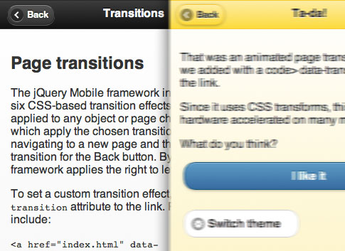
You can apply one of a number of different transition effects to a new page as it appears. To do this, just add a data-transition attribute to the link. Possible values are:
slide- Slide right to left (left to right if tapping the Back button). This is the default.
slideup- Slide from the bottom to the top (top to bottom if tapping the Back button).
slidedown- Slide from the top to the bottom (bottom to top if tapping the Back button).
pop- Expand the new page (contract it if tapping the Back button). Great for dialogs and popups.
fade- Fade the new page in (fade it out if tapping the Back button).
flip- Flip the old page out and the new page in, like flipping a card.
For example, by changing a line in the previous “Pages within pages” example, we can make the “About” page flip in and out:
<p><a href="#about" data-transition="flip">About this app</a></p>
To see transitions you do, of course, need a browser that supports them, such as Mobile Safari, desktop Safari, or Chrome.
Dialogs
By adding data-rel="dialog" to a link, you can make the linked page appear as a dialog, with rounded corners, margins and a dark background. It’s also a good idea to add a transition such as slideup, pop or flip so that it feels like you’re opening a dialog.
Let’s change our “about” link from the example above so that the linked page looks like a dialog:
<p><a href="#about" data-rel="dialog" data-transition="slideup">About this app</a></p>
At the time of writing, a dialog won’t work if it’s in the same HTML page as the link, so the above example will look like a regular page, not a dialog. (Hey, it’s an alpha version right!) So if you want to have a dialog, you need to put it in a separate HTML page and link to it that way.
Buttons

Buttons are an essential part of any touch-based app. They’re preferable to links, because they provide a bigger target when tapping (important if you have fat fingers like me!).
To turn a link into a button in jQuery Mobile, simply add data-role="button" to the a tag:
  <div data-role="content">
    <p><a href="#about" data-role="button">About this app</a></p>
  </div>

...

  <div data-role="content">
    <p>This app rocks!</p>
    <a href="#home" data-role="button">Go home</a>
  </div>
jQuery Mobile also automatically converts button elements, as well as input elements of type submit, reset, button, or image, into links styled as buttons. It attaches a click event to the link to trigger the original, hidden button element.
You can easily add various icons to buttons using the data-icon attribute, create inline buttons, and group buttons horizontally or vertically.
Formatting content
To make itself as flexible as possible, jQuery Mobile leaves most normal HTML content pretty much alone. It adds a bit of padding to make content more readable, but that’s about it.
There are also a couple of convenience styles to make life a bit easier: layout grids, and collapsible content blocks.
- Layout grids let you organize content in columns. There’s a 2-column grid, and also a 3-column version.
- Collapsible content blocks or “accordions” are blocks of content with a header that, when clicked, expand and contract.
Here’s an example of a collapsible content block. Click the block’s header to view the content inside. You can click the header again to hide the content.
<!DOCTYPE html>
<html>
  <head>
  <title>Collapsible Content Demo</title>
  <link rel="stylesheet" href="http://code.jquery.com/mobile/1.0a1/jquery.mobile-1.0a1.min.css" />
  <script src="http://code.jquery.com/jquery-1.4.3.min.js"></script>
  <script src="http://code.jquery.com/mobile/1.0a1/jquery.mobile-1.0a1.min.js"></script>
</head>
<body>

<div data-role="page" id="home">

  <div data-role="header">
    <h1>Home</h1>
  </div>

  <div data-role="content">
    <div data-role="collapsible" data-state="collapsed">
      <h3>About this app</h3>
      <p>This app rocks!</p>
    </div>
  </div>

</div>

</body>
</html>
Touch-optimized form elements
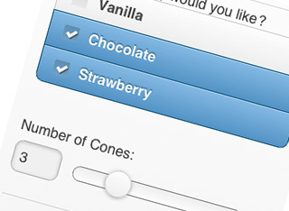
jQuery Mobile automatically replaces the standard HTML form controls, such as text fields, checkboxes and select lists, with custom controls that work better with a touch interface, and that can be styled more flexibly.
For example, checkboxes are made much larger so they’re easier to tap, while tapping on a select menu pops up a list of large buttons for the options in the list.
jQuery Mobile also rejigs form labels and fields based on the device’s display width. If the display is around 480 pixels wide then labels are placed above fields to save horizontal space. For wider displays, jQuery Mobile displays labels next to fields.
The framework supports new HTML5 form elements such as search (for search boxes) and range (for sliders). In addition, you can create nice “on/off” flip switches by using a select list with an attribute of data-role="slider", and putting 2 options in the list.
Another nice feature is grouping of radio buttons and checkboxes. If you group a set of radio buttons or checkboxes in a fieldset element with a data-role="controlgroup" attribute, jQuery Mobile automatically styles the fields so that they look like they’re grouped together, with no gaps between each field and rounded corners on the top and bottom fields.
Generally speaking, you don’t have to do much to take advantage of these form features — just create your form as normal, and jQuery Mobile takes care of the rest. One thing you should do, though, is wrap each label/field pair in a div or fieldset with an attribute of data-role="fieldcontain". This allows jQuery Mobile to add a horizontal separator bar between label/field pairs, as well as align the pairs so they’re easy to scan.
Here’s a quick demo of some of these form fields in jQuery Mobile:
<!DOCTYPE html>
<html>
  <head>
  <title>jQuery Mobile Form Demo</title>
  <link rel="stylesheet" href="http://code.jquery.com/mobile/1.0a1/jquery.mobile-1.0a1.min.css" />
  <script src="http://code.jquery.com/jquery-1.4.3.min.js"></script>
  <script src="http://code.jquery.com/mobile/1.0a1/jquery.mobile-1.0a1.min.js"></script>
</head>
<body>

<div data-role="page" id="home">

  <div data-role="header">
    <h1>Ice Cream Order Form</h1>
  </div>

  <div data-role="content">
    <form action="#" method="get">

     <div data-role="fieldcontain">
       <label for="name">Your Name:</label>
       <input type="text" name="name" id="name" value=""  />
     </div>

     <div data-role="controlgroup">
       <legend>Which flavour(s) would you like?</legend>

       <input type="checkbox" name="vanilla" id="vanilla" class="custom" />
       <label for="vanilla">Vanilla</label>

       <input type="checkbox" name="chocolate" id="chocolate" class="custom" />
       <label for="chocolate">Chocolate</label>

       <input type="checkbox" name="strawberry" id="strawberry" class="custom" />
       <label for="strawberry">Strawberry</label>

     </div>

     <div data-role="fieldcontain">
       <label for="quantity">Number of Cones:</label>
       <input type="range" name="quantity" id="quantity" value="1" min="1" max="10"  />
     </div>

     <div data-role="fieldcontain">
       <label for="sprinkles">Sprinkles:</label>
        <select name="sprinkles" id="sprinkles" data-role="slider">
          <option value="off">No</option>
          <option value="on">Yes</option>
        </select>
     </div>

     <div data-role="fieldcontain">
       <label for="store">Collect from Store:</label>
        <select name="store" id="store">
          <option value="mainStreet">Main Street</option>
          <option value="libertyAvenue">Liberty Avenue</option>
          <option value="circleSquare">Circle Square</option>
          <option value="angelRoad">Angel Road</option>
        </select>
     </div>

    <div class="ui-body ui-body-b">
      <fieldset class="ui-grid-a">
        <div class="ui-block-a"><button type="submit" data-theme="d">Cancel</button></div>
        <div class="ui-block-b"><button type="submit" data-theme="a">Order Ice Cream</button></div>
      </fieldset>
    </div>

  </div>

</div>

</body>
</html>
List views: Lists on steroids
List views are a very powerful feature of jQuery Mobile. They let you style standard unordered or ordered lists in a variety of useful ways. To turn a regular list into a list view, add data-role="listview" to the ul or ol tag.
Here are some of the things you can create using list views:
- A simple list of text items, with a nice box around each item
- A list of links. Place an
atag in a list item, and jQuery Mobile automatically adds a ‘>’ arrow icon to the right side of each list item. - Nested lists. If you nest another
ullist inside anli, jQuery automatically creates a second “page” for the embedded list, linked to from the originalli. This is very handy for creating trees of menu options, settings, and so on. - Split button lists. By placing 2 links inside an
li, you can create a list item with a vertical divider bar on the right side of the item. The user can then tap either the left or right side of the list item to achieve different things (such as viewing or purchasing). - Count bubbles. If you include an element with a class of
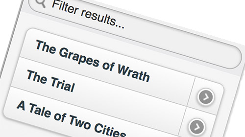
ui-li-countin a list item then jQuery Mobile creates a little “bubble” icon on the right side of the list item containing the element’s contents. This is great for things like message counts in mailbox lists. - Search filtering. If you add the attribute
data-filter="true"to aulorolelement then the list becomes searchable. A “Filter results…” text box appears above the list, allowing the user to narrow down the options. Perfect for large lists. - List dividers for splitting lists into sections. Just add
data-role="list-divider"to any list item. - Item thumbnails and icons. Place an
imgelement at the start of a list item, and jQuery Mobile will use the image as a thumbnail in the list, scaling it to 80 x 80 pixels. Add a class ofui-li-iconto theimgelement to scale it to a 16 x 16 pixel icon.
Here’s an example page that shows off a few of the list views available in jQuery Mobile:
<!DOCTYPE html>
<html>
  <head>
  <title>jQuery Mobile Lists Demo</title>
  <link rel="stylesheet" href="http://code.jquery.com/mobile/1.0a1/jquery.mobile-1.0a1.min.css" />
  <script src="http://code.jquery.com/jquery-1.4.3.min.js"></script>
  <script src="http://code.jquery.com/mobile/1.0a1/jquery.mobile-1.0a1.min.js"></script>
</head>
<body>

<div data-role="page" id="home">

  <div data-role="header">
    <h1>Lists Demo</h1>
  </div>

  <div data-role="content">

    <h2 style="padding: 1em 0;">A list view</h2>

    <ul data-role="listview" data-inset="true">
      <li>Cat</li>
      <li>Dog</li>
      <li>Mouse</li>
      <li>Squirrel</li>
    </ul>

    <h2 style="padding: 1em 0;">A list of links</h2>

    <ul data-role="listview" data-inset="true">
      <li><a href="#">About this app</a></li>
      <li><a href="#">Buy ice cream</a></li>
      <li><a href="#">Find a store</a></li>
    </ul>

    <h2 style="padding: 1em 0;">Nested lists</h2>

    <ul data-role="listview" data-inset="true">
      <li>Play
        <ul>
          <li><a href="#">Easy</a></li>
          <li><a href="#">Medium</a></li>
          <li><a href="#">Hard</a></li>
        </ul>
      </li>
      <li>Settings
        <ul>
          <li><a href="#">Graphics</a></li>
          <li><a href="#">Sound</a></li>
          <li><a href="#">Device</a></li>
        </ul>
      </li>
      <li>Highscores
        <ul>
          <li><a href="#">View</a></li>
          <li><a href="#">Submit</a></li>
          <li><a href="#">Reset</a></li>
        </ul>
      </li>
    </ul>

    <h2 style="padding: 1em 0;">A split button list with filter</h2>

    <ul data-role="listview" data-inset="true" data-filter="true">
      <li>
        <a href="#">The Grapes of Wrath</a>
        <a href="#">Buy This Book</a>
      </li>
      <li>
        <a href="#">The Trial</a>
        <a href="#">Buy This Book</a>
      </li>
      <li>
        <a href="#">A Tale of Two Cities</a>
        <a href="#">Buy This Book</a>
      </li>
    </ul>

    <h2 style="padding: 1em 0;">A list with count bubbles</h2>

    <ul data-role="listview" data-inset="true">
      <li><a href="#">SuperWidgets</a> <span class="ui-li-count">14</span></li>
      <li><a href="#">MegaWidgets</a> <span class="ui-li-count">0</span></li>
      <li><a href="#">WonderWidgets</a> <span class="ui-li-count">327</span></li>
    </ul>

  </div>

</div>

</body>
</html>
data-inset="true" formats a list as a block with curved corners and margins around it. If you omit this then the list stretches across the entire browser window width.
There are even more goodies in list views — find out more in the jQuery Mobile documentation.
Theming
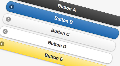
The grey, black and blue rounded widgets produced by jQuery Mobile look pretty nice, but life would be dull if we all had to use the same style for our mobile apps! To this end, jQuery Mobile lets you create custom themes that govern things like:
- Font family
- Drop shadows
- Corner radius values for buttons and boxes
- Icon sets
In addition, each theme can contain up to 26 different colour swatches (labelled from ‘a’ to ‘z’), which control foreground colour, background colour, and gradient. (The default jQuery Mobile theme comes with 5 swatches.) Typically, to make a page element use a particular swatch, you use the data-theme attribute. For example:
<!DOCTYPE html>
<html>
  <head>
  <title>Page Title</title>
  <link rel="stylesheet" href="http://code.jquery.com/mobile/1.0a1/jquery.mobile-1.0a1.min.css" />
  <script src="http://code.jquery.com/jquery-1.4.3.min.js"></script>
  <script src="http://code.jquery.com/mobile/1.0a1/jquery.mobile-1.0a1.min.js"></script>
</head>
<body>

<div data-role="page" id="home">

  <div data-role="header">
    <h1>Home</h1>
  </div>

  <div data-role="content">
    <a href="#" data-role="button" data-theme="a">About this app</a>
    <a href="#" data-role="button" data-theme="b">About this app</a>
    <a href="#" data-role="button" data-theme="c">About this app</a>
    <a href="#" data-role="button" data-theme="d">About this app</a>
    <a href="#" data-role="button" data-theme="e">About this app</a>
  </div>

</div>

</body>
</html>
Theming lists is a bit more complex, and more flexible, than regular theming — you can assign different swatches to separate components of lists, such as list items, dividers, count bubbles, split buttons, and so on.
To reduce load time, jQuery Mobile themes use CSS3 extensively for things like rounded corners, drop shadows and gradients, rather than using images.
To get an idea of how jQuery Mobile themes are created, check out the default theme’s CSS file.
Events
As well as making it easy to build mobile user interfaces, jQuery Mobile adds some mobile-specific events that you can use to detect actions performed on mobile devices.
For example, you can use taphold to detect if the user tapped and held their finger on an element, and swipe to detect if the user swiped horizontally from left to right (or right to left) across the element:
<!DOCTYPE html>
<html>
<head>
<title>jQuery Mobile Events</title>
<link rel="stylesheet" href="http://code.jquery.com/mobile/1.0a1/jquery.mobile-1.0a1.min.css" />
<script src="http://code.jquery.com/jquery-1.4.3.min.js"></script>
<script src="http://code.jquery.com/mobile/1.0a1/jquery.mobile-1.0a1.min.js"></script>
<script type="text/javascript">

$( function() {

  $('body').bind( 'taphold', function( e ) {
    alert( 'You tapped and held!' );
    e.stopImmediatePropagation();
    return false;
  } );

  $('body').bind( 'swipe', function( e ) {
    alert( 'You swiped!' );
    e.stopImmediatePropagation();
    return false;
  } );

} );

</script>

</head>

<body>

<div data-role="page" id="home">

  <div data-role="header">
    <h1>jQuery Mobile Events</h1>
  </div>

  <div data-role="content">
    <p>Try:</p>
    <ul>
      <li>Tapping and holding</li>
      <li>Swiping</li>
    </ul>
  </div>

</div>

</body>
</html>
Since jQuery Mobile is still in alpha, event support is a bit hit-and-miss right now, so your mileage may vary on different mobile devices!
Summary
In this article we’ve explored the new jQuery Mobile library, and seen how it can save you a lot of time and effort when building mobile web apps. Although it’s currently only in alpha, and a bit rough round the edges, it’s perfectly possible to start playing with it and creating apps.

thanks for the nice article, matt!
@jeffreyz: Thanks for the comment – glad you liked it. 🙂
Just curious if there are any “best practices” for applying backgrounds to mobile websites. Because a phone (or iPad) can be turned horizontally or vertically, we’re kind of stuck on how to best design and/or implement graphics considering the iphone/ipad functionality. Thanks!
Hi terramar,
Do you mean CSS background images? I don’t think it matters, since the page will look the same at either orientation – it’ll just be wider in landscape. Of course you need to ensure that your text and background images look OK at both sizes.
Thanks much for the nicely composed article. This helped me in getting started with mobile web development. 🙂
@tosrisri: Thanks for the feedback! I’m glad the article helped you out. 🙂
great tutorial. thanks!
Question: Once you have created your web application using Jquery Mobile, HTML, CSS etc…how do you go about wrapping it into a cross platform App to run on iPhone, Android etc? i mean so it can be distributed in the various appstores and downloaded as an App?
cheers
Kanizares
Hi Kanizares,
Web apps are usually designed to run at least partly on a web server, so they can’t easily be converted to cross-platform native mobile apps.
For iOS you may be able to take your (JavaScript-only) web app and wrap it in a webView within an iOS application – here’s an example:
http://mobiforge.com/developing/story/build-web-apps-iphone-using-dashcode
Great tutorial I tried using lists with alpha 1 jquery they were working fine but when i upgraded to alpha 3 it all got messed up how can i upgrade these to alpha3?
@Junaid: Lists work OK for me in alpha 3. Can you post a URL of the problem in a new topic please, and we can take a look?
http://www.elated.com/forums/authoring-and-programming/topic/new/
You mentioned the following in the JQM post
<div data-role=”header”>
This lets you create a toolbar at the top of the page, used for things like the page title and buttons. (Typically there is at least a “Back” button which the user can tap to return to the previous page.) By adding data-position=”fixed” to the header, you can make sure the header always stays at the top of the screen.
This is my master page template but i don’t see a back button when i navigate accross all the pages that use this master page. Please help
<div data-role=”page”>
<div data-role=”header” data-theme=”e”>
<h1>myCompany</h1>
</div><!– /header –>
<div data-role=”content” data-theme=”e”>
<p>
<asp:ContentPlaceHolder id=”ContentPlaceHolder1″ runat=”server”>
</asp:ContentPlaceHolder>
</p>
</div><!– /content –>
<div data-role=”footer” data-theme=”e”>
<h4>View Full Site</h4>
</div><!– /footer –>
</div><!– /page –>
</body>
</html>
@techhelp: You won’t see a “Back” button on the first-visited page of your JQM site. JQM only adds a “Back” button once the user visits another page within the site.
Hi Matt,
I commend you on this nicely put article, will be depending on it to spawn the first web app. Question though, would you use jQuery(document).ready() function, as you do in the realm of non-mobile web development, for your custom user functions and events trapping like clicks, triggers and so forth?
Thanks
Hi nunu,
jQuery Mobile triggers a ‘pageshow’ event whenever a mobile page is displayed – this is probably what you want to use. More info:
http://jquerymobile.com/demos/1.0a3/#docs/api/events.html
Cheers,
Matt
Hi ,
Thanks for the wonderful article.i have used page id with the example you provided.but my prob is that the page is not recognizing the id
<div id=”home” div-role=”page”>
</div>
i can’t use <a href=”#home”>Home Page</a>
please help me.
Regards,
Nithya.
@Nithya: Your code should be:
Cheers,
Matt
Thank you for taking the time to write and share this wonderful post. Excellent resource.
Hi all,
I have a list view with 48 x 48 pixels icons. Effectively they seem to be displayed as 80 x 80 pixels so the display is not very nice. I tried to create a specific style in my own style sheet but nothing change.
How can I use icon that are not 16 x 16 neither 80 x 80 ?
Thanks
@Quikdav: I would open up the resulting page in Firefox with Firebug or Safari/Chrome and inspect the img element. This will show you all the CSS classes assigned to the icon and its surrounding elements. You could then try creating appropriate CSS selectors to set the width/height.
If all else fails then use an inline style on the img element.
nice sharing. really appreciated
http://www.galeriniaga.com
[Edited by galeriniaga on 29-Jun-11 09:40]
Hi
Great article. I’m using jQuery mobile a the moment for an app.
I have a contact form set up in the app and the ‘action’ links to a PHP file (email.php) that processes the form. It works fine in webspace, but does not work when in PhoneGap, in the iPhone Simulator. So assuming it won’t work on an actual iPhone.
I can only assume I’ll need to link the app to a contact form in webspace. Or should I be looking at an Ajax/PHP solution. I see there are Tutorial sites out there showing how to build Ajax contact forms.
Any advice would be appreciated.
Nigel
What an amazing help!
Question from a newbie:
I’m gonna make a survey for iPad for a customer, and I need some really BIG buttons.
Is there any way to change the size on the buttons? The one on this page looks really good.
Thanks for good work!
how about the coding for ipad?
@Nig567: Yes, you can only run HTML/CSS/JS in the PhoneGap app itself. PHP needs to run on a server.
@farbrorc: Try setting a big font size on .ui-btn-up-c, .ui-btn-hover-c, .ui-btn-down-c etc in the CSS.
Great article. If you want to see jquery mobile in action, here is an example of a site that make use if it: http://www.mobosurvey.com
Hi all
I can’t trigger the event “beforepageshow”. I put it into my index.php file but It never fire for any page !!
$(document).bind(“mobileinit”, function()
{
$(‘div[data-role=”page”]’).live(‘beforepageshow’, function(event, ui)
{
alert( “pagebeforeshow” );
});
});
What’ wrong with my code ?
I understood “mobileinit” should be be defined one time (in the index.php for example). Not in all the files (= pages) of my web site. Should I define “beforepageshow” event for all my pages into “mobileinit” function ? I would like to define each “beforepageshow” event in the associated page. Is it possible and if yes, how ?
Thanks and regards
[Edited by Quikdav on 26-Aug-11 06:33]
@Quikdav: It’s pagebeforeshow, not beforepageshow:
http://jquerymobile.com/demos/1.0b2/#/demos/1.0b2/docs/api/events.html
Hi Matt,
Is it possible to explain how to run jquery mobile only on mobile devices, and how to show a “regular” site on the screen?
Kind regards,
Koen
@koentimmers: To do that, you’d probably need to resort to user agent detection for common mobile browsers, either on the server (eg PHP) or using JavaScript. You can then serve either the jQuery Mobile-enhanced or desktop version of your site as appropriate.
I am Planning to use jquery-postmessage-plugin and theaming in my latest Survey project. I am hoping that I don’t face any compatibility issues. Any tips for testing it? Thanks for sharing it though. Count me in your fans 🙂 Waiting for your response.
[Edited by sarahbird on 27-Nov-11 08:14]
hi Matt,
Why jquerrymobile “changepage” not working for the second time?It seems some problem with the navigation bar..PLZ respond
hi Matt,
Why jquerrymobile “changepage” not working.PLZ respond..ITz like we have a page with options “Join” “Login” “recover”. When we click (for example) “Join” ,it was supposed to go to the Join page..but its not working.Is there any special code to be implemented for this purpose?
Regards,
Ruth
@ruthmary1991: I’d need to see your code really. Can you post a demo page on http://jsbin.com/ ?
Hi Matt,
i am new to Jquery mobile,i want to use jquery mobile pages in jsp,can you tell me how to href jsp pages,i done it for html pages but i dont know how to do it for jsp pages linking.waiting for your valuable answer,please post an example if you have in your site.
@venu: Never used JSP, but I know that JSP can serve HTML just like any other server-side language. So just serve your mobile pages – including the jQuery Mobile includes and markup – just like you would any other web page using JSP.
Hi Matt
I have an issue with JQUERY Mobile events.
I have a page ‘consommation.php’ with a list listview. When I display this page (from index.php containing a listview too), the event ‘pagebeforeshow’ doesn’t occurs. It is the same for the click event when I click on options from ‘consommation.php’ listview. I don’t have any events.
But when I enter directly the URL for ‘consommation.php’ in my browser (without going through index.php listview), all my events are working !!!
There is something that lock my events !! Any idea on what’s wrong ?
Thanks and regards
Here is my code in ‘consommation.php’ :
<meta charset=”utf-8″>
<meta name=”viewport” content=”width=device-width, initial-scale=1″>
<link rel=”stylesheet” href=”css/MyTheme.min.css” type=”text/css”/>
<link rel=”stylesheet” href=”http://code.jquery.com/mobile/1.1.1/jquery.mobile.structure-1.1.1.min.css” />
<script src=”http://code.jquery.com/jquery-1.7.1.min.js”></script>
<script>
$(‘div[id=”consommation”]’).live(“pagebeforeshow”, function()
{
alert(“pagebeforeshow”);
});
$(‘div[id=”consommation”] ul[data-role=”listview”] a’).live(“click”, function()
{
alert(“click”);
var dataurl = $(this).attr(“data-url”);
alert(dataurl);
if (dataurl != null)
{
$.mobile.changePage(“sonde_detail.php” + dataurl);
}
});
</script>
<script src=”http://code.jquery.com/mobile/1.1.1/jquery.mobile-1.1.1.min.js”></script>
I have the same problem on this site http://seo-google.co.il/. Does anyone have an idea?