
For years now, most Web forms have included at least some lines of JavaScript code. Typically this JavaScript is used to validate the form — that is, check all the fields have been filled in correctly before the form is sent to the server. JavaScript is also used to enhance forms with additional functionality, such as calendar widgets and the like.
While using JavaScript for these purposes is a pretty good solution, it’s not without its problems:
- Not all browsers have JavaScript enabled, or can even run JavaScript.
- Each Web developer builds their JavaScript form validation and widgets differently. This means that, when confronted with a new form, a user has to learn the form’s unique quirks and foibles in order to use it.
- Adding decent validation to a form — not to mention creating custom widgets for things like dates and number ranges — is both fiddly and time-consuming.
The good news is that these dark days of JavaScript-laden Web forms may soon be coming to an end. Thanks to the joys of HTML5, we can now create forms with built-in validation and rich widgets for dates, numbers and so on, all without including a single line of JavaScript code. Hallelujah!
As with most cutting-edge Web stuff, there’s a catch to all this, and that is browser support (or lack of it). Fortunately, there are a few JavaScript libraries out there that can emulate HTML5 form validation and widgets, as we’ll see later in the tutorial. Sure, this does mean we’re not exactly banishing JavaScript for now, but at least we can remove it once the browsers catch up!
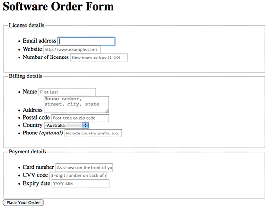
In this tutorial I’m going to walk you through the process of creating a nice, self-validating, widget-rich, HTML5 Web form. It’s an online order form for an imaginary software company.
You can play with the form now by trying out the demo. Fill in a couple of fields, then click “Place Your Order” to see the validation kick in. Try clicking the “Expiry date” field and see what happens.
Ready to code it? Let’s get started!
Step 1. Create the basic markup
First we’ll create the basic skeleton markup for the page and form:
<!doctype html>
<html lang="en">
<head>

<title>HTML5 Web Form with (almost!) No JavaScript in Sight | Elated.com</title>
<meta http-equiv="Content-Type" content="text/html;charset=utf-8" >

</head>

<body>

<div class="wideBox">
  <h1>HTML5 Web Form with (almost!) No JavaScript in Sight</h1>
</div>

<form id="orderForm" action="" method="get">

  <h1>Software Order Form</h1>

  <fieldset>
    <legend>License details</legend>

    <ul>
    </ul>

  </fieldset>

  <fieldset>
    <legend>Billing details</legend>

    <ul>
    </ul>

  </fieldset>

  <fieldset>
    <legend>Payment details</legend>

    <ul>
    </ul>

  </fieldset>

  <input type="submit" name="placeOrder" value="Place Your Order" />

</form>

</body>
</html>
No big surprises here — this is fairly standard stuff. We’re using the HTML5 doctype, adding head and title elements, specifying the utf-8 (Unicode) character set, adding a page title, and creating the basic form.
The form itself consists of an h1 heading, and 3 fieldset elements for the 3 sections of the form. Each fieldset has a legend, and an empty ul (unordered list) element. We’ll place our fields inside these lists. The form ends with a submit button so that the user can send the form.
Step 2. Add the “Email address” field
The first field we’ll add to the form is the “Email address” field. This goes inside the unordered list in the “License details” fieldset.
  <fieldset>
    <legend>License details</legend>

    <ul>

      <li>
        <label for="emailAddress">Email address</label>
        <input type="email" name="emailAddress" id="emailAddress" placeholder="[email protected]" required="required" autofocus="autofocus" maxlength="50" />
      </li>

    </ul>

  </fieldset>
You’ll no doubt be familiar with the label and input elements, as well as attributes such as for, type, name, id and maxlength. However, the emailAddress input field has some new, exciting HTML5 attributes and values!
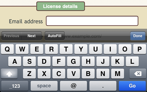
type="email"- This is one of the new input types that HTML5 gives us, and it’s designed specifically for email addresses. It behaves much like a regular
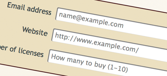
type="text"field; however, HTML5-aware browsers will validate the field automatically, ensuring that the user enters a valid email address. This is so much nicer than messing around with JavaScript and regular expressions! Furthermore, some browsers, such as Mobile Safari on the iPhone, will present a keyboard dedicated to entering email addresses (see screenshot below). placeholder=
"[email protected]"- This allows us to specify some dummy text to appear inside the field, before the user has entered their own text (see screenshot below). Again, previously you had to fiddle around with JavaScript to achieve this very nice (and useful) effect.
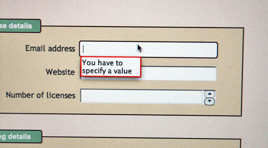
required="required"- This specifies that the field must be filled in. If the user tries to submit the form without completing this field then the browser will stop the submission and indicate that the field is incomplete (typically by moving to it and/or highlighting it). This means no more pesky JavaScript coding to check for required fields. Yay!
autofocus="autofocus"- Automatically moves the focus to this field when the form is first loaded, ready for the user to start typing. Again, previously you had to use an
onloadJavaScript event handler to achieve this. Much nicer to just use this attribute.
When I say “valid” email address, I mean text that conforms to the specification for an email address (such as [email protected]). It doesn’t necessarily mean that the email address actually exists! (HTML5 isn’t that smart.)
type="email" input field.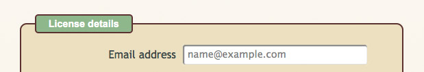
placeholder value as grey text within the field.Step 3. Add the “Website” field
Next, we’ll add the “Website” field below the “Email Address” field:
      <li>
        <label for="website">Website</label>
        <input type="url" name="website" id="website" placeholder="http://www.example.com/" required="required" maxlength="100" />
      </li>
Once again, we’ve used a new HTML5 input type: "url". As you’d imagine, this tells the browser to expect a URL to be entered, and it will stop the user submitting the form if it’s not a valid URL.
As with the "email" type, some browsers such as Mobile Safari display a custom keyboard to make it easier to enter URLs:

type="url" fields.Step 4. Add the “Number of licenses” field
Our next field allows the user to enter the number of software licenses to purchase:
      <li>
        <label for="numLicenses">Number of licenses</label>
        <input type="number" name="numLicenses" id="numLicenses" placeholder="How many to buy (1-10)" required="required" min="1" max="10" maxlength="2" />
      </li>
This uses yet another new HTML5 input type: number. This tells the browser to expect a numeric value to be entered. If the user tries to enter anything else, such as letters, then the browser prevents the user submitting the form.
In addition, we’ve used 2 more new attributes: min and max. These let us specify a range of allowable values for the number — in this case, between 1 and 10 inclusive.
Visually, many browsers display number fields with a little spinner to make it easy for users to enter numbers using the mouse. And once again, Mobile Safari brings up a special keyboard.

type="number" field. Handy for entering numbers using the mouse.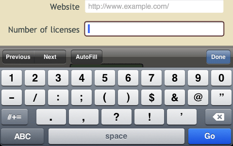
type="number" field, Mobile Safari presents its numeric keyboard by default to make data entry that little bit easier.Step 5. Add the “Billing details” fields
Now we move onto the second fieldset, “Billing details”. This fieldset contains the following fields:
- Name
- Address
- Postal code
- Country
- Phone
Since these fields are fairly straightforward, we’ll add them in 1 step. Here’s the markup:
  <fieldset>
    <legend>Billing details</legend>

    <ul>

      <li>
        <label for="billingName">Name</label>
        <input type="text" name="billingName" id="billingName" placeholder="First Last" required="required" maxlength="50" />
      </li>

      <li>
        <label for="billingAddress">Address</label>
        <textarea name="billingAddress" id="billingAddress" placeholder="House number, street, city, state" required="required" maxlength="150"></textarea>
      </li>

      <li>
        <label for="billingPostcode">Postal code</label>
        <input type="text" name="billingPostcode" id="billingPostcode" placeholder="Post code or zip code" required="required" maxlength="20" />
      </li>

      <li>
        <label for="billingCountry">Country</label>
        <select name="billingCountry" id="billingCountry"><option>Australia</option><option>Canada</option><option>New Zealand</option><option>United Kingdom</option><option>United States</option></select>
      </li>

      <li>
        <label for="phone">Phone <em>(optional)</em></label>
        <input type="tel" name="phone" id="phone" placeholder="Include country prefix, e.g. +44" maxlength="20" />
      </li>

    </ul>

  </fieldset>
The only new HTML5 field type here is "tel", for telephone numbers. Since phone numbers are pretty hard to validate, most browsers treat this field as a regular, single-line text input field, without attempting to validate the number. That doesn’t mean it’s a useless field type, though. For example, Mobile Safari displays a phone keypad when it encounters a type="tel" field:
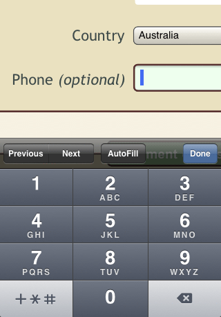
type="tel" fields. Lovely!You might have noticed that this field is the only one with a green background when the form loads. That’s because we’ve made it optional, by omitting the required="required" attribute. An empty optional field is, of course, valid, and we style valid fields with a green background (as you’ll see later).
Step 6. Add the “Card number” field
Now we move onto the 3rd and final fieldset in the form. First up: the “Card number” field, for entering credit card numbers:
      <li>
        <label for="cardNumber">Card number</label>
        <input type="text" name="cardNumber" id="cardNumber" placeholder="As shown on the front of your card" required="required" maxlength="30" pattern="[d ]{12,}" />
      </li>
It’s tempting to make this a type="number" field; however, that would prevent the user from entering the spaces between blocks of digits in their card number (and I hate it when websites do that!).
Instead, I’ve made it a regular text input field, and added another new HTML5 attribute: pattern. This lets us specify a regular expression pattern to compare the user-entered value with. If the value matches the pattern, the field validates; otherwise, the browser rejects the value.
In this case, the pattern I’ve used is:
pattern="[d ]{12,}"
This means “at least 12 digits and/or spaces”, which allows for plenty of flexibility while still constraining the value somewhat. (We don’t need to specify a maximum length in the pattern, since we’re doing that anyway with maxlength="30".)
Step 7. Add the “CVV code” field
The next field allows the user to enter their CVV (Card Verification Value) — that is, the 3-digit number on the back of the card. Since this number never has spaces between the digits, we can go ahead and use a type="number" field this time:
      <li>
        <label for="cvvCode">CVV code</label>
        <input type="number" name="cvvCode" id="cvvCode" placeholder="3-digit number on back of card" required="required" maxlength="3" pattern="d{3}" />
      </li>
Again, I’ve used a pattern attribute to constrain the input to exactly 3 digits. If the user enters the data in any other format then the browser will reject it.
Step 8. Add the “Expiry date” field
Our final form field is the “Expiry date” field, for entering the credit card expiry month and year. Here’s the markup:
      <li>
        <label for="expiryDate">Expiry date</label>
        <input type="month" name="expiryDate" id="expiryDate" placeholder="YYYY-MM" required="required" maxlength="7" />
      </li>
This code introduces another new HTML5 field type: "month". This field type allows the user to enter a specific year and month in the format YYYY-MM — perfect for credit card expiry dates!
At a basic level, this field type allows the browser to check that the user has entered a valid year and month in YYYY-MM format (and reject the input if they haven’t). On top of this, browsers can display various widgets such as spinners and calendars to let the user easily select a month and year. More on this later!
There are other useful date field types too, including type="date" (for full dates), type="time" (for times), and so on. Here’s a full list.
Step 9. Style the form
Now we’ve built our basic web form, but it’s somewhat lacking in the beauty stakes, even with all its HTML5 loveliness:
So let’s start adding some CSS to the page. First, we’ll style the body element, followed by the form element:
/* Add some margin to the page and set a default font */

body {
  margin: 30px;
  font-family: "Trebuchet MS", Arial, Helvetica, sans-serif;
}

/* Style the form with a coloured background (and a gradient for Gecko/WebKit browsers), along with curved corners and a drop shadow */

form {
  width: 35em;
  margin: 0 auto;
  padding: 50px 60px;
  overflow: auto;
  color: #3e4a49;
  background-color: #f5eedb;
  background: -webkit-gradient( linear, left bottom, left top, color-stop(0,#f5eedb), color-stop(1, #faf8f1) );
  background: -moz-linear-gradient( center bottom, #f5eedb 0%, #faf8f1 100% );
  border-radius: 10px;
  -moz-border-radius: 10px;
  -webkit-border-radius: 10px;
  box-shadow: 0 0 .5em rgba(0, 0, 0, .8);
  -moz-box-shadow: 0 0 .5em rgba(0, 0, 0, .8);
  -webkit-box-shadow: 0 0 .5em rgba(0, 0, 0, .8);
}
I won’t go into too much detail with the CSS, since that’s not the point of this tutorial. The gist of the above code is to specify dimensions for the form (such as width, margin and padding), colours, and backgrounds. I’ve added a subtle top-to-bottom gradient for Firefox, Safari and Chrome, with a plain colour fallback for other browsers. I’ve also added some other CSS3 niceties, including curved corners and a drop shadow around the form. These won’t work in IE7/8 sadly, although they should work in IE9 (I don’t have it to test).
The overflow: auto rule ensures that the floated elements within the form — i.e. the field labels — are cleared, pushing the form downwards to enclose them.
While we’re styling the form, we’ll also style the unordered lists within the fieldsets, set a uniform line height for everything in the form, and style the h1 heading in the form:
/* Give form elements consistent margin, padding and line height */

form ul {
  list-style: none;
  margin: 0;
  padding: 0;
}

form ul li {
  margin: .9em 0 0 0;
  padding: 0;
}

form * {
  line-height: 1em;
}

/* Form heading */

form h1 {
  margin: 0 0 1.5em 0;
  padding: 0;
  text-align: center;
}
Step 10. Style the fieldsets and legends

Next, we’ll style the fieldset elements that group fields together, and the legend elements that add the title to each fieldset:
/* Give each fieldset a darker background, dark curved border and plenty of space */

fieldset {
  padding: 0 20px 20px;
  margin: 0 0 30px;
  border: 2px solid #593131;
  background: #eae1c0;
  border-radius: 10px;
  -moz-border-radius: 10px;
  -webkit-border-radius: 10px;
}

/* Give each fieldset legend a nice curvy green box with white text */

legend {
  color: #fff;
  background: #8fb98b;
  font-family: Arial, Helvetica, sans-serif;
  font-size: 0.9em;
  font-weight: bold;
  text-align: center;
  padding: 5px;
  margin: 0;
  width: 9em;
  border: 2px solid #593131;
  border-radius: 5px;
  -moz-border-radius: 5px;
  -webkit-border-radius: 5px;
}
This is fairly standard stuff. We give the fieldsets and legends their own distinctive colours and rounded borders, and we also specify various text properties for the legends.
Step 11. Style the field labels
Next up — the field labels next to each field:
/* The field labels */

label {
  display: block;
  float: left;
  clear: left;
  text-align: right;
  width: 40%;
  padding: .4em 0 0 0;
  margin: .15em .5em 0 0;
}
We’ve floated the labels left so that each label appears to the left of its corresponding field, and made the labels 40% of the width of the fieldset to allow room for the fields themselves.
Step 12. Style the fields
We need to style all the field types in the form, including inputs, selects, and textareas. Here’s the CSS:
/* Style the fields */

input, select, textarea {
  display: block;
  margin: 0;
  padding: .4em;
  width: 50%;
}

input, textarea, .date {
  border: 2px solid #eae1c0;
  border-radius: 5px;
  -moz-border-radius: 5px;
  -webkit-border-radius: 5px;
  box-shadow: rgba(0,0,0,.5) 1px 1px 1px 1px inset;
  -moz-box-shadow: rgba(0,0,0,.5) 1px 1px 1px 1px inset;
  -webkit-box-shadow: rgba(0,0,0,.5) 1px 1px 1px 1px inset;
  background: #fff;
}

input {
  font-size: .9em;
}

select {
  padding: 0;
  margin-bottom: 2.5em;
  position: relative;
  top: .7em;
}

textarea {
  font-family: "Trebuchet MS", Arial, Helvetica, sans-serif;
  font-size: .9em;
  height: 5em;
}


/* Place a border around focused fields, and hide the inner shadow */

form *:focus {
  border: 2px solid #593131;
  outline: none;
  box-shadow: none;
  -moz-box-shadow: none;
  -webkit-box-shadow: none;
}


/* Display correctly filled-in fields with a green background */

input:valid, textarea:valid {
  background: #efe;
}
Let’s work through each of these CSS rules:
- Set up some common properties across all fields.
We usedisplay: blockso that we can control padding and margins, and we make them 50% of the width of the fieldset. - Set common properties for
inputandtextareafields.
Forinputs andtextareas, we add a coloured, curved border to each field, and we also add a nice inner shadow using thebox-shadowproperty. The valueinsetensures that the shadow is inside the field, rather than being a drop shadow.We also add these properties to the
.dateclass. This ensures that our jQuery Tools date field — which we’ll add later — is styled the same way as the other fields. - Style the
inputfields.
inputfields get a font size of .9em to make sure the text in the field is the same size as the rest of the text in the page. - Style the
selectfields.
selectfields are given some extra bottom margin to create space between them and any fields below. I also usedposition: relativeandtop: .7emto push theselectfield downwards, relative to the field label. - Style the
textareafields.
textareafields need to have their font family specified explicitly, otherwise they default to Courier font. We also give them a consistent font size and height. - Style focused fields.
When a field is focused by clicking it (or using the Tab key), we give it a solid brown border to match the rest of the form style. We also specifyoutline: noneto remove the blue outline that Safari adds to focused fields, to avoid it clashing with the brown border. Finally, since the brown border combined with the inner shadow is a bit overpowering, we remove the inner shadow on focused fields. - Style valid fields.
Here’s another great thing about HTML5 forms! We’re given a new selector,:valid, that can select all fields that are correctly filled in. We’ll give them a light green background. This gives the user instant visual feedback that they’ve filled in a field correctly, even before they submit the form. Nice!
Step 13. Style the “Place Your Order” button
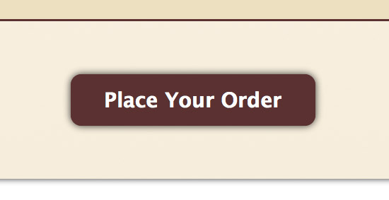
The last element to style is the “Place Your Order” submit button at the bottom of the form:
/* Submit button */

input[type="submit"] {
  margin: 50px auto 0 auto;
  width: 12em;
  padding: 10px;
  border: 2px solid #593131;
  border-radius: 10px;
  -moz-border-radius: 10px;
  -webkit-border-radius: 10px;
  box-shadow: 0 0 .5em rgba(0, 0, 0, .8);
  -moz-box-shadow: 0 0 .5em rgba(0, 0, 0, .8);
  -webkit-box-shadow: 0 0 .5em rgba(0, 0, 0, .8);
  color: #fff;
  background: #593131;
  font-size: 1.2em;
  font-weight: bold;
  -webkit-appearance: none;
}

input[type="submit"]:hover, input[type="submit"]:active {
  cursor: pointer;
  background: #fff;
  color: #593131;
}

input[type="submit"]:active {
  background: #eee;
  box-shadow: 0 0 .5em rgba(0, 0, 0, .8) inset;
  -moz-box-shadow: 0 0 .5em rgba(0, 0, 0, .8) inset;
  -webkit-box-shadow: 0 0 .5em rgba(0, 0, 0, .8) inset;
}
This is quite a lot of CSS for just one button. But then it is quite a fancy button!
Let’s look at each rule in turn:
-
- Style the basic button.
The first selector,input[type="submit"], is applied to allinputfields that have atypeattribute with a value of"submit"— in this case, our “Place Your Order” button. We give the button plenty of margin to add space around it, and some padding to add space between the button text and the border. We also add a solid curved border, as well as a drop shadow, and specify the button’s colour, background, and font.The
-webkit-appearance: none;property prevents Mobile Safari from using its own button style. This ensures that our button looks the same on the iPhone as it does on desktop browsers. - Style the hover state.
The next rule makes the mouse cursor change to a pointing hand when it’s over the button, and also inverts the button’s colours. We also apply these styles to the:activebutton state. - Style the active state.
The:activestate occurs when the user actually clicks the button. For this state, we make the button background slightly darker and change the shadow from a drop shadow to an inner shadow, giving the impression that the button is being pushed down.
- Style the basic button.
Step 14. Deal with IE horribleness
As is often the case, there are a couple of IE bugs that need squashing to avoid the form looking terrible in IE7 and IE8. We do this using conditional comments so that they only affect these particular browsers:
<!--[if IE]>
<style>

/* Work around IE fieldset background bleed bug */

fieldset {
  background: transparent;
}

</style>
<![endif]-->


<!--[if IE 7]>
<style>

/* Work around broken IE7 box model */

form ul li {
  margin: 0;
}

label {
  padding-top: 1.3em;
}

</style>
<![endif]-->
The first rule deals with the fact that IE doesn’t clip a fieldset’s background colour to the fieldset’s border. Instead, it leaks outside the border, which looks rubbish. I solve this by simply removing the background colour from the fieldset.
There’s actually a workaround that fixes the bleed while keeping the background colour, but it involves using relative positioning on the fieldset, which breaks the calendar of the jQuery Tools dateinput widget that we’re going to add later. So I’ve avoided it in this case.
The next couple of rules are for IE7 only. They adjust the margin and padding of the field list elements and labels so that the labels align properly with the fields.
All done — but does it work?
Our basic HTML5 form is done! Open it up in a modern browser and you’ll see some of these HTML5 fields and features in action.
I say “some”, because HTML5 form support is fairly patchy amongst browsers at the time of writing. For example:
-
-
- Opera 10.6 is the only browser that actually brings up a date picker when the user clicks the “Expiry Date” field. Safari 5 comes a close second, with a spinner for entering the date. (Safari Mobile doesn’t do this though.)
- Firefox 4.0 Beta 3 doesn’t do any validation at all. Opera, Safari and Chrome do validate, but in different ways. Safari and Chrome simply refocus to the first invalid field, while Opera actually provides a helpful error message next to the field.
- Firefox, Safari and Chrome support placeholders. Opera doesn’t.
- Most browsers support
autofocus. - Opera generally has the most comprehensive support for HTML5 forms.
- IE7 and IE8 don’t support anything! (IE9 might though.)
-
Here’s a useful table showing current support for HTML5 forms across the different rendering engines.
The situation should be improved in the near future, as browsers are continually adding better and better HTML5 support. For now, though, you’ll need to fall back to JavaScript if you want decent cross-browser support for HTML5 forms.
Quite a few JavaScript coders have picked up the reins here, and there are a variety of JavaScript libraries that can provide support for HTML5 forms. Here are a few:
-
-
- jQuery Tools is a collection of handy UI components, including tabs and overlays. Amongst the tools are Dateinput, for providing a pop-up calendar for date fields; Rangeinput, which adds support for
input type="range"(yet another HTML5 field type that we haven’t explored here); and Validator, for providing nice form validation with error tooltips when the form is submitted. - webforms2 provides validation for HTML5 forms, again with error tooltips. However it doesn’t provide any widgets, and has a few compatibility issues with IE8, making it unusable for some forms. That said, it sounds like a complete rewrite is on the cards, which should bring more features and better compatibility. A useful companion library is html5Widgets, which adds support for the various widgets used in HTML5 forms such as range sliders and calendar popups.
- html5form is a jQuery plugin that provides form validation, but no widgets.
- nmcFormHelper is another jQuery plugin with support for validation and placeholders (although the placeholders don’t work too well in Opera).
- jQuery Tools is a collection of handy UI components, including tabs and overlays. Amongst the tools are Dateinput, for providing a pop-up calendar for date fields; Rangeinput, which adds support for
-
JavaScript makes a comeback! Adding jQuery Tools to the form
After playing with the above options, I’d say that jQuery Tools is the best all-round option right now. The validation works well and looks great, as do the slider and calendar widgets. I found a couple of minor issues with IE and Opera — and a bigger issue with Mobile Safari — but overall it looks solid.
It’s easy to add jQuery Tools to our form. Here’s the code:
<!-- Load the jQuery library and the full jQuery Tools library -->
<!-- http://flowplayer.org/tools/download/index.html -->
<script src="http://cdn.jquerytools.org/1.2.4/full/jquery.tools.min.js"></script>

<!-- Add the dateinput and validator tools to the form (except for iOS devices) -->

<script>
$( function() {

  if( !navigator.userAgent.match( /(iPhone|iPod|iPad)/i ) ) {
    $("#expiryDate").dateinput( { format: 'yyyy-mm' } );
    $("#orderForm").validator();
  }

} );
</script>

<!-- For styling the dateinput field and calendar -->
<link rel="stylesheet" type="text/css" href="http://flowplayer.org/tools/demos/dateinput/css/skin1.css" />

<style>
First we load the jQuery Tools library. There are many ways to do this: you can load just the parts you need, or you can load the whole lot, including jQuery itself, as a single .js file. You can also download the file(s), or simply link to the files(s) on jQuery Tools’ CDN (content delivery network). In this example I’ve opted to load the whole kit and caboodle from their CDN, for simplicity.
To activate the tools, we simply call the methods dateinput() on our type="month" date field (passing in the format that we’d like the widget to use), and validator() on our form.
You’ll notice that I’ve used some yucky browser sniffing to stop the tools running on Mobile Safari. This is because the date input field becomes inoperable on this browser, and the validation tooltips don’t appear, which is confusing for the user. It’s a shame, but hopefully these bugs will be fixed soon!
Finally, the code styles the date input field and calendar popup. To do this I’ve simply linked to the demo skin CSS on the jQuery Tools site. In a real-world site you’d probably want to customize the CSS and host it on your server.
The only thing left to do is restyle the validator error tooltips to fit the look of our form:
/* Validator error boxes */

.error {
  background-color: #fffe36;
  border: 1px solid #e1e16d;
  font-size: .8em;
  color: #000;
  padding: .3em;
  margin-left: 5px;
  border-radius: 5px;
  -moz-border-radius: 5px;
  -webkit-border-radius: 5px;
  -box-shadow: 0 0 .5em rgba(0, 0, 0, .8);
  -moz-box-shadow: 0 0 .5em rgba(0, 0, 0, .8);
  -webkit-box-shadow: 0 0 .5em rgba(0, 0, 0, .8);
}
The end result
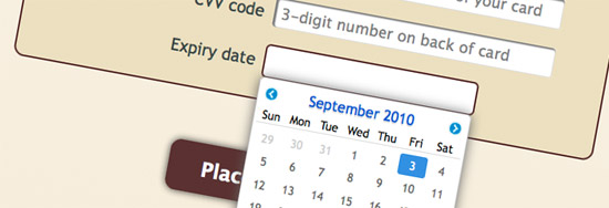
Try out the finished example again. Our form now works much better across all browsers. We now have nice yellow tooltips displayed next to invalid fields when the form is submitted, as well as an attractive pop-up calendar when we click the “Expiry date” field. (It would be great if the calendar only allowed you to choose the year and month, and not the day also, but you can’t have everything!)
It even works on IE7 and IE8, with the tooltips and the calendar in full effect.
The only remaining issues are:
-
-
- No placeholders in Opera or IE (though you could add these with another library or some simple JavaScript).
- With Opera 10, both the Opera and jQuery Tools calendars pop up when you click the date input field (not sure why).
- The validation error next to the date input field doesn’t disappear when you correct the field. Again, no idea why.
-
So this JavaScript fallback isn’t perfect, but it works pretty well as in interim solution. In a year or two’s time we’ll hopefully be able to ditch the JavaScript completely, and experience fully-native HTML5 forms with browser-based validation and pretty widgets. And won’t that be lovely!
More HTML5 form goodness
Here are some more useful resources for learning about HTML5 forms:
-
-
- A Form of Madness: This is the chapter on forms in Mark Pilgrim’s excellent “Dive Into HTML5” book.
- Improve your forms using HTML5!: Nice article from Opera about using HTML5 in your forms.
- Rethinking Forms in HTML5: Walks through the various currently-proposed HTML5 form elements and attributes.
-
I hope you enjoyed this foray into HTML5 forms! As always, if you have any comments or suggestions on this article I’d love to hear them — please post them below. 🙂
This has got to be one of the best CSS form design guides I have ever come across. I’ve been wanting to know how to round the borders for ages … but now I want to totally update all my forms. It is a bit scary knowing many people might not have up-to-date browers though.
Thanks a mil!
I love this forum. Thank you.
@Asa: You’re welcome – thanks for joining!
Very nice form and easy to use,
I am going to add into my blog. . . Thanks!