
As mobile web browsing becomes more common, it’s increasingly important to design websites for mobile use as well as for desktop browsing. This can mean anything from tweaking your regular site so it looks OK on Android and iOS devices, through to CSS media queries, responsive layouts, and even completely separate websites for mobile users.
The question is: How do you make a website work well on a mobile browser? It helps to start out by thinking about how the mobile browsing experience differs from desktop browsing. In this article I’ll touch on 10 important factors that make the mobile web different, and show how you can use those factors to influence your mobile site design decisions.
1. Smaller screens
Let’s start with one of the most obvious differences: Mobile browser displays are smaller than their desktop counterparts. “Smaller” here means two things:
- Physically smaller: Typically around 3-4 diagonal inches for a phone, and 9-10 diagonal inches for a tablet. This compares to a typical notebook screen size of 13-17 inches, and a desktop screen size of 20-30 inches.
- Fewer pixels: Most mobile displays currently have fewer pixels than desktop displays. An iPhone retina display is 960 x 640 pixels, whereas the smallest-screen iMac has a 1920 x 1080 display.
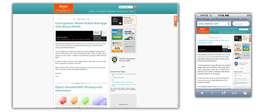
A smaller display means that the user can see a lot less information at once. Most modern mobile browsers compensate for this by allowing the user to zoom in and out easily, as well as adapting font sizes to make text more readable. Typically, though, the user will need to zoom in if the want to read the text in your page.
Another consequence of a smaller display is that more of your page content will be “below the fold”, requiring users to scroll through your page content more often.
So for your site to work well on a mobile browser, it needs to present important information near the top of the page; use an easy-to-read font; and not overwhelm the user with too much content in the page. In addition, the page layout not only needs to look good in a small browser window, but be usable too. This usually implies a simpler page layout than you might see on a regular website.
2. Slower processors

Although they are catching up, mobile devices generally have a lot less processing power than desktop computers. This is for various reasons, including cost and battery life. Therefore, mobile browsers take longer to render pages, and JavaScript-intensive pages can run very slowly.
Consider creating a simpler page layout for mobile browsers that uses less markup and CSS. If your site uses a lot of JavaScript for things like slideshows, interactive forms and the like, you might want to optimize or minimize your JavaScript so it runs smoothly on mobile browsers.
3. Less bandwidth

While cellular network speeds are improving all the time, a typical 3G mobile device will be lucky to get more than a 1 Mb/s download rate, compared to between 1.5 Mb/s and 20 Mb/s for a typical home ADSL link. (Of course, if the device has Wi-Fi access then downloads will be faster.)
What’s more, most mobile plans aggressively limit the amount of data that can be downloaded each month. If your users find that your site sucks up a large chunk of their download allowance then they’re unlikely to be back!
It’s always a good idea to make your site as bandwidth-efficient as possible, since every second that your users have to wait for your pages to load will increase their frustration. However, this is even more important when designing for the mobile web.
If your site contains large graphics or embedded videos that take up a lot of bandwidth, then you definitely want to look at creating a separate mobile-friendly site with smaller images and lower bit-rate video (or no video at all).
Also, if you’re providing downloadable PDFs or other content for your visitors, make sure the content isn’t too big to download comfortably on a mobile device.
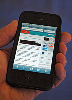
4. Touch input

One important aspect of many mobile devices is touch-based input. Rather than using a mouse or trackpad, the vast majority of mobile users work with their devices using a stylus or — more commonly these days — their fingers. This has several implications for mobile site designers, including:
- No hover events: Since there’s no mouse pointer, there’s no concept of “hovering” over a page element. This means that navigation menus and other controls that rely on the CSS
:hoverpseudo-class or JavaScriptmouseover/mouseoutevents won’t work well on touch devices. Some mobile browsers use various tricks to compensate for this, such as firing a hover event when the user taps the element once, and a click event if they tap again. On the whole, though, it’s best not to rely on hover events for your mobile site’s functionality. - Less precision: Clicking a 12-pixel-high text link with a mouse is no problem. Tapping the same link with big sausage fingers is a different story! Users can compensate for this by zooming in, but it’s still awkward. This is one of the best arguments for creating a separate site just for mobile users, since you can then replace those fiddly text links with nice, large, touch-friendly buttons and other controls.
- Gestures: Most modern touch devices allow the user to perform gestures using one or more fingers, such as swiping, pinching and so on. You can use gestures to enhance the experience for your mobile users. For example, you can let your users swipe left and right to move between images in a gallery. Many JavaScript frameworks such as jQuery Mobile can generate events for various touch gestures, making it easier to add gesture support to your mobile sites.
5. Fiddly keyboards

Unless you happen to be using an add-on full-size keyboard with your mobile device, the chances are that you’re typing on a fiddly little plastic keyboard or tapping a minuscule on-screen keyboard. While these keyboards are much better than they used to be, typing on them is still far from being a quick, pleasant experience.
This means that mobile users hate typing long reams of text. Your mobile site can make life easier for them by:
- Using shorter URLs
- Adding an autocomplete function to text fields and search fields
- Providing an easy way to browse popular pages or products, rather than having to search
- Pre-filling as much information as possible in web forms
6. No, or limited, multitasking

Multitasking — in the sense of being able to run more than one app at once — is finally starting to take off on mobile devices. That said, many devices still can’t multitask, and even those that can don’t offer the power or flexibility of desktop multitasking.
For example, on the iPhone 4 and iPad you can swap between running apps fairly easily by double-clicking the Home button, swiping and tapping, but it’s not as quick as just clicking an app icon or background window on a desktop computer. Furthermore, desktops allow you to see several app windows at the same time — a feat not yet possible on mobile devices.
This poor multitasking support can affect the way you design your mobile websites. For example, consider including Twitter/Facebook sharing buttons on every page of your site, so that users don’t have to copy and paste your page’s URL to a different window or app in order to share the page.
7. Websites are not always viewed in browsers
On the desktop, users nearly always surf the web in a browser. However, on mobile devices a large proportion of users view web pages within mobile apps, such as Facebook and Twitter apps.
This fact can have various subtle consequences for your mobile site designs. For example:
- Often there’s no URL bar: This means users can’t glean any information or context by looking at your page URL, copy and paste the URL, or type in a new URL.
- Reduced screen real estate: Mobile browser viewports are small at the best of times, but websites viewed in apps are often crammed into even smaller spaces thanks to app toolbars, buttons and other widgets surrounding the page.
- Limited functionality: Typically, browser features such as bookmarking, opening links in new windows or printing are not available when viewing web pages within apps.
Again, including sharing buttons within your pages can make it easier for users to share your content while inside another app. Also, don’t force people to rely on your page URLs for context. Include useful information such as article dates and breadcrumbs in the page to help users orient themselves.
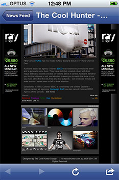
8. Portrait screens
The vast majority of desktop displays have a landscape orientation (they’re wider than they are tall). However, the opposite is true of mobile devices, since most users hold their device in a portrait orientation, so that their screen is much narrower than it is tall.
This is fuelling a trend toward mobile sites that are well suited to a vertical orientation, resulting in design decisions such as:
- Fewer columns of content (a single column being the ideal).
- No overly-wide elements: This includes large multi-column tables, as well as extra-wide images, slideshows, Flash movies and iframes.
- Navigation along the top rather than down the side.
Of course, most mobile devices let you switch to landscape format by rotating the device. Even so, users tend to browse in portrait mode most of the time, since it’s easier to hold the device with one hand that way.
9. People use mobile devices differently

This is perhaps one of the most important overall differences between the mobile web and the desktop web. Much of the time, people use their mobile device in a different way to their computer, and for different types of tasks.
At their computers, users are:
-
- Sitting at a desk
-
- Frequently in an office environment
-
- Often working
-
- Sometimes randomly surfing the web
- Often creating content
- Focused on the computer, not so much on their environment
On a mobile device, however, users tend to be:
-
- Sitting on the couch at home
-
- Walking around, inside or outside
-
- Queueing for something
-
- Waiting for a bus, train or plane, or travelling
-
- Looking for a specific piece of information
- Mostly consuming content
- Easily distracted by their environment
These differences affect the types of sites that work well on mobile devices. For example, websites and web apps that are designed to help people create content will generally be more popular on desktop computers, while sites that let users consume content easily, or find a specific piece of information while they’re on the move, will attract mobile users more.
10. No, or poor, Flash support
On the desktop, Flash is almost ubiquitous, with over 90% of browsers having the Flash player installed. With the mobile web, however, it’s a different story.
No iOS devices run Flash. Android devices using version 2.2 or later can run Flash, although many users choose to turn it off since it can cause performance and stability problems. In all, well under half of the world’s mobile devices are Flash-capable, and even when a device can run Flash, it’s usually not a pleasant experience.
Therefore, it goes without saying that a website relying on Flash is not going to be popular on mobiles. Fortunately there are now ways that you can create a Flash-like experience for both mobile and desktop users without needing to use Flash itself. Modern web standards like HTML5, CSS3 and SVG allow you to create vectors, animations, games, interactive elements, and embedded videos that will run well on all modern mobile devices, Flash-enabled or not.
Summary
While most modern mobile devices let you browse pretty much any website, there are many significant differences between the mobile web and the traditional desktop-based web experience. These differences include:
- Less power (smaller screens, slower processors, less bandwidth, less multitasking).
- Alternative approaches to entering data (touch input, fiddly keyboards).
- Different browser features and capabilities (pages viewed inside apps, portrait screens, little or no Flash support).
- People using mobile devices in different ways to desktop computers, and for different tasks.
When designing any website that will be viewed on mobile devices, it’s important to keep these differences in mind. By accommodating both desktop and mobile in your website strategy, you can provide a great experience for both of these audiences.
Happy building!
[Photo credits: Francesco Pappalardo, Ian Lamont, dog4aday, Marco Arment, JD Hancock]
Everytime I see a post on Mobile Web, I get this itch that i should dump my BlackBerry and get an iPhone.
On a different note though, great article. I haven’t started to design for mobile yet, I simply have no idea where to start, without a proper device for me to test on.
Cheers
@Crazyhunk: Thanks – glad you liked the article. 🙂
There are various device emulators you can use if you don’t have a mobile device. For Android there’s:
http://developer.android.com/guide/developing/tools/emulator.html
For iOS there’s the iOS Simulator:
http://developer.apple.com/programs/ios/develop.html
Cheers,
Matt
Thank you for the links Matt, will surely check them out … 🙂
Good article, but I’m really surprised some people still don’t get it. We’ve been talking about these things for a couple of years now.
Good post! I love this reasons! thanks!
This is a very nice way of making it crystal clear why our customers should be warned when they are building a website which is totally not usable on mobile devices.
Thanks for sharing this list!
Keep up the good work 🙂
I couldn’t find the speed test. say I go to ticketmaster to buy tickets would a pc or a high end tablet load the page faster?